| 1Tool Palette |
1-X APPENDIX |
Tool
Palette Features
| Menu |
Window > Tool
Palettes |
 |
 |
| Keyboard |
ToolPalettes or
[Ctrl+3] or TP |
| Related |
ToolPalettesClose or
[Ctrl+3] |
| Links |
Tool Palette Overview - for
the basic overview |
 The
Tool Palette in Architectural Desktop is a bit more advanced than the one
you will find in vanilla AutoCAD. If you are migrating from an earlier version of ADT, you may have noticed that the Default tab of most Object Style dialog boxes has
disappeared ( much to my disbelief). This tab of default settings has been moved
into the Icons on the Tool Palette as a Property of the Icon itself.
Tools are actually comprised of code written in XML ( eXtensive Markup
Language) which is stored in Catalog or Palette files with the extension of
.atc. These files can actually be read with a common text editor and
even modified (see discussion about creating custom Tools below). The
Tool Palette in Architectural Desktop is a bit more advanced than the one
you will find in vanilla AutoCAD. If you are migrating from an earlier version of ADT, you may have noticed that the Default tab of most Object Style dialog boxes has
disappeared ( much to my disbelief). This tab of default settings has been moved
into the Icons on the Tool Palette as a Property of the Icon itself.
Tools are actually comprised of code written in XML ( eXtensive Markup
Language) which is stored in Catalog or Palette files with the extension of
.atc. These files can actually be read with a common text editor and
even modified (see discussion about creating custom Tools below).
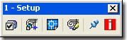
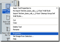
Illustrated to the left I show how right-clicking
over a Tool Palette icon activates a pop-up menu with the Properties...
option. Tool Properties
vary according to the Objects they represent or the commands they
activate. Some Tools will not offer any Properties that you can change
and that may be because of the
type of Tool or how the
Tool is set to link back to its
source in the Content Browser (read below for more on this subject).
Illustrated to the right I show two sample Tool Property
Palettes: one for a Wall and one for a Roof Slab. In both cases, you can use these
settings to save yourself a huge amount of time by configuring their settings to produce
the types of results you need on a regular and repeated basis; that way, you don't have to
repeat the process of making these settings on the Properties Palette every time you use
the same tool.
|
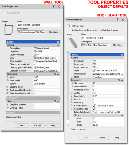 For Walls, for example, it is very easy to create a Wall
Style for Interior Studs with Gyp Bd. on Each Side, but to get that Wall to always use
another Layer, Cleanup Group Definition, Justification or other settings can be a bit of
work. You can, however, use the Tool Properties to preset all of the unique settings
you prefer and get the types of results you expect.
For Roof Slabs, for example, you may want a Roof Slab that
always uses a custom Fascia design and you may find that you typically use a certain
Thickness and Slope so why not program that in and save time. |
|
Apply Tool
Properties to The Apply Tool
Properties to> menu option, illustrated to the right, offers options
that vary depending upon the Object Style the Tool is for. Some tools,
such as those that simply insert an MvBlock or Hatch an area do not have
this menu option.
At one level this menu option acts much like
a Properties Painter where you can "apply" settings from the Tool icon to
existing Objects in the current drawing file. At another level, this
menu option offers the option to "Convert To" or "Create From"
feature that is missing from most of the alternate pull-down menus.
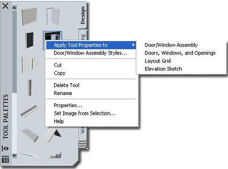
Illustrated to the right I show how the
Door/Window Assembly Tool offers the option to "Apply Tool Properties To>"
a "Layout Grid" and an "Elevation Sketch". By Selecting
either of these two options, you can Convert a 2D drawing or a Layout Grid
Object into a Door/Window Assembly. Look for similar options under
other Tools. |
 |
Creating a Custom
Tool Palette Group
| Menu |
Tools >
Customize> Tool
Palettes... |
|
|
| Keyboard |
Customize or
right-click on control bar of Palette |
| Links |
|
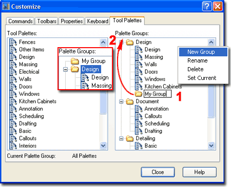
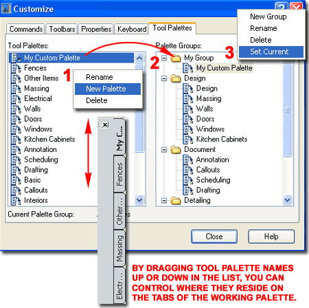
Starting with ADT 2005, you can use the
Customize dialog box to manage Tool Palette tools much like Toolbars and
buttons. Illustrated to the right I show how you can use the
right-click context
 menu, under the Palette Groups pane, to create a
New Group for a custom set of Tools. menu, under the Palette Groups pane, to create a
New Group for a custom set of Tools.
In the example to the right, notice that the
New Group I created landed under the current Palette Group folder making it
a sub-group. Since I want a primary group, I show that I have dragged
the New Group folder up to the top position.
Note:
Sub-groups can be used to organize highly specialized tools, like those for
Scheduling, that belong to specific categories like, Documentation.
Sub-groups can also be used to differentiate tools for project types but
honestly, I don't use sub-groups in my work. |
 |
| Creating a Custom
Tool Palette for the new Palette Group + Set Current
Under the Tool Palettes pane of the Customize
dialog box you can use the right-click context menu to Rename, add New
Palettes and Delete existing Palettes. These Palettes can be dragged
 up
or down in the list affecting the order in which they appear on the current
Palette Group. They can also be dragged over to the Palette Groups
pane and up or down within that pane providing a means to make highly
structured associations. up
or down in the list affecting the order in which they appear on the current
Palette Group. They can also be dragged over to the Palette Groups
pane and up or down within that pane providing a means to make highly
structured associations.
Illustrated to the right I show that I have
created a New Palette that I named "My Custom Palette" and I dragged this
Palette over to "My Group" created in the previous step.
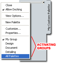
Once you have a custom Palette Group with at
least one Palette, you can use the "Set Current" option from the context
menu to make this group the only active one on the working Tool Palette.
In the illustration to the left I show how this Palette may appear and how
you can access your other Palettes (or "All Palettes") should you get
nervous about losing the tools you are dependant on.
|
Note:
If you have lost or Deleted a Palette or Palette Group, chances are that you
can retrieve it from the Content Browser Catalog. Below I will discuss
how to create backup copies of custom Palettes in the Content Browser for
restoring or for sharing. |
| Creating a Custom
Tool for the new Palette Once you
have a Palette ready for Tools, you can start adding them in a multitude of
ways that should prove entertaining enough to keep you busy for hours.
In the illustration to the right I show
 one
of my personal favorite ways of creating a custom Tool: simply drag an
Object from the working screen area over to the Palette. one
of my personal favorite ways of creating a custom Tool: simply drag an
Object from the working screen area over to the Palette.
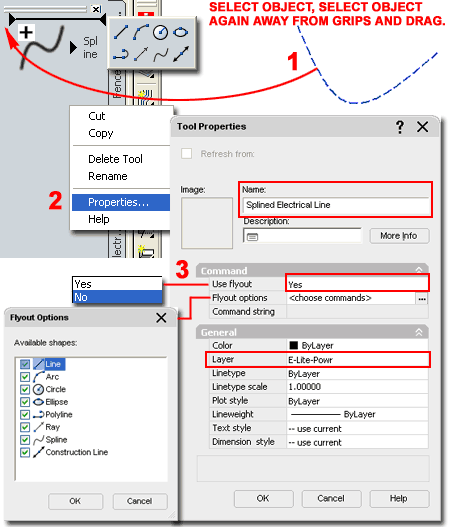
Illustrated to the right I show how you might
go about creating a custom Tool for drawing electrical lines in Reflected
Ceiling Plans. In Step 1 I show that I have Selected a Spline Object
that I created earlier. In order to drag it, you have to Select the
Object, release your mouse button and then look for a spot on the Object
away from Grip Points and Select again ( right on the Object). For the
second Selection of the Object, hold the left mouse button down as you drag
the Object over to the Palette. Once over the Palette, continue to
hold the left mouse button down but look for the small "plus" icon and the
horizontal placement bar. When you see these two graphic indicators
you can release the left mouse button and you should see a new Tool.
When Objects are added to the Tool Palette by
drag-n-drop methodology, they trigger a Tool creation related directly to
the Object Type; a Spline Object will, for example, create a fly-out menu
while a Wall will only create a specific Wall Tool.
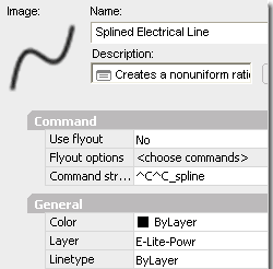
In this example I show that I don't want a
fly-out menu so I have used the Properties... context menu option to access
the Tool Properties dialog. On the Tool Properties dialog I show that
I have used the "Use Flyout" drop-down list to set this value to
"No". This action automatically resets the "Command String" field to
"^C^C-spline" as illustrated above, left.
One of the best reasons to use custom Tools
for things as simple as electrical lines is that you can use the "Layer"
value field to automate Layering. Unfortunately for ADT users, basic
AutoCAD Objects,
|
like Splines, cannot be set to use the Layer Keys in ADT
unless you go through the tedious work of using the AEC Content Wizard - see
Part - 17 Documentation -
AEC Content Wizard.
Note:
While in Customize mode, using the Customize dialog box, you can drag
buttons from toolbars to Palettes. I did find that this option does
not appear to work with custom fly-outs that aren't native to AutoCAD or ADT. |
|
Tool Overview -
Not all Tools are Equal Not only
can you drag-n-drop Objects to make new Tools, you will find a plethora of
Tool Types throughout the default Palettes that come with ADT.
Of the variety of Tool Types, you can
basically categorize them into three groups: Command Tools,
Command Tools with Properties and Object Tools. To me,
Object Tools are really just Command Tools specifically designed to work
with one Object Style. Since ADT has quite a collection of Object
Style Types or Families you will find nearly as many Tool Types. For
those few remaining Object Styles that don't have Tool equivalents, you will
find that the DesignCenter and the AEC Content Wizard continue
to be essential for their management - see discussion under
Tool Palette and
DesignCenter Content for more.
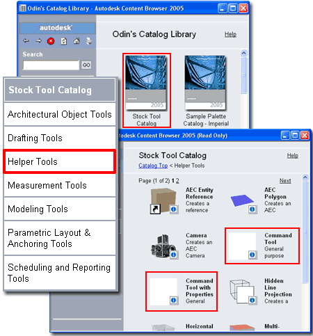
One of the best ways to learn about the
different Tool Types it to visit the Stock Tool Catalog in the Content
Browser and add them to a custom Tool Palette where you can test and
modify them. Illustrated to the
right I show that I have accessed the Stock Tool Catalog and Selected the
"Helper Tools" Category where you will find two of the most adaptable Tool
examples: the Command Tool and the Command Tool with Properties.
Recommended:
To follow along with the lengthy discussion below I recommend that you use
the information discussed above to create a custom Palette and drag
both of the Tools illustrated to the right over to this new Palette.
|
 |
Command Tools
| Mouse |
Drag
example "Helper" Tool from the Stock Tool Catalog
to Palette, Right-click over Tool icon on Palette and Select Properties |
Command Tools cannot be created by dragging
an Object to the Tool Palette so you will find that in order to create one
of these Tool Types you will either need to drag it from the Content Browser
or Copy an existing one.
Command Tools are basically a direct
duplicate of Tool Buttons despite the type of Tool you acquire when you drag
a tool button to a Tool Palette. Tool Buttons, like Command Tools, can
only do one thing: play a command script to the command line. When you
write the command script you have to type everything exactly as you would
when typing commands on the keyboard. With the aid of the menu
language, DIESEL, you can use special characters to create more
sophisticated scripts including options for user input. You can also
include full LISP code or make calls to other programs written in LISP or
VBA.
Refresh from - this checkbox option is for Tools linked to a source
Tool in a Content Browser Catalog. See discussion under
Tool
and Palette Refreshing for the full story.Image
- this option is typically blank for Tools that are not directly
associated with an Object. You can set custom images to make your own
Tool icons. See discussion under Tool Images
for the full story. Tips:
| ^C^C |
Use these four characters
to help your custom commands run better by canceling anything
else that might be on the command line. |
| ; |
Use the semicolon character
to represent a keyboard "Enter". Be careful because a space
will automatically be interpreted as the same "Enter" but it is easier
to read the semicolon |
| \ |
Use the forward slash
character whenever you want to Pause the script and allow the
user to input a value by picking a point on the screen or typing it on
the keyboard. |
|
Note:
Tool buttons never create Command Tools even though they should. The
"Erase" tool button, for example, creates a Command Tool with Properties
when there is no possible way to employ Properties for this action.
The good news is that it doesn't hurt to have the Properties and it makes it
easier to alter the tools.
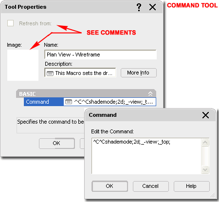
The example Command Script listed above is one
that I use regularly because it not only changes the View to Top but sets
the Shademode to what I typically use in Isometric Views: 2D (Wireframe).
Try it yourself by copying this statement and pasting it in for the
Command:^C^Cshademode;2d;_-view;_top; |
Command Tools
with Properties
| Mouse |
Drag
example "Helper" Tool from the Stock Tool Catalog to Palette, Right-click over Tool icon on Palette and Select Properties |
Command Tools with
Properties are, as the name implies, Command Tools with a set of Properties
including Color, Layer, Linetype, Linetype Scale,
Plot Style, Lineweight,
Text Style and Dimension Style. In addition to these Properties,
Command Tools provide "Flyout" options that are a derivative of toolbar
fly-out buttons. The Command String
field of this Tool is identical to the Command field on the Command Tool and
you can actually use "Command Tools with Properties" in place of Command
Tools. Command Tools with Properties
offer a list of Properties that may or may not relate directly to the action
set by the Command String. Dimension Style, for example, is irrelevant
for a Tool set to draw Lines, Arcs or Circles and should thus be set to
"Standard" or "--current" to avoid importing unwanted settings. All of
the Properties under the General section of the Tool Properties dialog are
stored directly in the .atc file and as such, you can think of these settings
as embedded in the tool itself; i.e., they are not stored in a drawing file.
Refresh from - this checkbox option is
for Tools linked to a source Tool in a Content Browser Catalog. See
discussion under Tool
and Palette Refreshing for the full story. Image -
this option is typically blank for Tools that are not directly associated
with an Object. You can set custom images to make your own Tool icons.
See discussion under Tool Images for the
full story. |
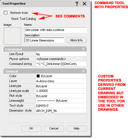
The example Command Script listed above is one
that I use regularly because it not only activates the Linear Dimension but
automatically activates the Continue Dimension after the first dimension
string has been placed.
Notice the three forward slashed used to allow the user to pick points on
the screen. Try it yourself by copying this statement and pasting it in for the
Command string:^C^C_DimLinear;\\\DimCont; |
| Object Tools
In addition to the two basic Tool Types
discussed above, you will find a huge variety that all relate specifically
to Object Types. These can be categorized into two groups: the general
ones for AutoCAD Objects and the specific ones for Architectural Desktop
Objects.
All of these work on the same principles set forth in the Command Tools with
Properties; i.e., they all produce Objects and they all offer Properties (well,
most of them).
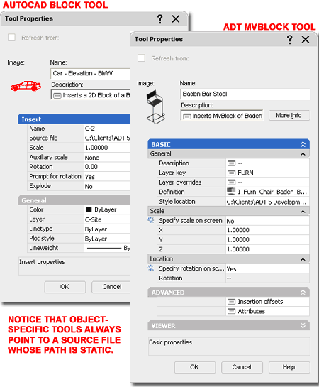
Illustrated to the right I show a comparison
between two similar Object Tools: one that inserts the common AutoCAD
Block and one that inserts an Architectural Desktop Multi-View Block.
Notice that both Tools offer Properties unique to the Object Type and
include a path to the location or source of the Object (compare "Source File"
and "Style Location"). This path becomes a fundamental part of the Tool
since without the source Object, the Properties become meaningless.
When you create Object Tools that require a path, be aware that this path is
static and if you change the location of the source drawing file the tool
will no longer work properly. When you drag an Object like
a Wall to a Palette, the source file becomes the current drawing. The
default Tools in ADT's Content Browser point back to the Styles Folders on a
Path set by the
Tool Catalog
Content Roof Path field on the Options dialog. For best results,
you should consider adding your custom source files to custom Folder Names
within the Styles Folder. If you
want to make a set of Tools that Insert a collection of Blocks and or
MvBlocks, for example, you will need to keep the file or files for these
Blocks in the same location as that set in the Tools. Relative Paths
or pathless calls to Blocks are not allowed making the task of managing
paths highly problematic for CAD managers. There are, however, tools
in the Content Browser that can be employed to make this work less daunting
but the average user may find that tools often break; particularly in large
networked environments where everything is managed on servers. Read up
on Publishing Catalogs and
Path options
in the Options dialog for more. |
Note:
Be aware that the Content Catalog's Publishing tool and the Tool Catalog
Content Roof Path setting is only for Architectural Desktop Objects and thus
has no affect on AutoCAD Tools ( Blocks, for example) |
Tool Palette and
DesignCenter Content
| Links |
AEC Content Wizard
(Part 17-Documenation)- for information on how to work with the AEC
Content Wizard. |
| |
Create AEC
Content Wizard (Part 25 - Block - Profiles) - for other information
on using the AEC Content Wizard. |
For
Architectural Desktop Tools, there remains a unique variety that hasn't been
fully integrated into the Tool Palette system and offers no Properties at
all. You will find that most of these tools have duplicate tools under
the Custom tab of the DesignCenter where they were created through the use
of the AEC Content Wizard. Basically the AEC Content Wizard,
likely to be phased out in the near future, is the predecessor to Tool
Properties allowing users to embed ADT-specific functionality within a
DesignCenter Object. Some Objects still do not have equivalent Tool
Properties and thus remain locked in the old DesignCenter but as ADT
evolves, these Properties will surely be migrated to the Tool Palette
system. What advanced ADT users should be aware of, however, is that
the AEC Content Wizard offers the awesome power to combine just about any
script with ADT features. You can, for example, make a command that
draws a simple AutoCAD line but keys it to an Layer in the current Layer
Key; making it far more adaptable than locking it to one specific layer.
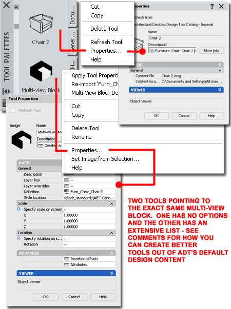
Illustrated to the right are two examples of Tools that basically achieve
the same results: Insert a Multi-View Block. The one on the top comes
directly out of ADT's Content Browser Catalog and consequentially offers no
options
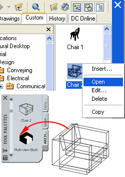 on its Tool Properties dialog box. The other Tool was one that
I created by Opening the File that the Multi-View Block resides in and
dragging it to my Tool Palette. As you can see, the second option
offers far more options on the Tool Properties dialog. on its Tool Properties dialog box. The other Tool was one that
I created by Opening the File that the Multi-View Block resides in and
dragging it to my Tool Palette. As you can see, the second option
offers far more options on the Tool Properties dialog.
Illustrated
to the left is a neat trick that you can employ to improve your Tool
Properties for Design Content.
From the DesignCenter, right-click
over an Object such as an MvBlock and Select the Open menu option.
Once the file has opened, Select the Object and Drag it
directly to your Tool Palette. Close the file without
saving any changes.
|
 If you check the Tool Properties for
this newly introduced Tool, you should find that you have a list of options
similar to those illustrated to the right.
Note:
Because some DesignCenter Content has unique Properties set with the AEC
Content Wizard, this trick will not work correctly or optimally for all
Design Content. Objects that are Annotation based or have Attributes
with special features such as Force Horizontal, will not work using this
trick but if you drag them directly from the DesignCenter to your Tool
Palette, those special properties will remain in tact. |
|
Tool Images
When creating custom Tools, a Tool Image is typically created for
you automatically based on the Object Style dragged over to the Tool Palette. Tools
created by other means, such as Copying or dragging from the Content Browser
may not display any Tool Image at all.
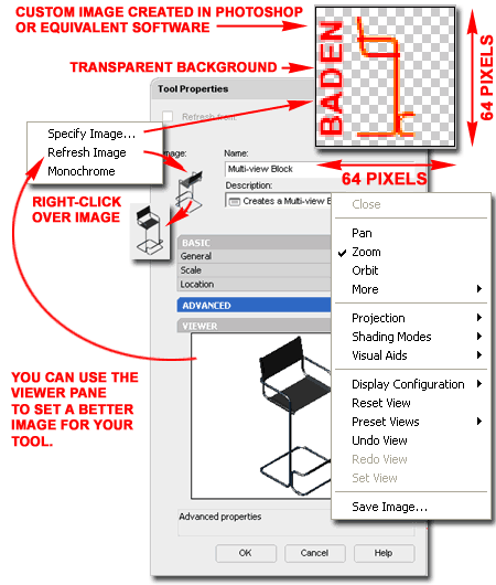
Should you find that you need to create or
modify the Tool Image, there are a variety of things that you can do but
they all center on working with the Tool Image Context menu illustrated to
the right. On this menu you will find three options: Specify Image...,
Refresh Image and Monochrome.
Specify Image... - use this option to
access the "Select Image File" dialog where you can Select any .bmp, .jpg, .png,
.gif, or .tif image on your local or network drive. Once you have
Selected a custom image, this image will automatically be copied to the Images folder under the current Palette
Location. Custom Images should be no less than 64x64 Pixels but I have
had acceptable success with smaller and
larger images. If you decide to create a custom image with Photoshop
or equivalent software, it is best to use the 64x64 Pixel dimension and be
sure to have a transparent background for all areas that will blend in with
the Palette - see illustration upper right.
Refresh Image - use this option in
conjunction with the Viewer Pane and 3dOrbit Context menu to reset more
desirable views, angles, perspectives and so forth. For Objects that
have a definitive Right and Left side, such as exterior Walls, you may need
to use this technique to get the exterior side to show as you wish it on the
Tool.
Monochrome - use this option to reduce the
current Tool Image to a Grayscale image. Not all images will offer the
Monochrome option and I have found that not all images convert to monochrome
even when the option is available. This typically occurs when custom
Blocks have been used in Object Styles. |
Note:
Many users complain that they have suddenly lost one or more of their Tool
Images and that is typically due to tinkering with Paths that end up
disassociating the Tool from its Image folder. Like drawings with
Xref's and Web pages with Images, Tools point to images and that path is
vital. |
Content Browser
and Catalogs
| Menu |
Window> Content Browser |
 |
|
| Keyboard |
ContentBrowser [Ctrl+4] |
| Browser |
Use
"Click to add or create a catalog" button |
| Links |
|
Though many users may never need to use the
Content Browser's tools for creating custom Content, I recommend that all
users become familiar with these tools because it is a great way to save a
backup copy of your custom Tools and Palettes. Beyond just saving a
backup copy, users and CAD managers will find all sorts of amazing
managerial benefits in using the Content Browser; including path controls,
linking
and locked shared Palettes. Illustrated
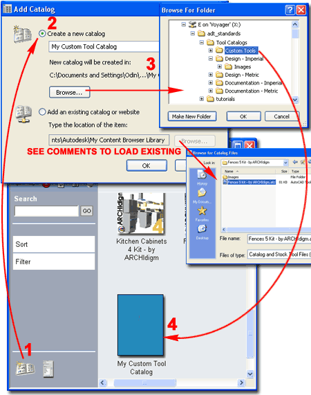
to the right I show the steps required to create a New Catalog in the
Content Browser. When you pick on the "Click to add or create a
catalog" button, the Add Catalog dialog automatically activates where you
have two primary choices: "Create a new catalog" or "Add an existing catalog or
website". Be sure to set the path information correctly on the first
attempt whenever creating a Catalog because you cannot change this later.
If you make a mistake, you can Delete the Catalog and create a new one but
be aware that once the Catalog file has been created, the file will remain
on your local or network system; i.e., to truly remove it you need to
manually delete it with Explorer. New Catalogs can be set to read
existing Catalog files in case you really get a disconnect that you want to
thread back together. In most cases you
will create a New Catalog that you will then populate with Tools that you
organize as you see fit. This Catalog will either be located on the
local machine in the default path location or in a folder on a network
server where it can be shared with other users and workstations. In
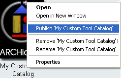
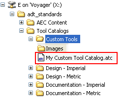
the illustration to the right I show that I have used the Browse... button
to place my new catalog, "My Custom Tool Catalog", in the "Custom Tools"
folder on my office server which has been mapped as driver letter "X".
You can think of a Catalog as a file and as long as the names are unique,
all Catalogs can reside within one folder; this can prove to be quite
messy and difficult to sort through so you may want to consider a set of
Folders for each custom Catalog.
Note:
When you create a new Catalog, be sure to avoid exceptionally long path
statements and Catalog Names because the limit is 255 characters.
For the more advanced users, you may appreciate
the fact that you can drag .atc files from Explorer directly to the Content
Browser. |
Once a Catalog has been created, it can be Added
or imported to other workstations by using the "Add an existing catalog
or website" option on the Add Catalog dialog. CAD managers will
soon discover that adding one custom Catalog for the Office is the way to go
because once you have the Catalog you can populate it as you see fit without
having to return to all workstations to Add it. Adding a Website
offers interesting possibilities and you can see some of them by using the
default "Architectural Desktop & VIZ Render Plug-ins" Catalog. If you
want to experiment, you can create a new Catalog that goes to this website:
"http://www.archidigm.com/classroom/osmosis/i-drop/adt_i-drop_cover.htm"
which is our i-drop center that you have access to as a subscriber.
You will need to input your User Name and Password when accessing the site. |
| Catalog
Properties A Catalog in the Content
Browser is something similar to a Folder but when you look for it with
Windows Explorer, you will find it listed as a unique file type with the
three letter extension of ".atc." (autodesk tool catalog or something to
that effect). This "catalog" has a unique set of Properties as
illustrated to the right and serves as the primary container of Categories,
Packages, Palettes and Tools (see discussion below).
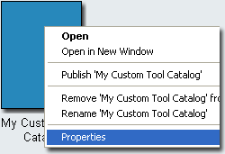 In
the Content Browser you can use the Properties option on the Context menu to
access the Catalog Properties dialog, as illustrated to the right. On
this dialog you can set or change the Title, Description, File
or Target Location, Publisher, Type and
Image. On the Home Page of the Content
Browser you will find a Search tool, a Sort tool and a Filter tool that are
all designed to work with the information you provide in the various Fields
of this dialog box. In
the Content Browser you can use the Properties option on the Context menu to
access the Catalog Properties dialog, as illustrated to the right. On
this dialog you can set or change the Title, Description, File
or Target Location, Publisher, Type and
Image. On the Home Page of the Content
Browser you will find a Search tool, a Sort tool and a Filter tool that are
all designed to work with the information you provide in the various Fields
of this dialog box.
Content Browser Tools:
Search - use this text field to input one or more words (or numbers) to
search for Tools. As you enter deeper within any Catalog you
will find checkbox options under the Search field that you can use to
isolate any Search to that particular organizational object. This
Search feature
only searches for Tools. Be aware that this list has a bug preventing
users from Deleting previous search strings; to clear it you will need
to visit the Registry and look here:
HKEY_CURRENT_USER\Autodesk\Autodesk Content Browser\45\MRUList2 - MRUString
Sort - use this option to rearrange
the Catalogs by "...Last Used", "...Publisher", "...Title"
and "...Type".
Filter - use this option to limit the
Catalogs displayed by "*All Catalogs", "Content", "Personal",
"Rendering", "Samples" or "Tutorials"
Catalog Properties:
Image - by right-clicking over the blank image tile, you can invoke the
"Specify Image..." Context menu option which will allow you to Select any
.bmp, .jpg, .png or .tif image on your local or network drive. Though
you can actually Select any Image Size, to avoid distorted scaling it is
best to use images set to 90x120 Pixels. As with all other images
manually set within the Content Browser, a copy will be created
automatically and placed in the Images folder under the current Catalog
folder
Title - Name of Catalog and Name of .atc
file. If you name your Catalog "My Custom Tool Catalog", for example,
you will find the file is named "My Custom Tool Catalog.atc". Be sure
to limit the name so that the full path plus the name is less than or equal
to 255 characters. |
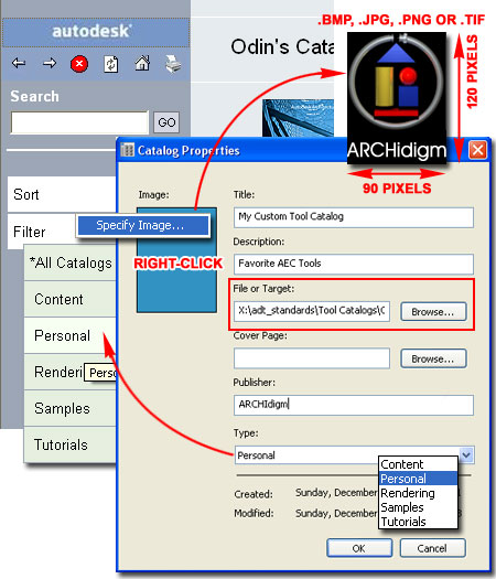
Description - use this field to add a
text description in the form of a tool tip when a user hovers their cursor
over the Catalog icon in the Content Browser.
File or Target - this
field should be set when creating the Catalog. You can only use this
field and Browse... button to set the current Catalog to an existing Catalog
file. It would be rather unusual to use this option.
Cover Page - use this
field to specify a path to an .htm or .html file. By using a custom
Cover Page you can make the first page of your Catalog unique with custom
text, images and even links. For best results, do not set your Cover
Page until you have added one or more Categories because this is all that
you will see in the right hand pane after setting the custom Cover Page.
For examples, take a look at the default Design and Documentation Tool
Catalogs.
Publisher - use this
field for Sorting purposes - see comments above.
Type - use this
drop-down list to set one of five Filter categories - see comments above. |
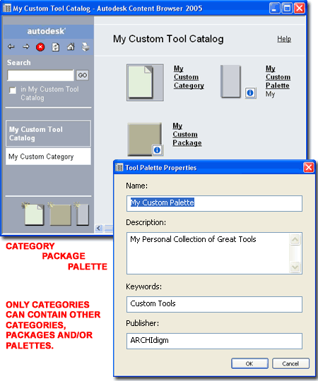
| Catalog
Organizational Objects Within a
custom Catalog in the Content Browser you will find three organizational
Objects that you can use to organize Tools: Categories, Packages and
Palettes. If you don't want to use any of these Objects, you can
drag-n-drop Tools directly to the Catalog's Cover Page.
Category - use this "Object" to create
something analogous to a page ( or sub-folder) with the option to use any
of the three organizational Objects found on the Catalog Cover Page. You can see an
example of this in many of the default Catalogs that come with ADT and it is
useful for large Catalogs.
Package - use this "Object" to store a
collection of Tools that you may wish to drag directly to any existing
Palettes you may have. In other words, it is a package ( or
collection) of Tools for quick transfer. Only Tools can be added to a
Package.
Palette - use this "Object" to create
an actual Palette Object that can be added to your current Tool Palette.
Only Tools can be added to a Palette. When Palettes are added to the
current Tool Palette, a new file is created - see comments under "Note"
below.
Regardless of how any Tool has been
organized, you can always access a single Tool and drag it directly to any
current Tool Palette. Note:
When you drag a Palette from a Catalog to the current working Tool Palette,
a new .atc file is automatically created under the current System Profile (
not to be confused with an ADT or AutoCAD Profile). The default
location for this .atc file is "C:\Documents and Settings\[Current User
Profile]\Application Data\Autodesk\ADT 2005\enu\Support\WorkspaceCatalog
(Imperial)\Palettes" or the Metric equivalent. When you issue a
request for the Palette to be Refreshed, the one from the Catalog location
is copied over to the local path location much like Xref's or Web Pages are
copied to "Temp" directories. |
 |
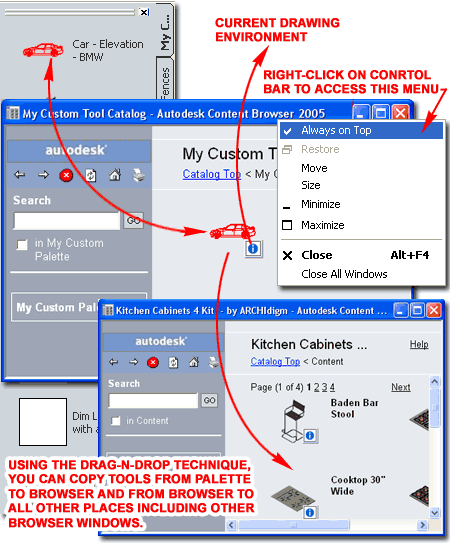
| Populating a
Catalog in the Content Browser Once you have a
custom Catalog with or without Categories, Packages and Palettes, you can
begin to populate it with Tools.
 Unfortunately you cannot create Tools
directly in the Content Browser so you are forced to create them on the
current Tool Palette in ADT and then drag individual, groups of Tools (hold
Ctrl key depressed) or the whole Tool Palette (drag tab) over to a Catalog.
Tools already stored in the Content Browser can be Copied to other Catalogs
but the only way to make significant changes to them is to drag them to the
current Tool Palette, make the changes and then drag them to a Catalog.
This is also true if you simply want to make changes to any of your exiting
Tools; in fact, it's a little worse because the Catalog allows Tools with
identical Properties (Tools are not overwritten). Unfortunately you cannot create Tools
directly in the Content Browser so you are forced to create them on the
current Tool Palette in ADT and then drag individual, groups of Tools (hold
Ctrl key depressed) or the whole Tool Palette (drag tab) over to a Catalog.
Tools already stored in the Content Browser can be Copied to other Catalogs
but the only way to make significant changes to them is to drag them to the
current Tool Palette, make the changes and then drag them to a Catalog.
This is also true if you simply want to make changes to any of your exiting
Tools; in fact, it's a little worse because the Catalog allows Tools with
identical Properties (Tools are not overwritten).
Illustrated to the right I show some of the
drag-n-drop options you have for copying Tools to and from the a Catalog in
the Content Browser. By using the Context menu option for "Open in
New Window" you can activate multiple Catalogs, Categories,
Packages or Palettes to copy Packages,
Palettes or individual Tools. Not that I feel completely
comfortable about advising it, I did find that this is even possible between
different versions of ADT. One of my
favorite drag-n-drop actions is to take a Tool from a Catalog directly to
the current drawing environment. This is particularly useful with
Tools that you don't use regularly.
Note:
To drag-n-drop a Palette over to a Catalog, be sure that the point of
destination can accept a Palette; Packages, for example, cannot receive a
Palette. When dragging the Palette tab, you may find that the process
of sending it, or dropping it, to your Catalog takes a little longer than
with individual Tools; i.e., drag slowly if you experience problems. |
 |
Catalog Publishing
| Mouse |
Right-click over Catalog, Select Publish
[Catalog Name] |
| Links |
|
The Catalog Publishing Wizard in the
Content Browser assists users and CAD managers with Catalog and Tool
Path issues. As you may realize
 by
now, most Tools that create Objects point to a Source drawing file where the
Object Style resides. The Path to this Source can either be a static
location manually set at the time the Tool was created or the location can
be within Architectural Desktop's
Tool Catalog
Root Path (which is actually a dynamic path that can be changed on the
Options dialog). by
now, most Tools that create Objects point to a Source drawing file where the
Object Style resides. The Path to this Source can either be a static
location manually set at the time the Tool was created or the location can
be within Architectural Desktop's
Tool Catalog
Root Path (which is actually a dynamic path that can be changed on the
Options dialog).
For Architectural Desktop Style-based
Tools, you can employ the Publishing tool to collate scattered Source
Files and reset Paths to a new centralized Path location. Using the "Leave
it in its current location" option helps to repair and update files and
Path issues.
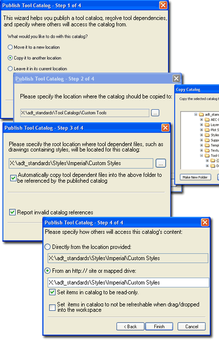
Illustrated to the right, on the first dialog
box of the Publish Wizard, I show that I am using the "Copy it to another
location" which has become my most common choice because I find it
creates a new and clean collection of files while leaving what I had in case
something else goes terribly astray. I am a fan of redundancy when it
comes to computers since it is rather easy to Delete Files and Folders.
On the second dialog box of the Publish
Wizard I show that I have chosen a Path on my Network Server (the "X" is a
mapped drive). On my Server I have a single Folder for all "adt_standards"
and under this Folder I have a series of Folders that include some I Copied
from the default structure of ADT and some I created for custom use.
In this group, as it relates to Content and Publishing, notice that I have a
Folder named "Styles". This Folder's name is paramount to customized
restructuring of ADT because the Tool Catalog Roof Path has been set
to look for this Folder and any sub-folders.
On the third dialog box of the Publish Wizard
I show that I have chosen to Copy my source files to a custom folder
("Custom Styles") within the parent "Styles" Folder as discussed
above. This will allow me to control the Path via the Tool Catalog
Root Path setting on the Options dialog. You don't have to follow
this formula but it does offer a little more flexibility and control.
Automatically copy tool dependent files into
the above folder to be referenced by the published catalog - this option
provides a means to copy tool source files for Tools that import Style-based
Objects such as MvBlocks, Walls, Slabs, Schedules and so forth. I was
dumbfounded when I discovered that this only works with ADT Style-based
Objects and not something as obviously useful as standard AutoCAD Blocks.
Report invalid catalog references - this
option is basically essential so you can check for errors and one of the
most disappointing errors you may find when learning about publishing is
that you cannot publish source files over files that have already been
published; i.e., if the file exists the publisher will not write over it and
this will be reported as an error. One fix is to use Explorer to
Delete the previously published files.
Set items in catalog to be read-only -
this option will lock all Tool Properties inside the Catalog but
those Properties only amount to things like "Name", "Description",
"Publisher" and so on. It does not lock the
Properties for the Palette, Package or Category within the Catalog.
Ironically this means that a user cannot Delete individual Tools in a
Catalog but they can Delete Palettes, Packages or Categories - this doesn't
make any sense to me and you may want to consider using the "Read-only"
Attribute for higher security.
What this setting affects [Close
and Restart of ADT may be necessary]:
Tool dragged to local Palette - Refresh from will be
checked (set active). Uncheck to access Tool Properties.
Recheck will lock Tool permanently to original settings.
Palette dragged to Tool Palette -
Refresh and Auto-refresh will be checked (set active) on the
Palette with no options on the Tools; even when the Refresh is unchecked
(set inactive).
|
Set items in catalog to not be refreshable
when drag/dropped into the workspace - this option deactivates the
"Refresh from" option on the Tool Properties dialog and Tool Context menu
but you can activate it on the Tool Properties dialog. The odd thing is that in my tests
I found that when this option is activated, it makes the Tools in the
Catalog read-only so I don't recommend using this option until this bug has
been fixed.
What this setting affects [Close
and Restart of ADT may be necessary]:
Tool dragged to local Palette - Refresh from will be unchecked (set
inactive) and all Tool Properties will be accessible. Checking the
"Refresh from" option locks the Tool Properties permanently but allows
Refreshing from the Tool's Context menu.
Palette
dragged to Tool Palette - Refresh
will be unchecked (set inactive) and all Tool Properties will be locked.
Checking the Refresh option will lock the Palette and Tool Properties
permanently but Palette Refreshing will still be possible via the
Palette Context menu. If you want Auto-refresh set active you must
do this at the same time that you set the Refresh because after this
action no changes will be possible.
Set items in catalog to be read-only and Set items in catalog to not be refreshable
when drag/dropped into the workspace - using both options together
produces results identical to those for the "Set items in catalog to not be
refreshable..." option. |
|
Tool
and Palette Refreshing When working
with Tools and Tool Palettes you may have noticed references to
"Refreshing". This option only exists for Tools and Tool
Palettes created by interaction with the Content Browser (such as dragging
them over). Because Tools and Tool Palettes can be linked back to
their origin in the Content Browser, Refreshing provides users with the
option of updating individual Tools or full Tool Palettes at their own
convenience. By working with the Properties dialog for Tools and Tool
Palettes, in conjunction with Publishing options for Content Browser
Catalogs, users and CAD managers can set rules to lock, automate or open
Tool Refreshing. These options provide the means for an office to have
standard Tools that are locked, Template Tools that are flexible and
"disposable" Tools
that are completely open for independent management by individual users.
Be aware that Refresh options are affected by
several settings and actions that may prove to be a bit confusing. To
make matters worse, I have found on several occasions that Tool and Tool
Palette settings do not properly update until ADT has been shut down and
restarted. If you spend a good deal of time playing around with all of
this .XML code, you may even cause crashes or odd things like losing all of
your Tool Images. Keep a clear head about what you are doing and
observing and it should remain fairly logical. Remember that a Palette
or Tool created on a local machine under the current user Profile is likely
to exhibit different characteristics than Tools or Palettes dragged over
from the Content Browser. If you mix and match haphazardly, for
example, you may find Tools that exhibit different characteristics on a
single Palette ( like Locked, able to Refresh, or with no Refresh option at
all).
Refresh from [Tool
Properties] - use this checkbox to force a Refresh action, toggle the "Refresh
Tool" option on the Tool's Context menu and lock the Tool as
"Read-only". Tools not created from the Content Browser will not have
a refresh option because refreshing is an action tied to the Content
Browser. Tools dragged over from the Content Browser may have the
"Refresh from" checkbox preset (checked) depending on how the Catalog was
Published but if you uncheck and recheck this box, you force the Tool to
"Read-only" mode. Once a Tool is locked to "Read-only" mode, you
cannot restore it to a previous state. This means that you have to
bring a new copy of the Tool from the Content Browser if you want another
state. Tools dragged over as part of a whole Palette are affected by
the Refresh settings for the Palette; i.e., if a Palette is set to Refresh
so too are all of the Tools.
|
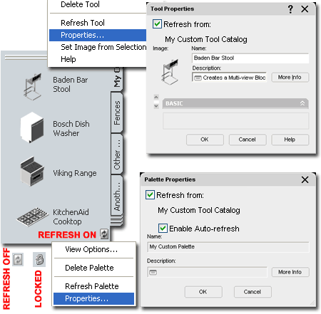 Refresh from [Palette Properties] -
when Palettes are dragged over from a Content Browser Catalog, the Refresh
option is automatically placed in the lower right corner. If the
Catalog or Palette file has been set to "Read-only" with Explorer, the
Refresh icon will be replaced with the icon of a lock. By default (not
modified or Published) Palettes will be set to "Refresh from" but not
"Auto-refresh".
Enable Auto-refresh - this Palette option
is only available when the "Refresh from:" option is available and checked.
When checked, this option automatically refreshes the Palette upon startup
of ADT. Theoretically it should do this when switching Profiles but I
did not find this to be true and thus you may have to Close and Restart ADT
to see the results of this option.
Tip:
Though you can Lock Tools and Palettes through Publishing, the most
secure and accurate way to ensure Standards is to use a "Read-only"
Attribute (with Explorer) on the .atc files. When you make this
setting on Tool Palettes, you should find that they will display the
"locked" icon in the lower right. |
Tool Palettes
File Locations - Options dialog box
| Menu |
Tools >
Options... |
| Keyboard |
Options or OP |
| Mouse |
Right-click in Command Line Window. |
Under the Files tab of the Options dialog you
will find a folder labeled "Tool Palettes File Locations" and here you can
set one or more Paths for stock and custom Palettes.
If you decide to relocate the stock Palettes
that come with ADT by default, you will need to set the Path to the new
location here. Multiple machines can share the same Path(s) to the
same Palettes but be aware that this could pose some problems for users who
want to modify their Palettes. One option you can consider is to use a
"Read-only" setting on .atc files that store the Palettes you want shared.
This "Read-only" setting will place an icon of a lock in the lower right
corner of the Palette and will prevent users from making any changes,
whatsoever, to the Palette and its Tools.
Any Path you set to a folder containing
Palette files will automatically load any and all Palettes form this folder
and folders below it (sub-folders). You can use the Apply button to
set the results of this action immediately and thus quickly determine the
success or failure of your efforts. Remember that most settings you
make within the Options dialog box are saved to the current AutoCAD/ADT
Profile as set under the Profiles tab.
|
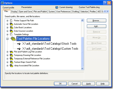
When a user Adds a New Palette, it will
automatically be added to the Path Location at the top of the stack. |
|
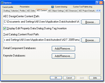
Tool Catalog
Content Root Path - Options dialog box
Under the AEC Content tab of the Options dialog
you will find a path field labeled "Tool Catalog Content Roof Path" with a
Browse... button to help locate other paths.
This path statement affects nearly all of the
default Tools that come with Architectural Desktop. Because most Tools
create Objects that are based on Styles, they have to point to a Source File
to retrieve the Object Style and create an Object on your screen. If
you think about this concept for a second you will realize that this could
amount to a lot of Styles and consequentially a lot of drawing files that
hold those Styles. You don't want this type of data scattered randomly
about so the Path statement illustrated to the right provides the means to
control a portion of all those Tool Paths from a centralized point. In
essence, this Path statement offers users and CAD managers something close
to a "relative path" structure between Tools and the Source Files that they
need in order to function properly.
I call this "close" to a relative path
because the Path you set here is only a portion of the whole Path statement
on each Tool. A default Imperial Door Tool, for example, comes from
the following default Path location: "C:\Documents and Settings\All
Users\Application Data\Autodesk\ADT 2005\enu\Styles\Imperial\Door Styles (Imperial).dwg".
If you compare this Path statement with the default "Tool Catalog Content
Root Path" statement (right) you will quickly see how far it points before
stopping. And guess what, the Tool Path statement simply takes over
from there. Getting back to the Imperial Door Tool example, this means
that the Door Tool reads the "Tool Catalog Content Root Path" statement up
until the last folder and then adds its own part for the final and specific
Path location.
In simple terms, the Path you set for the "Tool
Catalog Content Root Path" statement is a variable in the full Path
statement for all Tools that point to this Path location or folders below it
(sub-folders). The example Door Tool has a Path that looks like this:
<Style ref="%AECCONTENT_DIR%\Styles\Imperial\Door Styles (Imperial).dwg">.
From the end of the "...\enu" Path statement which is saved as the
variable "%AECCONTENT_DIR%", the Door Tool saves the remainder of the
Path: "...\Styles\Imperial\...". As you can see, this forces
you to work within the Styles folder if you plan to tinker with the Path
statement for any or all of the default Style-based Tools. |
As you may already have figured out, you
really have the freedom to create any new Palette with any New Tools that
point to any location you want and you can keep the Palette anywhere you
want as well. This is all ideal for those weird individuals who love
to hide all their private CAD stuff in an office but it's a recipe for
sending a CAD manager to the loony bin. The best structure for CAD
managers is one that allows for contained yet mobile path locations; i.e.,
we'll put it all here but we may need to move it in the future.
Working with information discussed here provides just that bit of structure
to remain sane in the long run.
Note:
The default "Tool Catalog Content Root Path" is: C:\Documents and
Settings\All Users\Application Data\Autodesk\ADT 2005\enu
If you find that you have built custom Palettes
with custom Tools that point to Path Locations outside of the "Tool Catalog
Content Root Path", you can still save your work and restructure as
necessary. The trick is to take the Palette over to the Content
Browser and use the Publish tool as discussed under
Catalog Publishing. |
| Catalog and
Palette Files in XML code If
necessity or general curiosity leads you all of the way to the point where
you are actually reading your .atc files, then what you see to the right is
 what
you can expect to encounter. You can Open any .atc file
with Notepad or equivalent editor but what you will see is XML code which is
so close to HTML code that you can actually rename an .atc file to .htm and
read it in Internet Explorer (not recommended but possible). Even if
you only have the most rudimentary understanding of how web pages are coded,
that will be enough to help you read the code in these Catalog and Palette
files. what
you can expect to encounter. You can Open any .atc file
with Notepad or equivalent editor but what you will see is XML code which is
so close to HTML code that you can actually rename an .atc file to .htm and
read it in Internet Explorer (not recommended but possible). Even if
you only have the most rudimentary understanding of how web pages are coded,
that will be enough to help you read the code in these Catalog and Palette
files.
The most significant thing in these files is
arguably the references to items at the end of some Path. I have
actually resurrected bad Palette files by using Find and Replace to fix Path
statements but you better know what you are doing before trying things like
this.
Below are some things you may
want to know:
<Definition ref="%AECCONTENT_DIR%\Styles\ ARCHidigm
Styles... - statements such as this refer to an Object Style's drawing
file location and ends with the name of the drawing file and the extension
".dwg". This particular example, "Definition ref", is for an MvBlock. |
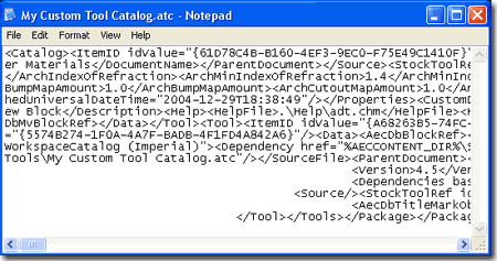
<Style ref="%AECCONTENT_DIR%\Styles\Imperial\...
- this statement is similar to the one above but is for a Style-based Object
like a Door or Wall.
<Image cx="64" cy="64" src=".\Images\Multi-view
Block_796E7... - statements such as this refer to the Tool Image and
have the name of the image file and typically the extension ".png".
The odd numbers come from a process in which the Content Browser
automatically places the image files in the .\Images folder ( a sub-folder
of the .atc file). If you are doing a lot of experimentation it is not
uncommon to see numerous duplicates of the same images but with different
numbers at the end. The Content Browser is not very good at cleaning
up after itself and doesn't remove image files. |
|
2Material
Definition Styles |
2-X APPENDIX |
Material
Definition pull-down menu
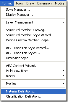
| Menu |
Format> Material
Definitions... |
| Keyboard |
MaterialDefine or Material |
| Links |
Object Style Properties - Materials Overview - for an example of how
to access Material Definitions through the Object's Style Properties
Materials tab. |
When you venture into the world of
Material Definition Styles, one of the first things you need to be clear
about is the difference between a Material Definition Style and a
Rendering Material. Below I will discuss Material Definition
Styles which not only provide the option for placing Rendering Materials on
Objects but options for Hatch Patterns and Linework providing a
"complete" display package for Objects. Rendering
Materials are just a small aspect of Material Definition Styles but
obviously one of the most visible. A Rendering Material is basically,
but not always, a Raster Image (like a digital photograph) tied together
with unique settings that control tiling, texture, opacity and a host of
other properties. These properties are set in VizRender which is a
watered down version of Autodesk's Viz product (which is a light version of
Max) bundled with Architectural Desktop. |
 To
Render Architectural Desktop work the process goes along the following
lines. In VizRender you make a Rendering Material and drag it to the
current drawing file or the Content Browser. From the Content Browser you drag the Material to a
Palette or directly into the current Architectural Desktop drawing file.
In ADT you create a Material Definition Style where, among other things, you
Select the Rendering Material. With a Material Definition Style
available you can now assign it to one or more Objects by working with the
Materials tab of any Object Style Properties dialog. To Render, you
create a link to VizRender where the Render Material is passed back to
produce photorealistic raster images or digital animations. To
Render Architectural Desktop work the process goes along the following
lines. In VizRender you make a Rendering Material and drag it to the
current drawing file or the Content Browser. From the Content Browser you drag the Material to a
Palette or directly into the current Architectural Desktop drawing file.
In ADT you create a Material Definition Style where, among other things, you
Select the Rendering Material. With a Material Definition Style
available you can now assign it to one or more Objects by working with the
Materials tab of any Object Style Properties dialog. To Render, you
create a link to VizRender where the Render Material is passed back to
produce photorealistic raster images or digital animations.
Illustrated above is the
primary way to access the Material Definition Styles but you can also gain
access to them by going to the
Materials tab
under the Object Style Properties dialog for most Objects. |
| Material
Definition pull-down menu
On a local installation of
ADT you should find, within the ADT folder, the following sub-folder
structure ( see image below left ).
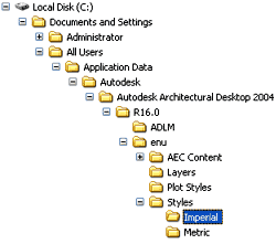 Both
the Imperial and Metric folders contain
similar Styles
folders within which you will find one Material Definitions Style template drawing
file. Both
the Imperial and Metric folders contain
similar Styles
folders within which you will find one Material Definitions Style template drawing
file.
On a Network based installation of ADT, these
Material Definition Styles should be on a captured drive (like "G:\offices standards") or
similar location with a similar folder structure to that illustrated left
(Content >> Imperial >> Styles >> Material Definitions (Imperial).dwg or (Content >> Metric >> Styles >>
Material Definitions
(Metric).dwg. In a very customized office
scenario, these files may not even be present and others may have been
designed for the Styles your office prefers (in this case, see your CAD manager). |
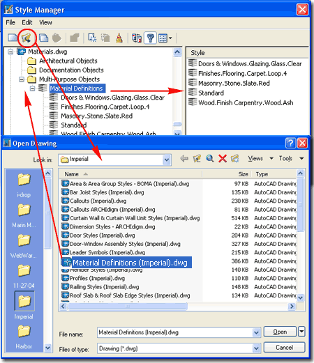
Illustrated above I show how you can access the
default Material Definitions template file that contains approximately 140
Styles. Many of these Material Definition Styles will automatically be
introduced to your project files when you import default Object Styles such
as Doors, Windows, Slabs and so on. You cannot access this list
through the Content Browser but you could create your own Catalog of these
Materials Definition Styles should you wish to. Simply drag all Styles
to a Palette and then Add the Palette to a Browser Catalog. |
|
Adding a
Material Definition Style to an Object
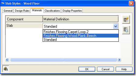
Most of the Objects in ADT offer a Materials
tab under the Style Properties dialog as illustrated to the right for
Slabs. From this tab you can assign any Material Definition Style
available in the current drawing file, create New ones or Modify existing
ones.
 Materials
can be assigned to Objects by the Style as illustrated to the right or
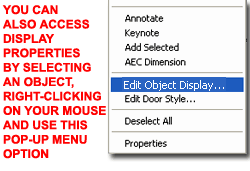
directly to a specific Object as a Style override. Select the
specific object, right click on your mouse to invoke the
context menu and select Edit Object Display... Materials
can be assigned to Objects by the Style as illustrated to the right or
directly to a specific Object as a Style override. Select the
specific object, right click on your mouse to invoke the
context menu and select Edit Object Display...
|
 |
| Confirming use
of Material under Object's Display Properties
 Once
a Material Definition Style has been set under the Materials tab for any
Object's Style Properties you can go to the Style's Display Properties to
control how this Material Definition Style affects the appearance of the
Object for one or more Display Representations. Once
a Material Definition Style has been set under the Materials tab for any
Object's Style Properties you can go to the Style's Display Properties to
control how this Material Definition Style affects the appearance of the
Object for one or more Display Representations.
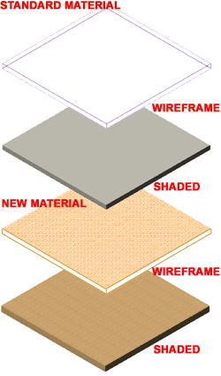
Illustrated to the right and left I show how the
Model Display Representation of a Slab Object Style appears before and after
a Material Definition Style has been Selected and set to control the Display
Components.
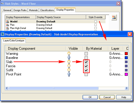
Illustrated to the right I show that in order
for a Material Definition Style to affect an Object's Display Components,
those Components must be set to use the "By Material" control. In
essence, this setting defers local control over to the Material Definition
Style. |
If you get the feeling that this is getting
confusing and perhaps a bit redundant you would not be the only person that
feels this way. We might argue that with Material Definitions there is
no need for unique Object Display Components but at this time the Materials
are not sophisticated enough to handle everything and many Objects have
Components that are unique. How far you want to push the use of
Material Definition Styles is really up to you.
Note:
Notice that no Object Style has a Display Component for Surface Hatch.
This Display Component will be introduced by any Material assignment,
regardless of how you set the "By Material" option and can only be
controlled by working with the Material Definition Style Properties. |
|
3Material
Definition Tools |
2-X APPENDIX |
Material Query
| Menu |
N.A. |
| |
No Button or Tool for this
command. Not listed in Help Menu. |
| Keyboard |
MaterialQuery |
| Links |
Drawing Setup - Units Tab
- for information on how to change the Volume Units. |
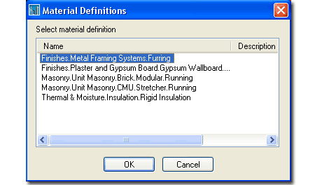
The "MaterialQuery" command can be
used to list all of the Material Definition Styles attached to an
Object which can be rather useful on more complicated Object Styles like
Walls. Of course, you can get the same list simply by looking at the
Materials tab of the Object Style but this option is fairly fast. For
any Material Definition Style Name that you Select in the Material
Definitions dialog, see right, you will get a "Total Volume" report on the
command line (use the F2 key to see a larger text Window).
Command: MaterialQuery
Select Objects: 1 found
Select Objects:
Total volume: 7 CF |
 |
Material List
| Menu |
N.A. |
| |
No Button or Tool for this
command. Not listed in Help Menu. |
| Keyboard |
MaterialQuery |
| Links |
Drawing Setup - Units Tab
- for information on how to change the Volume Units. |
The "MaterialList" command is similar
to the MaterialQuery command discussed above but provides a full list of all
Materials and their Volumes on the command line (use the F2 key to see a
larger text Window). Remember that you can highlight all text in the
Text Window and Copy it for Pasting into other programs. |
Command: MaterialList
Select Objects: 1 found
Select Objects:
Material Name Volume
--------------------------------------------------
Finishes.Plaster and Gypsum Board.Gypsum Wallboard.Painted.White
5 CF
Finishes.Metal Framing Systems.Furring 7 CF
Masonry.Unit Masonry.CMU.Stretcher.Running 61 CF
Thermal & Moisture.Insulation.Rigid Insulation 11 CF
Masonry.Unit Masonry.Brick.Modular.Running 32 CF
Command: |
Surface Hatch
Toggle
| Menu |
N.A. |
 |
 |
| Keyboard |
ToggleSurfaceHatch |
| Links |
|
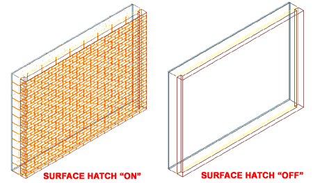
You can Toggle the Display of All Surface
Hatch Patters On or Off by using the "ToggleSurfaceHatch" button on
the Drawing Window Status Bar or by typing this command.
Note:
You can also use the "Fill" command to toggle all fills and Hatch
Pattern. |
 |
Surface Hatch Override - Add
| Menu |
N.A. |
| |
No Button or Tool for this
command. |
| Keyboard |
SurfaceHatchOverrideAdd |
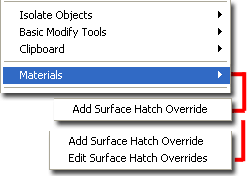
| Mouse |
Select
Object, right-click, Select Materials> and cascade over to Add Surface
Hatch Override |
| Links |
|
 Working
with the Surface Hatch Override tool provides options for modifying the
Rotation and Base Point of any Surface Hatching on any Face of any Object.
This is typically a desirable option when working with Materials such as
Bricks, Tiles and similar patterns that you want to start in a very specific
location which cannot be solved by the
X and Y
Offset value option under the Material Style.. This is very
similar to the new "HatchSetOrigin" option for regular AutoCAD based Hatch
Patterns. You can Add
multiple Surface Hatch Overrides to any
single Object (for different Faces) and you can even Add multiple Surface
Hatch Overrides to the same Surface ( be very careful about this because
there is no way to see that you have multiple overrides on a single
Surface). Working
with the Surface Hatch Override tool provides options for modifying the
Rotation and Base Point of any Surface Hatching on any Face of any Object.
This is typically a desirable option when working with Materials such as
Bricks, Tiles and similar patterns that you want to start in a very specific
location which cannot be solved by the
X and Y
Offset value option under the Material Style.. This is very
similar to the new "HatchSetOrigin" option for regular AutoCAD based Hatch
Patterns. You can Add
multiple Surface Hatch Overrides to any
single Object (for different Faces) and you can even Add multiple Surface
Hatch Overrides to the same Surface ( be very careful about this because
there is no way to see that you have multiple overrides on a single
Surface).
Faces - this drop-down list always
offers two options but they will vary according to the orientation of the
Face you Selected. If you Select a Back Face, for example, the two
options will be "All back faces" and "Only selected back face". For
Objects with more than six faces, such as those created from polygonal
Profiles, you may have more than one Back Face and the "All..." option
provides a means to affect these multiples at one time. The only
problem I have with this is that what my eye perceives as similarly oriented
faces is not necessarily how ADT interprets face orientation; i.e., just
because they all face one way does not make them Back Faces.
Hide Surface Hatching - this checkbox
provides a simple way to remove the Hatch on a Selected Face. This
setting affects 2D Section/Elevation results as well. |
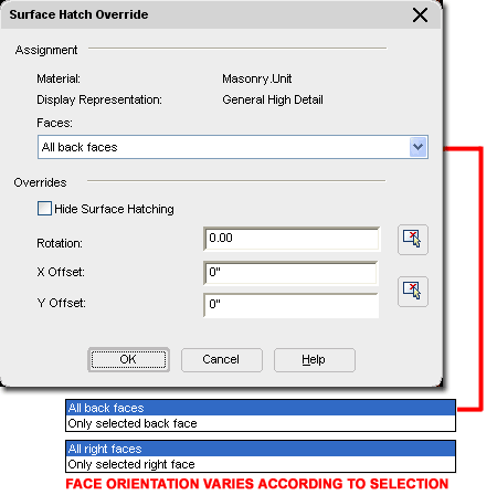
Rotation - use this numeric field or
pick-points button to specify a unique angle for the Surface Hatch as it
applies to the Selected Face. Do not confuse this option with the
Angle
setting for Surface Hatch on the Hatching Tab of the Material Definition
Style Properties dialog. Though both produce similar results, this
Rotation option is actually an override whereas the Angle option affects the
Material for all cases. This setting affects 2D Section/Elevation
results as well.
X and Y Offset -
use these two numeric fields to reposition the base or seed point of the
Surface Hatch Pattern on the Selected Face. This is how, for example,
you can move a Brick, CMU or other Tile Pattern Up and/or Over along a
Surface. This setting affects 2D Section/Elevation results as well. |
Surface Hatch
Override - Edit
| Menu |
N.A. |
| |
No Button or Tool for this
command. Not listed in Help Menu. |
| Keyboard |
SurfaceHatchOverrideEditInPlace |
| Mouse |
Select
Object, right-click, Select Materials> and cascade over to Edit Surface
Hatch Override |
| Links |
|
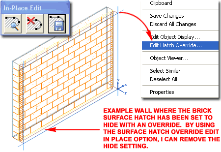
The Edit in Place option for Surface Hatch
Overrides is only available for Surfaces that have Overrides on them - see
discussion above.
If you work with the Context menu, you will
find that the Materials> cascading menu will offer a new option, "Edit
Surface Hatch Overrides", when you have Selected a Surface that already
has one or more Overrides.
Illustrated to the right I show an example of
how the Brick Surface Hatch Pattern was set to "Hide
Surface Hatching" as part of an Override set earlier. Now that I
want to change the Override, I have to use the "SurfaceHatchOverrideEditInPlace"
command to get back to the Surface Hatch Override dialog. When
you are in the "Edit-in-Place" mode, Select the blue rectangular or
polygonal shape representing the outline of the current Surface, right-click
and Select "Edit Hatch Override..." on the Context menu as
illustrated to the right. This action will activate the same Edit
Hatch Override dialog used to set the Override in the first place. |
Note 1:
Because you can accidentally Add Multiple Surface Hatch Overrides to a
single Surface, you may find it impossible to get down into "nested"
Overrides. I have yet to find any way to clear all Surface Hatch
Overrides.
Note 2:
Though you enter an "In Place Edit" mode when Editing an existing
Surface Hatch Override, I found no advantage to this option other than the
ability to access the "Edit Hatch Override" menu option. Though you
can alter the blue Surface Hatch Outline such changes do not affect the
Hatch nor are the changes saved in any way. Perhaps new features are
planned for a future release. |
Material
Boundary
| Keyboard |
2dSectionResultAddHatchBoundary |
| Mouse |
Select 2D
Elevation or Section Object, Right-click and select Material
Boundary > Add from the object specific pop-up menu. |
| Links |
Part 14 - Elevations - for the full
story on how to generate 2D Elevations. |
| |
Material Boundary -
for more information and examples on this subject. |
| |
|
 Material
Definition Styles are typically observed in Plan and Model Views where Plan
or Model Display Representations control what and how Materials are used.
For some Objects, such as Doors and Windows, there is a unique Display
Representation just for Elevations typically utilized by the auto-generating
Elevation and Section tools. For Objects that do not have unique
Elevation Display Representations, the Model Display Representation is often
used for 2D Sections and Elevations. Part 14 - Elevations and
Part 15
- Sections are dedicated to the subject of creating these 2D Objects and
illustrated to the right I show how you can use another Material Tool to
work with these them. For more information be sure to visit either of
these parts. Material
Definition Styles are typically observed in Plan and Model Views where Plan
or Model Display Representations control what and how Materials are used.
For some Objects, such as Doors and Windows, there is a unique Display
Representation just for Elevations typically utilized by the auto-generating
Elevation and Section tools. For Objects that do not have unique
Elevation Display Representations, the Model Display Representation is often
used for 2D Sections and Elevations. Part 14 - Elevations and
Part 15
- Sections are dedicated to the subject of creating these 2D Objects and
illustrated to the right I show how you can use another Material Tool to
work with these them. For more information be sure to visit either of
these parts.
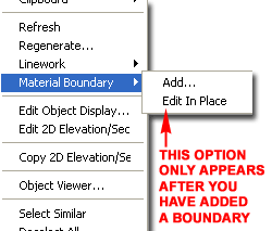
The Material Boundary tool can be used on 2D
Sections and Elevations, as illustrated to the right, to "Erase" or "Limit"
the amount of material or Hatching displayed. Because 2D Sections and
Elevations are linked to the source model and act as single Objects ( like
Blocks ), you will find options on the 2D Section/Elevation Material
Boundary dialog box for isolating specific Material Definitions.
|
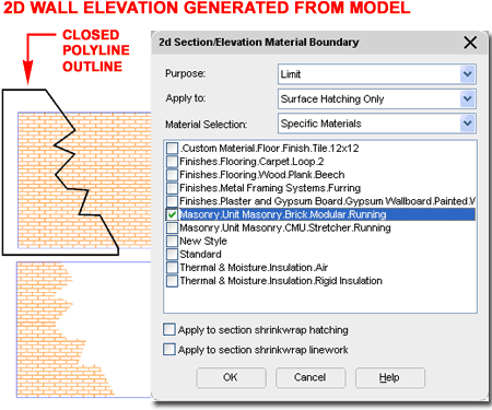
To employ this tool, you will need to draw a
Closed Polyline object that will either Limit the Hatch or Erase it.
This Polygon must be drawn over the 2D Section or Elevation as illustrated
above. Select the 2D Section or Elevations, right-click, Select "Material
Boundary" from the Context menu and cascade to the Add... option.
When queried to "Erase Selected Linework? [Yes/No]", respond with a "Yes"
since the Polyline can be accessed later via the "Edit In Place" option.
The final set of options will be made on the 2D Section/Elevation Material
Boundary dialog.
To remove a Material Boundary,
use the "Edit In Place" Context menu option and simply Delete the Polygon. |
Creating a New
Material Definition - General Tab
| Menu |
Format> Material
Definitions... |
| Keyboard |
MaterialDefine |
| Links |
Style Manager Overview -
for information on this topic and how to purge unwanted Styles. |
| |
Render Materials - Purging -
for information on how to remove render materials as opposed to material
definition styles. |
Creating and Modifying Material Definition
Styles is actually fairly easy. Because they have been designed as
Object Styles (a huge mistake in my opinion), you can apply much of the same
logic to these "Objects" as you would with the Style Properties of most
other Objects.
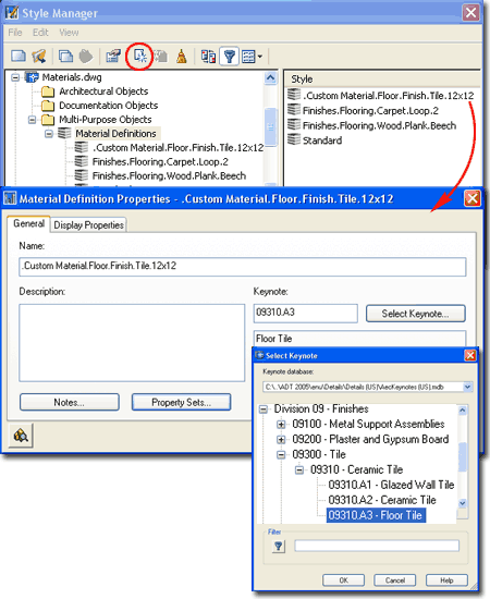
Illustrated to the right I show the process
of creating a new Material Definition Style that I have named ".Custom
Material. Floor.Finish. Tile.12x12" (the use of periods is simply a
grammatical format by Autodesk and you don't have to adopt it).
Material Definition Styles, like Object
Styles, can have Notes, Property
Sets and Keynotes. This provides the means for assigning data to
individual components within a single Object Style, like Walls. |
 |
| Creating a New
Material Definition - Display Properties Tab
On the Display Properties tab for the
example Material Definition Style discussed above, I show in the
illustration to the right that I have set Style Overrides on every
single Display Representation. This is a necessary step for every
Material Definition Style because that is the only way to make them
different from each other. Unlike Object Styles that may share a
common set of Display Representations but vary based on Dimensional
Properties, Material Definition Styles only have Display Representations as
a means of providing variation.
The Display Representations with a graphic
black arrow in the upper left corner are simply copies of the "General"
Display Representation. Those listed to the right come with the
default Materials Definition Styles in ADT but you can also create your own
using the
Style Manager.
Note:
One of the biggest problems you will encounter with the Display
Representations of Material Definition Styles is the time spent laboring |
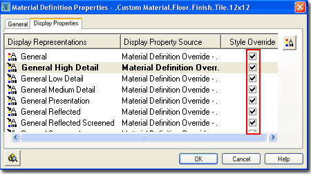
through every single individual Display
Representation Override when creating new ones or modifying existing ones.
There are no tools to expedite this work but you can save some time by
creating a template; i.e., create one Material Definition Style that will
serve as a master copy for all others that you plan to create. |
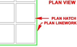
| Material
Definition Display Properties - Layer/Color/Linetype Tab
 Plan Linework - this display component
was designed to control the Object Component's linework appearance in a Plan
View Display Representation but may not always be visible due to numerous
other display options that can overlap this linework; namely "Shrinkwrap".
You should, for example, find that this display component works rather well
for Components within Walls. Plan Linework - this display component
was designed to control the Object Component's linework appearance in a Plan
View Display Representation but may not always be visible due to numerous
other display options that can overlap this linework; namely "Shrinkwrap".
You should, for example, find that this display component works rather well
for Components within Walls.
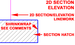 2D Section/Elevation Linework - this
display component was designed to control the Object Component's linework
appearance in Sections and Elevations created using the auto-generating
tools. 2D Sections and Elevations have their own Style Properties that
may override this component but you can use the "Exclude from 2D Section
Shrinkwrap" Rule found under the "Other" tab to prevent this override. 2D Section/Elevation Linework - this
display component was designed to control the Object Component's linework
appearance in Sections and Elevations created using the auto-generating
tools. 2D Sections and Elevations have their own Style Properties that
may override this component but you can use the "Exclude from 2D Section
Shrinkwrap" Rule found under the "Other" tab to prevent this override.
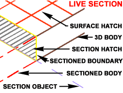 3D Body - this display component was
designed to control the Object Component's appearance in any view that
utilizes the Model Display Representation; such as Isometric and Perspective
Views. This component will affect the wireframe linework but may also
control the Shade Mode Colors depending on the Rendering Material settings
found under the "Other" tab and your current Render Settings found on System
tab of the Options dialog. When working with Slabs you may find that
this component overrides the Plan Linekwork component and that has to do
with how Slabs are actually a derivative of Roof Slabs which were designed
for Sloping ( for Floor Slabs, you can override the default Cut Plane for
better results ). 3D Body - this display component was
designed to control the Object Component's appearance in any view that
utilizes the Model Display Representation; such as Isometric and Perspective
Views. This component will affect the wireframe linework but may also
control the Shade Mode Colors depending on the Rendering Material settings
found under the "Other" tab and your current Render Settings found on System
tab of the Options dialog. When working with Slabs you may find that
this component overrides the Plan Linekwork component and that has to do
with how Slabs are actually a derivative of Roof Slabs which were designed
for Sloping ( for Floor Slabs, you can override the default Cut Plane for
better results ).
Plan Hatch -
this display
component was designed to control the Object Component's Hatch Pattern
appearance in a Plan View Display Representation. Generally this
component works rather well as long as the Hatch Display Component of the
Object Style's Display Properties have been set to "By Material". In
some cases, depending on the Cut Plane, you may find that you see the
Section Hatch instead; e.g., Slabs.
|
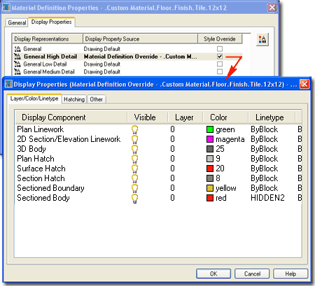
Surface Hatch -
this display component was designed to control
the Object Component's Hatch Pattern appearance in Views that display
Surfaces; such as Model. You should find that this component is great
for managing Hatch Patterns on Objects in 2D Sections and Elevations.
Section
Hatch - this display component
was designed to control the Object Component's Hatch Pattern appearance when
cut with a Section tool. When using Live Sections you are likely to
see this component more clearly than in 2D Sections where the 2D Section
Style may overlap this pattern with its own ( Solid Hatch by default ).
Sectioned Boundary -
this display component was designed to control
the Object Component's outline when cut with a Section tool. I have
yet to find any evidence that this option works on 2D Sections but it is
quite evident on Live Sections. You may have seen it in action as the
default red outline used by most of the Materials that come with ADT.
Sectioned Body -
this display component was designed to control
the Object Component's hidden 3D Body appearance when cut with a Section
tool. As with the Sectioned Boundary, I have only observed this option
in Live Sections where you have to use the "AecToggleSectionedBody" command
toggle in order to see this component. |
|
Material
Definition Display Properties - Hatching Tab
On the Hatching tab of the Material Definition
Display Properties dialog you can set the Hatch Patterns for the three
Display Components under the Layer/Color/Linetype tab.
In order for any of these Hatch Patterns to
display properly be sure to confirm that the Object's Style Properties
defers the Hatch Display Component to "By Material". For Slabs and
Roof Slabs Plan Hatch will not display properly unless the Cut Plane
Height is set to cut through the Object.
For Surface Hatch, be sure to confirm
Placement under the "Other" tab as discussed below.
Under 2D Section/Elevation Style
Properties, you will find that there is a Display Component for
Shrinkwrap Hatch which, if On, can overlap the Section Hatch (
see example under 2D Section/Elevation Rules below). |
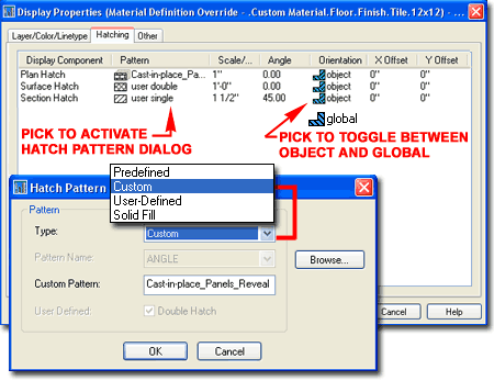 |
|
Material
Definition Display Properties - Other Tab
SURFACE HATCH PLACEMENT
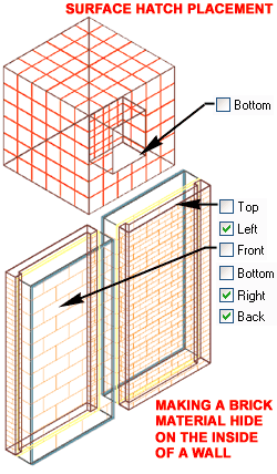 These six checkboxes for Top, Left, Front, Bottom,
Right and Back can be
used to control how many sides of your Object(s) display the current Surface
Hatch Pattern ( if used). You can also use these checkboxes to control
the sides on which you wish to display the "Surface Rendering Material" (See
comments below). To me, assuming I wish to use the Surface Hatch
Display Component, these boxes offer the option to increase system
performance and reduce undesirable clutter when viewing my model files in 3D
Views. For most Material Definition Styles you should feel safe to
uncheck the "Bottom" option because it will become the Top when the Object(s)
is Viewed from underneath. Illustrated to the right I show that I have
also unchecked the "Back" option and this is something you will need to
experiment with because ADT has a rather odd way of interpreting back sides.
Should an Object have a niche in it, for example, the Front surface of that
niche is considered part of the Back side of the Object but there are times
when this really helps to make Sections and Elevations read better by not
using too much Hatch Linework. These six checkboxes for Top, Left, Front, Bottom,
Right and Back can be
used to control how many sides of your Object(s) display the current Surface
Hatch Pattern ( if used). You can also use these checkboxes to control
the sides on which you wish to display the "Surface Rendering Material" (See
comments below). To me, assuming I wish to use the Surface Hatch
Display Component, these boxes offer the option to increase system
performance and reduce undesirable clutter when viewing my model files in 3D
Views. For most Material Definition Styles you should feel safe to
uncheck the "Bottom" option because it will become the Top when the Object(s)
is Viewed from underneath. Illustrated to the right I show that I have
also unchecked the "Back" option and this is something you will need to
experiment with because ADT has a rather odd way of interpreting back sides.
Should an Object have a niche in it, for example, the Front surface of that
niche is considered part of the Back side of the Object but there are times
when this really helps to make Sections and Elevations read better by not
using too much Hatch Linework.
SURFACE RENDERING
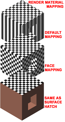 Render Material - use this drop-down list or the Browse... button to Select
any render material available in the current drawing. Render Materials
produce a photorealistic effect of actual materials such as Wood, Metal and
Stone by using a raster image that has been configured for use in ADT
through the tools found in VizRender. Render Material - use this drop-down list or the Browse... button to Select
any render material available in the current drawing. Render Materials
produce a photorealistic effect of actual materials such as Wood, Metal and
Stone by using a raster image that has been configured for use in ADT
through the tools found in VizRender.
Mapping - use this drop-down list to
Select one of three options for controlling how the Render Material is
applied (mapped) to the surface of Objects. Default Mapping typically
maps to the top surface and "bleeds" down the sides to create a look that is
usually undesirable. Face Mapping maps to each face of the Object
reproducing the same surface material ( or image) for all sides. This
is usually the best default option. Same as Surface Hatch maps the
Rendering Material according to the checkboxes set under the Surface Hatch
Placement section. This is a rather useful option when you only want
the material to display on one surface like on Spaces, Slabs and Roofs, for
example. |
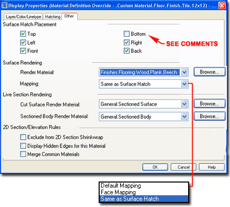
LIVE SECTION RENDERING
 Cut Surface Render Material - use this drop-down list or Browse...
button to Select any Render Material available in the current drawing.
Most Objects in ADT include the "General.Sectioned Surface" but you can
actually use any Render Material you wish. You will see this material
across the surface of an Object where it has been cut by the Section Tool
for Live Sections. In cases where the Object would show a material
when cut, like metals or concrete, you could use the same material as that
Selected for Render Material. You can also use VizRender to create
different colors rather than use this default gray color for all Objects. Cut Surface Render Material - use this drop-down list or Browse...
button to Select any Render Material available in the current drawing.
Most Objects in ADT include the "General.Sectioned Surface" but you can
actually use any Render Material you wish. You will see this material
across the surface of an Object where it has been cut by the Section Tool
for Live Sections. In cases where the Object would show a material
when cut, like metals or concrete, you could use the same material as that
Selected for Render Material. You can also use VizRender to create
different colors rather than use this default gray color for all Objects.
Sectioned Body Render
Material - use this drop-down list or Browse... button to Select any
Render Material available in the current drawing. Most Objects in ADT
include the "General.Sectioned Body" but you can actually use any Render
Material you wish. You will only see this material under unique
circumstances for Live Sections where the "AecToggleSectionedBody" has been
used to display Body forms for Objects cut by the Section Tool. The
default material looks much like a blue glass which works fairly well
because of the transparency. Since all of the default Material
Definition Styles use this Render Material, all objects appear the same but
you could create a variety of transparent colors in VizRender to enhance
this feature.
|
| 2D Section/Elevation Rules
Exclude from 2D Section Shrinkwrap - check this box to override the
Outer and Inner Shrinkwrap Display Component
of the 2D Section/Elevation Style. The purpose of this option
is to provide a means for the Material to control the appearance of the
outline (Shrinkwrap) of sectioned bodies; different Objects with different
Materials could thus have different lineweights. In the illustration
to the right I show how activating this option defers the Outer Shrinkwrap
Display Component of the 2D Section/Elevation Style to the "2D
Section/Elevation Linework" Display Component of the Material Definition
Style ( from ByBlock (Blue) to Magenta). Notice in my example that
Linework in all Subdivisions beyond the sectioned cut are also Magenta and
that is because the Material Definition Style only has one Display Component
for 2D Section/Elevation Linework. In principal this option has its
merits but in the bigger picture of practical use I don't find it very
feasible to think about how every material affects sections.
Display Hidden Edges for this
Material - check this box to capture body edges that are hidden in the
2D Section or Elevation View. By capturing these edges, you can
control their display with the "Hidden" Display Component under 2D
Section/Elevation Style as illustrated to the right ( see dashed black
line). If the Hidden Display Component is turned Off, you will not see
these edges.
Merge Common Materials -
check this box to remove linework created by bodies that share the same
Material and are perfectly planar. In the illustration to the right I
show that I have stacked two cubes (Mass Elements) and by using this "Merge"
option, the edge between them has been removed. This option can be
extremely valuable when cutting Sections and Elevations of stacked floors. |
 |
|
4Render Materials |
2-X APPENDIX |
| |
|
Render
Materials - Adding
| Menu |
Window> Content Browser |
|
|
| Keyboard |
ContentBrowser [Ctrl+4] |
| Browser |
Load from
Render Material Catalog |
| Links |
|
On the Content Browser in
Architectural Desktop, you will find a Catalog named "Render Material
Catalog" which contains a fairly extensive list of Render Materials
ranging from Wood types to Foliage.
You can create your own Render Materials by
using VIZ Render (type VizRender or use the Desktop icon).
Illustrated to the right I show the basic steps required to create, catalog
and use a custom Render Material.
In Viz Render activate the Materials
Palette and set "Scratch" as the active tab. At the
top of the "Scratch" tab you should find a Tool to create a New
Material. Once you have created a New Material, locate the Material in
the current list, right-click over it and Select Properties
from the Context menu to activate the Material Editor. Use the
Material Editor to type in a Name for your new Render Material,
use the Template drop-down list to specify the type of Render
Material you want and use the remaining Properties to define its
characteristics. Once done, you can drag the new Render Material from
the Materials Palette over to any Catalog in the Content Browser or you can
drag the Render Material directly into the current Architectural Drawing
File.
Render Materials residing in a Catalog can be
dragged directly into the current drawing file just as you can with any
Object Style. Once the Render Material has been defined in the current
drawing file, you should find that it will now be available on the
"Other"
tab of any Material Definition Style's Properties dialog. |
 |
Render
Materials - Purging
| Menu |
N.A.
- The AutoCAD View pull-down menu does provide access to Render> but not
the ADT View pull-down menu. |
 |
 |
| Keyboard |
MatLib |
| Links |
|
During the course of a project it is rather
easy to accumulate undesirable data and Render Materials are no exception.
Purging Material Definition Styles does not remove Render Materials.
Illustrated to the right I show the only tool
I have found that you can use to Purge Render Materials. Though
Architectural Desktop's Render Materials are more sophisticated than
AutoCAD's native Rendering Materials, you will find that they are referenced
and used by the old AutoCAD Rendering Tools such as the Materials Library
illustrated to the right. By typing "MatLib" you can activate this
dialog and safely use the Purge button to remove all unused Rendering
Materials. Be sure to avoid using the Delete button as that will
actually remove Render Materials even if they are referenced by an active
Material Definition Style. |
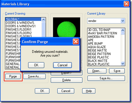 |
|
5Options
Dialog - Display Related Settings |
3-X APPENDIX |
| |
|
| Options
- Display tab On the Display tab
of the Options dialogue box, illustrated to the right, there are several
Display related options and settings that you can use to improve the performance or
appearance of your 3D Modeling and Rendering work. Unfortunately, the performance
aspect is usually inversely proportional to the appearance aspect so that a great looking
Shaded Sphere, for example, also takes longer to turn while in 3D Orbit. The default
settings, in my opinion, are unacceptable though so you should make some minor
adjustments as outlined below.
Display Resolution - See also Dynamic Tessellation setting.
Arc and circle smoothness - ( VIEWRES ) - this variable not only affects
Arcs, Circles and Polyline arcs but the Solids created from them. This variable
applies to Rendering as well. This variable does not affect AEC objects or AEC
objects created from arcs or circles - see AecFacetDev for AEC object facet control.
Segments in a polyline curve - (
SPLINESEGS ) - this variable affects Polylines only. It is best observed when using
Pedit on Plines and using the Spline option to curve a jagged set of Plines. The
range of values can be between -32767 and 32767.
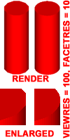 Rendered
object smoothness - ( FACETRES ) - this variable affects Solid objects only and
works in conjunction with the Viewres variable ( Facetres X Viewres ) to create the
smoothness of curved surfaces on Solids. Though the User Guide claims that this
affects the various Shademodes, I have not found that to be the case. However, it
does affect Renderings and Exporting of Solids to other programs. The default value
is 0.5 with a range between 0.01 and 10.0. Higher numbers increase smoothness. Rendered
object smoothness - ( FACETRES ) - this variable affects Solid objects only and
works in conjunction with the Viewres variable ( Facetres X Viewres ) to create the
smoothness of curved surfaces on Solids. Though the User Guide claims that this
affects the various Shademodes, I have not found that to be the case. However, it
does affect Renderings and Exporting of Solids to other programs. The default value
is 0.5 with a range between 0.01 and 10.0. Higher numbers increase smoothness.
Contour lines per surface - (
ISOLINES ) - this variable affects Solid objects only. The number of isolines helps in
visualizing curvature in Wireframe Mode but does not apply to Rendering ( despite what the
on-line help suggests ).
Display Performance
Pan and zoom with raster image - ( RTDISPLAY )
- this variable does not affect the Rendering aspect of this guide but does affect how
working with Referenced Images, such as Renderings,
are seen when Panning or Zooming in AutoCAD and Architectural Desktop. If you use
the wheel on your mouse for Panning or Zooming, this variable does not apply. On
very large images it helps to have this variable unchecked but then you have to wait
anyway.
Highlight
raster image frame only - ( IMAGEHLT ) - this variable is an interesting
option that allows you to see the whole raster image area with a cross hatch pattern
instead of just the frame. Make sure HIGHLIGHT is set on ( 1 ) for this to work.
The problem with this option is that it makes it impossible to relate content on
the image with any content on the screen so this is not an option I find particularly
useful.
True color raster images and rendering - (
VIEWRES ) - this variable is very important when Rendering images directly on the screen.
True Color is 32bit and as long as your system is configured to
display such a high level of color, you can see it on your screen and better judge the
quality before committing to a super high quality File output. This variable affects
Referenced Images as well and does degrade system
performance.
Apply solid fill - ( FILLMODE
) - this variable controls solid fills of Polylines with Width, Trace lines, objects
created with the Solid command , old .shx Fonts that have fills and all Hatch patterns.
When turned off, no fills or hatch patterns will show. This variable does not
affect Rendering but does affect general display performance and is particularly useful on
drawings with an enormous amount of hatch patterns. |
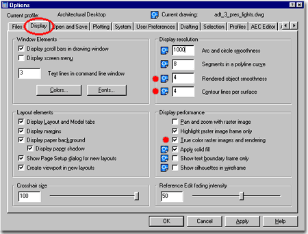 Show
text boundary frame only - ( QTEXTMODE ) - this variable turns all text objects
into rectangular outlines. It does improve general performance a lot, but the
rectangles do not represent the true outline of the text and can thus be a bit misleading
about the position, height and width of text.
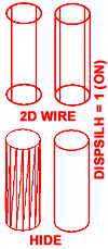 Show
silhouettes in wireframe - ( DISPSILH ) - this variable only affects Solid
objects by controlling the wires along the outer edge in 2D Wireframe Shademode and the
faceted appearance when the HIDE command has been executed ( not Hide in Shademode ). Show
silhouettes in wireframe - ( DISPSILH ) - this variable only affects Solid
objects by controlling the wires along the outer edge in 2D Wireframe Shademode and the
faceted appearance when the HIDE command has been executed ( not Hide in Shademode ).
Other Display Variables that are not
listed here: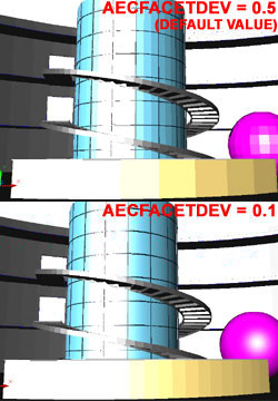
AecFacetDev
- ( FACETDEV ) - this variable is for
Architectural Desktop objects only and has a huge impact on the appearance of curved AEC
objects, from curved Curtain Walls to curved Roof fascias. The value is for the length of
a chord along any curve so the shorter the distance ( smaller number ), the smoother the
curve. The range is between zero and infinity and the default value is 0.5.
You may find that you will need to use a value of 2 - 0.1 depending on what and how close
you are Rendering. In some cases when converting AEC objects from Polylines, you may
need to set this variable prior to the conversion; this is particularly true with Roof
Slabs.
Surftab1 - this is not a
Display control but a tabulation setting for the creation of Surface objects in AutoCAD
and Architectural Desktop. I have added them to this list for reference purposes in
case you are also using Surfaces. The problem with these tabulation settings is that
they cannot be set after the creation of a Surface but must be set prior to creating
it.
Surftab2 - see comments on
Surftab1. This tabulation setting works for Surface objects that take two
directions for tessellation; surfaces like EdgeSurf. |
| Options
- System tab On the System tab
of the Options dialogue box, illustrated to the right, you can use the Current
3D Graphics Display drop-down list to select other drivers or use the Properties...
button to add one or make changes to the current driver configuration.
The options you have depend greatly upon the configuration
of the computer system you have and the type of video card that is installed. Though
Autodesk claims that the AutoCAD kernel supports multi-threaded applications, the evidence
as to the benefits appears negligible. I think it safe to say that the return on
investment for multiple processors is far greater with products like 3D Studio Max and the
new Autodesk Viz than with AutoCAD and its Flavors. Rendering in AutoCAD and
Architectural Desktop is slow and will remain slow until a new Rendering engine is added.
I have found that it is actually faster to run Architectural Desktop side-by-side
with Viz.
The Properties... button does provide
access to some really cool options however so you should definitely take advantage of what
there is to offer - see comments below. |
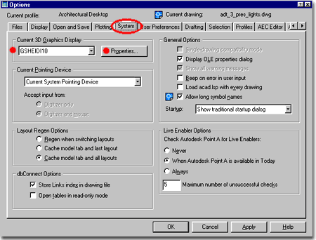 |
| Options
- System tab - 3D Graphics System Configuration
The 3D Graphics System Configuration dialogue box, illustrated
to the right is accessed through the
Properties... button on the System tab of the Options
dialogue box ( discussed above ). On this dialogue box you can make some
significant performance changes to the display of your 3D Modeling work; including
activating Lights and Materials in Shaded Modes.
Adaptive degradation - check this box to allow for degradation options.
When you activate Adaptive degradation, you also make the various degradation
options available. If you need to toggle this option on and off for different
projects, using the Adaptive degradation checkbox will remember any settings you have made
for the various options. Unchecking all options is equivalent to unchecking the
Adaptive degradation checkbox. Setting Flat shaded, Wireframe
and/or Bounding box checkboxes defines the type of degradation to utilize
when performing such tasks as 3D Orbiting. By checking one or more options the
degradation can jump to lower levels of display if determined necessary to meet the
required speed set by the Maintain speed value.
Maintain speed in FPS ( Frames per Second )
- this value sets the point at which degradation will occur. If, for example, a
model has all render options on and is being rotated in the 3D Orbit tool but cannot
maintain a speed of 5 frames per second while displaying full render options ( textures,
etc., ), the jump will be made to Flat shaded or any other option set.
Note about degradation: this is a
really useful option if you are pushing your system to its limits. If you like
working with Render options on and find that the model hick-ups a lot and moves too slow
when you are changing display angles, views and so forth, use the degradation
options. Start with Flat shaded before using Wireframe. For most of my work I
usually use the Wireframe option as illustrated to the right. If degradation kicks
in too early, set the Frame per second value higher.
Dynamic Tessellation - use these options to control smoothness of 2D and
3D objects viewed in the various Shademodes . Though it may be difficult to detect
much difference
 between having
Dynamic tessellation on or off, you can definitely see the difference if you set the
Surface and Curve tessellations to their lowest values ( see images left ) and then Zoom
in and out a couple of times. The main function of Dynamic tessellation is to adjust
smoothness when changing proximity ( like Zooming ) to objects; hence the term
"dynamic". Static tessellation, the default when dynamic is off, never
changes smoothness or the number of tessellations and can thus prove to be faster when
working with tools like the 3D Orbit tool. between having
Dynamic tessellation on or off, you can definitely see the difference if you set the
Surface and Curve tessellations to their lowest values ( see images left ) and then Zoom
in and out a couple of times. The main function of Dynamic tessellation is to adjust
smoothness when changing proximity ( like Zooming ) to objects; hence the term
"dynamic". Static tessellation, the default when dynamic is off, never
changes smoothness or the number of tessellations and can thus prove to be faster when
working with tools like the 3D Orbit tool.
Surface tessellation - the higher the
setting ( right ) the smoother the surfaces and the more draw upon your system's display
resources. Setting this option low is less likely to be noticeable than setting the
Curve tessellation value low because surfaces tend to be flat anyway.
Curve tessellation - see comments for
surface tessellation. Setting this option low is likely to be very noticeable - see
illustration left.
Number of tessellations to cache - a range
field that can be set between 1and 10. Though this sounds like a control for number
of lines or triangles, it is really more about the cache setting and typically becomes
observable with multiple shaded viewports. Use a higher cache value for more
viewports.
Note about Dynamic tessellation: though I
have no statistical evidence and every machine varies, I tend to find that dynamic
tessellation with mid-high settings runs very well and perhaps better than static.
Though this defies logic, I suspect that the caching has something to do with a perceived
performance improvement. Run your own tests and see how your system behaves. These
settings do no not affect Rendering.
Render Options
Enable Lights - checking this option allows the actual Rendering Lights to show
on surfaces in the various Shademodes.
Enable materials - checking
this option allows Material Colors to show on surfaces in the various Shademodes and
enables further options for Materials.
Enable textures - checking this option allows bitmaps in Materials to
show on surfaces in the various Shademodes. I have experienced various forms of
success with textures not displaying and am currently uncertain what causes problems but
it may be among the following: Bitmap complexity, Shademode limitations, system resource
and display ram resources running low or a combination of all these possibilities.
When it works, it's quite awesome. You may also notice odd results when in
Perspective Views and this is a normal phenomena; Axonometric Views tend to work
best. |
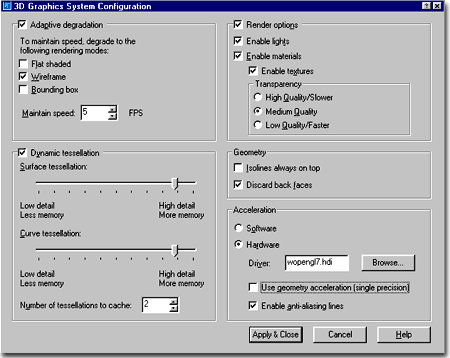
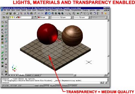
Transparency
High, Medium and Low Quality - checking any of these three
options allows for transparency to show on surfaces with Materials that have
Transparency Values
greater than zero. Though each setting affects performance, particularly in 3D
Orbit, they also display transparency in different ways. You may wish to use the Low
Quality option simply because of how the pixelized version of transparency appears ( it's
a nice look sometimes ). In the illustration above, I used the Medium Quality
setting for the Transparency because the Low Quality used too few pixels to be clear and
the High Quality was too clear to be seen. The settings on the Materials affect how
these options appear as well so you may have to work with both to get an optimum
appearance ( or lack there of ).
Geometry
 Isolines
always on top - checking this box will display all isolines on 3D objects in
the two shademodes that have edges on - see illustration to the left. Isolines
always on top - checking this box will display all isolines on 3D objects in
the two shademodes that have edges on - see illustration to the left.
Discard back faces - checking
this box will improve display performance by not calculating for hidden geometry behind
visible geometry. Having this option on is best and usually is not a problem in
Shaded views. This term and concept is also part of Rendering where it has to do
with face normals and what is perceived as back and front - see Discard Back Faces as a Rendering
option.
Acceleration - this option is only of value to those who have advanced graphics
cards specifically designed to provide display benefits for CAD software.
Software - this option is the default and uses Autodesk's display drivers for 3D
graphics display.
Hardware - use this checkbox
to deactivate the default software driver and to select a new hardware driver.
Driver - use the Browse... button
to select the supplied "wopengl7.hdi" driver from Autodesk or
one by the manufacturer of your 3D Graphics Card.
Use geometry acceleration (
single precision ) - this option only works if your graphics card supports this
option.
Enable anti-alias lines - this
option creates smoother geometry but adds more demand on the hardware.
Note about Acceleration: choosing
a hardware acceleration driver can be a very tricky business if you don't know what you
are doing. Chances are that you will actually experience a performance degradation.
When and if you experiment, make sure to test without the "Use geometry
acceleration" and "Enable anti-alias lines" options to confirm any
performance enhancement. Also, make sure to read up on your Graphics Card and read
the documentation on this subject in your AutoCAD or Architectural Desktop manual. |
| 6Downloads |
4-X APPENDIX |
| Files and Exercises used in this eGuide
|
| |
|
|
7Links to other Sources |
5-X APPENDIX |
| 3D Content and more Illustrated to the right are a few places to visit on-line for more
content to be used in your Renderings. Feel free to recommend your favorite sources
and I will be happy to add them to this list.
|
|
 Architectural
Desktop 4 & 5 - Development Guide
Architectural
Desktop 4 & 5 - Development Guide