| 1Documentation - Access |
1-17 DOCUMENTATION |
Documentation toolbar
How do I get this toolbar?
Though I show the Documentation toolbar, to the right, that I migrated over
from ADT 3.3, many of the symbols have been removed from the DesignCenter
leaving the buttons without any place to point. I am currently trying
to figure out if I can make the buttons activate the Tool Palettes but have
yet to make progress on this desire. It appears that we will
eventually be forced to use the Tool Palettes for all Documentation Symbols. |
 |
 |
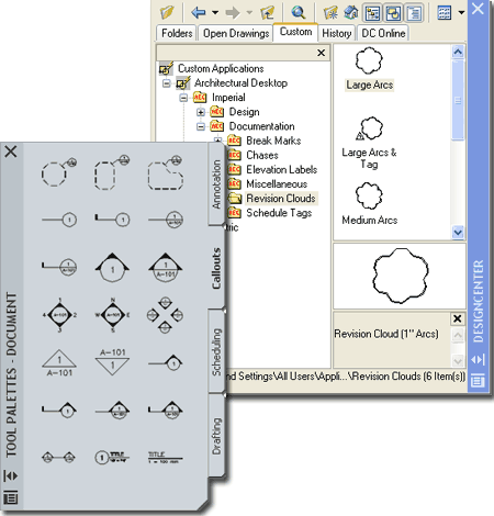
Documentation menus
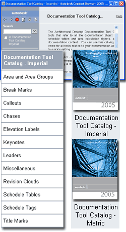
Illustrated to the right I
show the DesignCenter and the few remaining Documentation
Content Folders it currently offers. Below, left, I show the Content
Browser and how you can use the Documentation Tool Catalogs to create or
populate existing Palettes with all of the documentation Content available
in ADT; including the items remaining under the DesignCenter. I also show the
default Tool
Palette with the Document Group active to show where much of the
Documentation Content has migrated to.
 If you have been using
previous releases of ADT and grown accustomed to using the DesignCenter you
are likely to continue to be disappointed as this tool fades in development.
Many of the Documentation Symbols that you will find on the Tool Palettes have
now been consolidated into single drawing files, much like Object Styles,
which is quite different from the individual Block-like files the DesignCenter works with. The command sequence (a.k.a. command string)
typically created with the AEC Content Wizard is now part of the Tool
icon's Properties making it far easier for you to read and modify. If you have been using
previous releases of ADT and grown accustomed to using the DesignCenter you
are likely to continue to be disappointed as this tool fades in development.
Many of the Documentation Symbols that you will find on the Tool Palettes have
now been consolidated into single drawing files, much like Object Styles,
which is quite different from the individual Block-like files the DesignCenter works with. The command sequence (a.k.a. command string)
typically created with the AEC Content Wizard is now part of the Tool
icon's Properties making it far easier for you to read and modify.
To insert Symbols from
the DesignCenter you can simply drag-n-drop an item from the right-hand
List Pane ( not the Preview Pane ). You can also right-click to access
a context menu over any of these items for more options.
|
To insert Symbols from
the Tool Palette all you have to do is Select the item but you may also
use the drag-n-drop technique as long as you are careful about where you
drag to; tool icons can be moved on the tool palette.
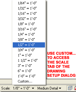
IMPORTANT:
The size of Documentation Symbols is based on the current Drawing Scale as
it applies to Printing. You can set this scale on the Drawing
Setup dialog or on the Drawing Window Status Bar. Changing the
Drawing Scale after insertion of these Symbols does not change the Symbols. |
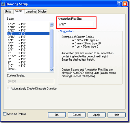
| Setting the Drawing Scale for Annotation Symbols
Most of the Documentation Symbols are scaled
upon insertion by a ratio derived from the current drawing's Scale as set on
the Drawing Setup dialog illustrated to the right. Documentation
Symbols that involve Annotation, such as Callouts, will use the desired
Annotation Plot Size at the desired drawing Scale as their ratio.
 Unlike
Dimension Styles in AutoCAD and ADT, there is no simple fix for dealing with
Documentation Symbols that don't match the desired drawing Scale; i.e., if
you change the drawing scale the symbols remain at their original sizes.
This means that you better get the drawing Scale and Annotation Plot Size
right before you start Documenting; but that's no different than how most
have used AutoCAD for years now. If you typically place your
Documentation Symbols on Layouts over Viewports, be aware that this practice
will not work with many of the symbols in ADT because they need to interact
directly with the Model. Unlike
Dimension Styles in AutoCAD and ADT, there is no simple fix for dealing with
Documentation Symbols that don't match the desired drawing Scale; i.e., if
you change the drawing scale the symbols remain at their original sizes.
This means that you better get the drawing Scale and Annotation Plot Size
right before you start Documenting; but that's no different than how most
have used AutoCAD for years now. If you typically place your
Documentation Symbols on Layouts over Viewports, be aware that this practice
will not work with many of the symbols in ADT because they need to interact
directly with the Model.
The default Annotation Plot Size for Imperial
Unit drawings has been set to 3/32" because users complained that the more
logical 1/8" value made most of the Documentation Symbols too large; rather
than changing the symbols, the programmers changed the default value.
You may need to tinker with this value to get the Annotation portion of the
Documentation Symbols to match your preferences. Keep in mind that
many Symbols also use the drawing Scale to figure out how large to make
things like Leader Tails on Section Marks.
|
If you are unfamiliar with how AutoCAD and ADT
employ the concept of drawing scale, think in terms of ratios: 1/8"=1'-0",
for example, is 1" = 8'-0", is 1"=96", which is also expressed as the ratio
1:96. Using this ratio, symbols can now be scaled from their original
scale of 1:1 up to match your desired drawing ( or print ) scale. For
Metric users things are so much easier because everything is already
expressed in ratios.
Documentation Symbols using
Annotation will typically apply the following mathematical formula to
determine the proper scale: Annotation Plot Size x Scale Ratio. You
should find, for example, that Annotation Symbols will be scaled up by 12
times in drawings with a Scale of 1:96 and with an Annotation Plot Size at
1/8" - 12 = 96x1/8. |
| Design
Content - Path settings - Options dialog
Illustrated to the right is the Options (
type "OP" ) dialog box with the AEC Content tab active. You
can use the path statements here to change where ADT will look for
DesignCenter and Tool Palette tool Content.
AEC DesignCenter Content Path -
use this path statement to direct ADT's DesignCenter to any location, local
or Networked based, for the "AEC Content" folder and all sub-folders as per
original installation. In other words, if you move the original AEC
Content folder, all sub-folders much be move as well since the DesignCenter
can only look in one place at one time. Also, these sub-folders and
their location is crucial to keeping the Tool Palette tool functional - see
comments below.
Display Edit Schedule Data Dialog During Tag
Insertion - this is one of those options that you wind up living with though you
can turn it off so easily. Un-checking this option is much like making Attributes
Preset upon insertion. To see what this thing does, try attaching a Window or Door
tag to a Window or Door and look for the Edit Schedule Data
dialog box.
Uncheck this option and repeat the exercise. Then, decide which option is better.
Unchecked, right? I leave it unchecked.
Tool Catalog Content Root Path - use this
path statement to direct ADT's Tool Palette and Tool Catalog tools to
another location. Because there are numerous tools in ADT that pull
directly from the AEC Content folder (and sub-folders) you really are not
free to direct this path to any location you prefer. In fact, this
path and the AEC DesignCenter Content Path statements are bound together
even if it does not appear as such here. The crucial relationship
between these two path statements is such that the AEC DesignCenter Content
Path ( and physical folders ) resides one folder below wherever you direct
the Tool Catalog Content Roof Path. If you don't maintain this
physical folder relationship, many tools simply won't work because they
can't find the source objects. |
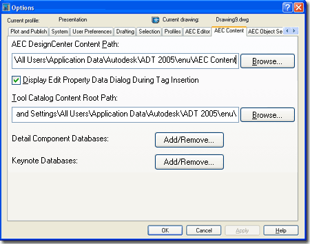
Detail Component Databases and Keynote
Databases - use the Add/Remove... button to access .mdb (Microsoft Data
Base) files for component and keynote data. Architectural Desktop
comes with a few examples but users familiar with Access can create their
own. The databases listed here are the default sources and do not
necessarily represent what users may encounter for specific Projects.
With the use of the Project Navigator, project-specific databases can be set
and all others can be restricted - see Add or Modify Project in the Project
Navigator. |
| Documentation Symbols and
Behavior
When you insert
any of the various
Documentation Symbols, you
may notice that
some behave differently than others;
some, for example, offer a host of options on the command line while others
function like traditional Blocks.
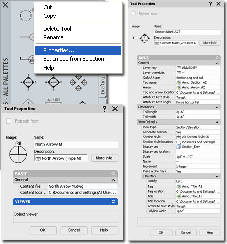
You can use
the Context menu to access the Properties of any Tool Palette icon as
illustrated to the right and if you compare a symbol as simple as the "North
Arrow M" to something as sophisticated as the "Section Mark A2T", you are
likely to get a surprise.
Not all
Documentation Symbols need complexity and North Arrows, for example, really
don't need to do more than Key to the right Layer, Scale to the right
drawing Scale and let you Orient them. Other Symbols are getting
extremely complex in functionality because they are becoming integrated into
the whole building documentation assembly process; interacting with tools in
the Project Navigator, for example.
As you
become more knowledgeable about how the tools can be configured for use with
Architectural Desktop you will start to see that you can actually make
improvements to the work done by the makers of this product. The North
Arrow example to the right, for example, has not been optimized for the
Tool Palettes and instead
defers its coded functionality back to the
Aec Content
Wizard and the
DesignCenter; i.e., it works under both tools. Below I
will elaborate on this and hopefully provide you with enough of an
understanding of how Documentation Symbols work, that you can start to
create your own.
Documentation - Text Style and Fonts
 ADT
will use the current Text Style for the
Documentation
Symbols and in the ADT template files, you should find that the Text Style
RomanS
( mapped to Romans.shx) is the current Style. ADT
will use the current Text Style for the
Documentation
Symbols and in the ADT template files, you should find that the Text Style
RomanS
( mapped to Romans.shx) is the current Style.
You can change the Font for this
Style if you have already used it for your Documentation Symbols or you can
create a New Text Style, as illustrated to the left.
The Height of the Text Style is
not important because it is determined by the
Annotation Plot Size. |
If you prefer to have your
symbols use a predefined Text Style, you can force the symbol to use
the Text Style set by the Symbol instead of by the current drawing - See
Attribute Text Style (Target or Content) under the Tool Properties as
illustrated above. For other symbols you may need to use the Aec
Content Wizard to work with a similar setting. |
| Documentation
Symbols and Fields Among the
Documentation Symbols that exhibit more sophisticated behavior than that of
simple Blocks, you will find some that not only employ Attributed Text but
Attributed Text as Fields. Such Symbols tend to have a gray box around
the Field and often default to the question mark "?" character.
If you edit these Fields as you would any
Attribute Text ( by double-clicking or with the "AttEdit" command ), you
remove the Field functionality and thus reduce the Symbol to more of a
common Block with Attributes. The Field actually works as a superior
form of Text because it can acquire values or data from other sources.
For Documentation Symbols, Fields were embedded in Attributes to allow you to
Override any data or values that might be erroneous thus providing you with
that ability to work with them as common Blocks with Attributes. The default "?"
character, for example, can easily be changed to the text or number you
prefer; should that be necessary.
Some Fields have been designed to work with
data directly in the current drawing file while others work with data in
other files; this "higher level" of connection to other files is only possible through
the use of the Project Navigator.
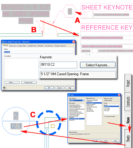
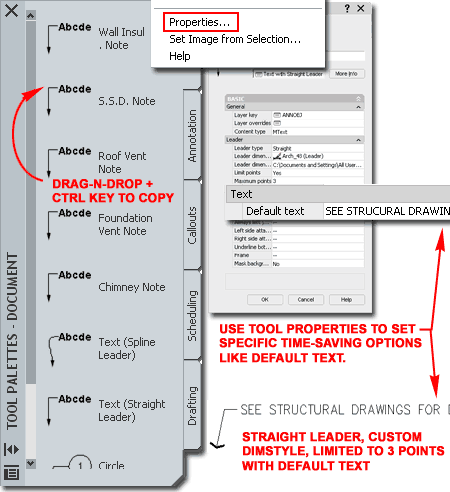
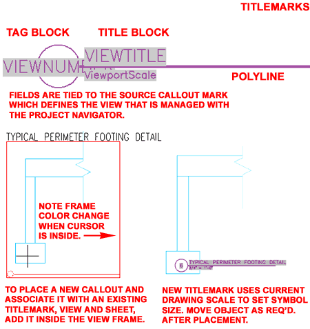
Illustrated to the right I show two Keynote
Documentation Symbol examples and one Detail Mark example. In example
"A", I show a Keynote Leader with a
Field in the hexagon bubble. This Field will not be filled in until a
Keynote Legend has been created because the Field derives its numeric value
from that legend.
In example "B",
I show another Keynote Leader with a Field that extracts its data directly
from the Object Style's Keynote assignment. A legend can be created from
this Keynote as well.
In example "C"
I show a "Detail Boundary" Callout which has two Fields that acquire their
values through the use of the Project Navigator. For optimum results,
this Symbol requires that an associated View be Generated. This View
is then associated with a Sheet which completes the data required to fill in
the two Fields that could reside on a drawing under the Constructs, Views or
Sheets category
of the Project Navigator. |
Note:
When using more sophisticated symbols, such as Callouts, the question of
where to place them may arise. Though you can place Callout symbols in
Constructs, Views or Sheets, you cannot avoid working with Views.
Callout symbols acquire their Field data by a process of tying or connecting
Views to Sheets. This means that you can pace Callouts on Sheet
drawings as has been customary in most architectural offices, but you will
need to allow the symbols to generate Views in View Drawings under the Views
tab of the Project Navigator so you can drag these Views to Sheet Drawings (
even if it is the same file as the source of the symbol). |
| 2Adding Documentation Content |
2-17 DOCUMENTATION |
Adding Break Marks
| Menu |
N.A. |
 |
|
| Keyboard |
AecDcSetImpBreakMarks - imperial, AecDcSetMetBreakMarks - metric |
| |
_AecAnnoBreakMarkAdd
- command |
| Browser |
Load from
Documentation Tool Catalog, Break Marks |
| Links |
Aec Content Wizard - for information
about symbols that do not have Tool Properties. |
| Status |
Not
updated for Tool Palettes |
| Note: |
See also
Express Tools > Draw > Break-line Symbol (Breakline) |
 The Break Marks folder
and Documentation Browser Catalog offers Bar, Cut Line and
Pipe break marks. These symbols are simple objects and not Multi-View Blocks so they
will not only be easy to use but also easy to edit with Grips or other common AutoCAD
commands. The Break Marks folder
and Documentation Browser Catalog offers Bar, Cut Line and
Pipe break marks. These symbols are simple objects and not Multi-View Blocks so they
will not only be easy to use but also easy to edit with Grips or other common AutoCAD
commands.
The DesignCenter and
Tool Palette versions of these symbols are identical because they
have not been updated yet for the Tool Palette; i.e., if you check the icon
Properties of any BreakMark tool you will find that it just defers to the
Command String
associated with the AEC Content Wizard and the DesignCenter. You can
also use the "AecAnnoBreakMarkAdd" command to work with these
symbols, add your own block or select another "break type" option - see
command-line example, right. |
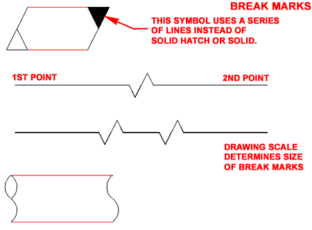
Command: _AecAnnoBreakMarkAdd
Specify first point of break line or [Symbol/Type]: _SYMBOL
Specify symbol block name or [?]<NONE>: Anno_Break_Single
Specify first point of break line or [Symbol/Type]: _TYPE
Specify break type or [STretched/SCaled] <STretched>: _Stretched |
Adding
Leaders
| Menu |
N.A. |
 |
 |
| Keyboard |
_AecAnnoLeaderAdd
- completely Tool Palette driven for easier use |
| Browser |
Load from
Documentation Tool Catalog, Leaders |
| Links |
Stock Tools and their
Properties - for more information on working with the custom
settings on Tool Property dialogs. |
| Status |
Fully
Updated and improved for use with Tool Palettes. No DesignCenter
equivalent anymore. |
There are numerous Objects in Architectural
Desktop that fall into the category of "Leaders" but for this discussion I
will focus on those listed in the Documentation Tool Catalog under Leaders.
The Leader Tools are little more than standard
AutoCAD Leader Dimension Objects with a few extra ADT-based Properties such
as Layer Keys. This makes them rather easy to understand and equally
easy to create for custom use; I urge you to take advantage of this
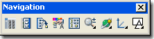
capability. Illustrated to the right I
show how you can easily Copy an existing Leader Tool using the
drag-n-drop technique while holding the Ctrl key depressed.
After making one or more Copies of a Leader Tool, you can right-click to
access the Properties... Context menu option. On the Tool
Properties dialog you can Name your Tool and set numerous valuable
properties; including Layer Key, Content Type ( Mtext or Block), Leader Type
( None, Straight or Spline) and Default Text. See comments under
Stock Tools and their Properties
for more on this subject and a breakdown of the options on this Properties
dialog. |
Note:
Do not attempt to create an ADT Leader Tool by dragging over a Leader Object
from your screen area. This action will only result in a Tool that
produces regular AutoCAD QLeaders. |
Adding Keynotes
| Menu |
N.A. |
|
|
| Keyboard |
N.A. - these are only Tool Palette driven and work under the
Detailer Tools. |
| Browser |
Load from
Documentation Tool Catalog, Keynotes |
| Links |
Stock Tools and their
Properties - for more information on working with the custom
settings on Tool Property dialogs. |
| Status |
Tool Palettes
Only. |
Keynotes are new to Architectural Desktop
2005 and as such are in their first phase of evolution; appearing to have
been optimized for the Detail Component Manager; i.e., the Keynote Tools are
from the Details section of the program.
The structure of Keynote symbols is nearly
identical to that of Leaders with the exception of one or more Fields
preset as "Default text" or embedded in a Keynote Block
symbol. This means that you can create Keynotes with as many
variations as you can with Leaders and that includes having no Leader as
well; e.g., a keynote note. If you are
fairly well versed in how ADT works, then you are likely to understand how
Tags and Schedules can mine for Property Set Data based on Selected Objects.
Unfortunately, Keynotes don't employ this system and introduce yet another
form of Data that is Database driven using Microsoft Access files as the
source. When a Keynote tool is used to Select non-Detail Objects such
as Walls, Doors, Windows and so forth, it derives its connection to a
database by the Object Style Keynote assignment. This means that it is
actually tragically easy to have a Keynote label a Wall type as one form of
construction while the Property Set Data identifies it as another form in a
Wall Schedule. And unlike Tags, Keynotes presently (should change in a
future release) do not update when the source Object is changed.
Reference Keynote - this type of keynote
uses a preset Field in the Default Text value field of the Leader
Tool Properties. It has a matching Reference Keynote Legend that reads
Reference Keynotes in a local file or any of the Sheets in the current
Project. |
 Sheet Keynote - this
type of keynote uses a Block as the "Content Type" of the Leader Tool
Properties. The default Block employs a Field embedded in an
Attribute. It has a matching Sheet Keynote Legend that must be used to
fill in the missing Field data ( usually a number ) which is then correlated
to matching reference data in the corresponding keynote database. |
Adding
Miscellaneous
| Menu |
N.A. |
 |
|
| Keyboard |
AecDcSetImpMiscellaneous - imperial, AecDcSetMetMiscellaneous - metric |
| |
_AecAnnoSymbolAdd
- most common command but check other symbols if this is important for
you. |
| Browser |
Load from
Documentation Tool Catalog, Miscellaneous |
| Status |
Not
updated for Tool Palettes |
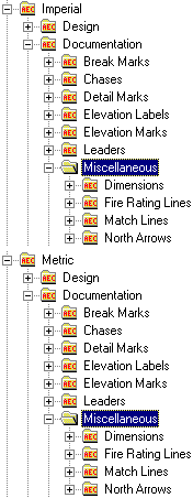 The
Miscellaneous folder lives up to its name by providing
access to a variety of Objects that have little in common other than the
fact that most are related to documentation. One of my favorite items
to complain about is the North Arrows sub-folder; this is not
"miscellaneous" content to me since I happen to use a north arrow on every
project I do. Of course, it is usually the same north arrow unless I
am doing presentation drawings. The
Miscellaneous folder lives up to its name by providing
access to a variety of Objects that have little in common other than the
fact that most are related to documentation. One of my favorite items
to complain about is the North Arrows sub-folder; this is not
"miscellaneous" content to me since I happen to use a north arrow on every
project I do. Of course, it is usually the same north arrow unless I
am doing presentation drawings.
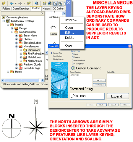
If, like me, you prefer to use AutoCAD-based
Dimensions instead of the Aec Dimension Objects in ADT, you may find
the Dimensions Folder of particular interest. These Dimensions are not
new Objects but simply
Command Strings that take advantage of features
available through the Aec Content Wizard; features like Layer Keying.
Unfortunately there is no Tool Palette equivalent so if you drag any of
these tools over to a Palette, the icon Properties will simply defer to the DesignCenter
( they will still function properly).
The Fire Rating Lines folder offers
five Linetypes for various Wall hour
ratings and requires that you Select points on Wall Objects to indicate the
length of the Line. You can use the "_AecAnnoRatingLineAdd"
command to work with these Objects and set your own Polyline Width,
Color and Linetype. |
The Match Lines
folder offers a couple of match line options based on a Pline and Text.
These Objects work similarly to the Fire Rating Lines but are are not tied
to Objects so you can draw them as you would any Line or Pline. You
can use the "_AecAnnoMatchLineAdd" command to work with these Objects
and set your own Polyline Width, Color, Linetype and
Symbol. The Symbol is the Match Line Text label that accompanies
the Match Line Object when you insert it from the DesignCenter.
The North Arrows folder
provides access to numerous North Arrow Blocks that Scale, Rotate and
Layer Key upon insertion. They are not, however, MvBlocks and you may
want to consider creating one or two that take advantage of how MvBlocks can
accommodate different Scales and Display Representations depending on View
Orientation and/or Display Configurations. You can use the "_AecAnnoSymbolAdd"
command to work with these Objects but since there really are no options
other than Block Name, Insertion Point and Rotation Angle ( both set on
screen), it is better to work with them directly from the DesignCenter or
Tool Palette. |
Adding Elevation Labels
| Menu |
N.A. |
  |
|
| Keyboard |
AecDcSetImpElevationLabels - imperial, AecDcSetMetElevationLabels - metric |
| |
_AecAnnoElevationLabelAdd
- command to add |
| |
_ElevationLabelModify
- command to edit |
| Browser |
Load from
Documentation Tool Catalog, Elevation Labels |
| Status |
Not
updated for Tool Palettes |
The Elevation
Labels folder contains three
sub-folders; each with its own set of
 Elevation
Label types: 2D Section, Model and Plan. Despite
the different folder names, each symbol works on the same basic principle
which is to read the Z-axis height value and label accordingly. Upon
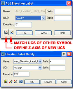
insertion of any of these Attributed MvBlocks, you can use the Add
Elevation Label dialog to specify the actual Elevation value you may
want, include a Suffix or Prefix, match any existing Saved UCS's or Define a
New UCS to orient the Z-axis in the direction of the Height value. Elevation
Label types: 2D Section, Model and Plan. Despite
the different folder names, each symbol works on the same basic principle
which is to read the Z-axis height value and label accordingly. Upon
insertion of any of these Attributed MvBlocks, you can use the Add
Elevation Label dialog to specify the actual Elevation value you may
want, include a Suffix or Prefix, match any existing Saved UCS's or Define a
New UCS to orient the Z-axis in the direction of the Height value. After an
Elevation Label has been placed, you can regain access to the main dialog by
using the Context menu (ElevationLabelModify) - see illustration left.
Because the Attribute Text is embedded within these MvBlocks, using the
Elevation Label Modify dialog is the easiest solution for changing the text
labels. |
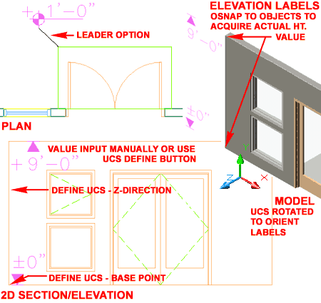
Of the set, the most confusing Elevation Labels
are the ones you are likely to want to use the most: the 2D Elevation types.
The reason they may prove to be confusing to use is that they only read the
Z-axis height value and 2D Sections and Elevations don't have a Z-axis
height value (it's always zero). To resolve this problem, you can use
the "Define UCS" button on the Add Elevation Label dialog (illustrated
right) to set the "Base point" and then the New Z-axis direction as it
applies to the Height value you want the symbol to register - sounds
crazy doesn't it. When you "define" a new UCS, you will also be forced
to Name it. This effort may be worthwhile if you have a lot of similar
Labels to place that all relate to the same newly defined UCS.
|
Adding
Revision Clouds
| Menu |
N.A. |
 |
|
| Keyboard |
AecDcSetImpRevisionClouds - imperial, AecDcSetMetRevisionClouds - metric |
| |
_AecAnnoRevisionCloudAdd
- command |
| Browser |
Load from
Documentation Tool Catalog, Revision Clouds |
| Status |
Not
updated for Tool Palettes |
| Note: |
See also
Draw > Revision Cloud (RevCloud) |
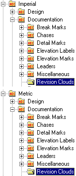 The Revision Clouds folder
and Documentation Browser Catalog offers several cloud types with small and
large arc segments that come with or without a triangular-shaped tags. The Revision Clouds folder
and Documentation Browser Catalog offers several cloud types with small and
large arc segments that come with or without a triangular-shaped tags.
The DesignCenter and Tool Palette
versions of these symbols are identical because they have not been
updated yet for the Tool Palette; i.e., if you check the icon Properties of
any Revision Cloud tool you will find that it just defers to the
Command String
associated with the AEC Content Wizard and the DesignCenter.
You can
use the "_AecAnnoRevisionCloudAdd" command to work with these Objects
and set your own Polyline Width, Color, Arc Length and
Symbol. The Symbol is the triangular Block with a single
Attribute for the cloud number. |
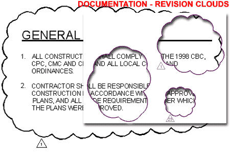
To draw a Revision Cloud, you will need to draw in the
counter-clockwise fashion and then conclude the routine by coming back to the original arc
segment. The cloud will automatically terminate and if you have a Tag to insert, you
will be queried for its location and number. Revision Clouds use the
current drawing's
Scale to
determine Arc Segment size but use the Scale and the
Annotation Plot Size
to determine the size of the tag.
If you use the same Revision Cloud type in Model
Space and Paper Space, you can make them look identical as long as you use
the same Drawing Scale as the Viewport Scale. Paper Space (Layout)
Revision Clouds are automatically set to a scale of 1:1 but the Tags are
affected by the Annotation Plot Size. |
Adding
Detail Marks
| Menu |
N.A. |
 |
Callouts tab |
| Keyboard |
N.A. |
| Browser |
Load from
Documentation Tool Catalog, Callouts |
| Links |
Callout Marks and Block
Structure - for more information on how the annotation bubble is
constructed. |
| |
Callout Marks and Views - for
more information on how annotation text is threaded through the Project
Navigator. |
| Status |
Fully
Updated and improved for use with Tool Palettes. No DesignCenter
equivalent anymore. |
 In
Architectural Desktop there are two primary Detail Callout
Types: Detail Boundaries and Detail Marks. Though they
differ in the graphics used to indicate where the detail is cut, they share
the same annotation bubble structure used for most of the Callout Marks. In
Architectural Desktop there are two primary Detail Callout
Types: Detail Boundaries and Detail Marks. Though they
differ in the graphics used to indicate where the detail is cut, they share
the same annotation bubble structure used for most of the Callout Marks.
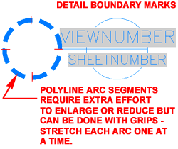
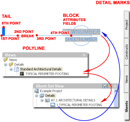
Illustrated to the right I show an example of
a common Detail Mark and some of the options available when drawing
this documentation symbol. The cut-line portion is a single
Polyline unless a manual Break has been defined during creation
(notice the Break option on the command line after the 2nd Point has been
drawn). When you are done drawing the cut-line, hit the Enter Key to
automatically insert the annotation bubble and look for the last point to
specify the direction of the tail.
The annotation bubble is similar to many of
the other documentation symbols which employ a Block with linework and
attributed text. However, all of the Callout Marks use Fields
embedded in the Attribute Text to provide a type of data-linking to
other drawing files. These Fields are typically defined by a gray box
that will not print but is there distinguish them from other forms of
text.
As long as you avoid using the "Callout Only"
option on the Place Callout
dialog, the Fields within the annotation bubbles should not be filled in
manually as you typically would with Attributed Blocks; instead, the data
can be derived automatically by using the Project Navigator to
associate Detail Views with Detail Sheets as illustrated
above, right. |
 Note: Note:
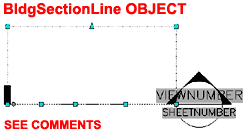
Detail Marks, like Section Marks, utilize the BldgSectionLine Object
to determine the Boundary for the cut they make in your Model. Though
this Object is typically not displayed, you should be able to Select it by
Selecting the cut-line as illustrated to the right. If you choose to
use the symbol as a "Callout Only" and/or you do not use "Generate
Section/Elevation" option, the BldgSectionLine Object will not be created.
This Object has its own Display Representation and you can find it under the
"Representation by Object" in the Display Manager Window. |
Adding
Elevation Marks
| Menu |
Documentation>
Documentation Content> Elevation Marks... |
|
|
Callouts tab |
| Keyboard |
AecDcSetImpElevationMarks - imperial |
| |
AecDcSetMetElevationMarks - metric |
| Browser |
Load from
Documentation Tool Catalog, Callouts |
| Links |
Elevations - for information on elevation line
objects, subdivisions and display properties |
| |
Callout Marks and Views - for
more information on how annotation text is threaded through the Project
Navigator. |
| Status |
Fully
Updated and improved for use with Tool Palettes. No DesignCenter
equivalent anymore. |
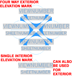 In
Architectural Desktop there are two primary Elevation Callout
Types: Elevation Single and Elevation Four Way. The
Single Elevation Callout Mark is basically one direction of the Four
Way Callout Mark so if you can figure out how to use the more complicated
one the single one will be easy. In
Architectural Desktop there are two primary Elevation Callout
Types: Elevation Single and Elevation Four Way. The
Single Elevation Callout Mark is basically one direction of the Four
Way Callout Mark so if you can figure out how to use the more complicated
one the single one will be easy.
The Four Way Elevation Callout Mark is
arguably the most sophisticated or complex in the whole group. Not
only does it employ two Blocks and Attributed Text with
Fields, it uses four copies of one of these Blocks in
different directions that each relate to Views. This is much
like combining four Detail Marks in one symbol.
When you insert an Elevation Mark, you will
be required to specify the direction for the first number ( or "North"
direction). I found that this symbol does not work correctly when you
specify non-orthogonal angles so you may need to rotate the symbol after
creation or rotate the UCS icon prior to insertion.
After this symbol has been oriented, the
Place Callout dialog will appear as it does for all of the other Callout
Marks - see comments under Callout Marks
and Views for more information on this dialog. Though you can
choose to use the Callout as a "Callout Only" its greatest function lies in
how you can use it to "Generate Section/Elevation" automatically.
Illustrated to the right I show how the four
way Elevation Mark will request two diagonal points (on the command line) to
define the space from which you want your interior elevations generated.
You can then specify an "Elevation Line Depth" and "Elevation
Height" to complete the dimensions for the 3D elevation areas. The
"Elevation Line Depth" appears to divide the specified value in half
relative to the outer points originally used to define the plan area; but
I've found many unusual anomalies that make me question what is really
happening with respect to this information. Once you have the Elevation Line
Objects you can use Grip Editing to adjust them as needed.
|
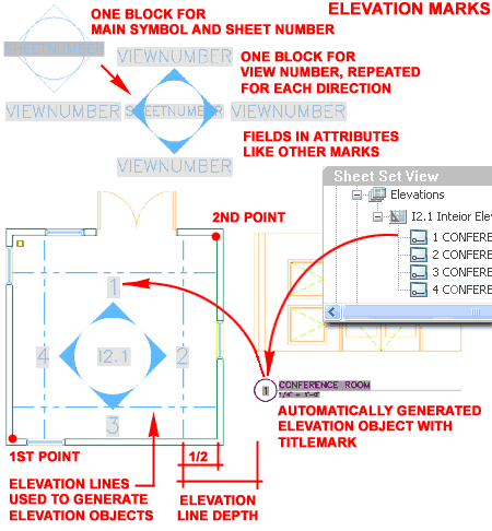
After the
Elevation Line Objects have been defined, you should find that you are
required to place the first Elevation Object and the amount of distance you
want between each of the remaining Elevation Objects.
To complete the
annotation work, you will need to drag the Elevation Views from the Views
tab of the Project Navigator into a Sheet file. Once the Elevation
Views (and Objects) have been placed on a Sheet, you should find that the
Sheet Number and View Numbers are automatically resolved.
Note:
If you are not quite ready for the full use of this symbol and all of the
fancy Project Navigator linking, you can still get some automatic work out
of it. If you assemble an Elevation Drawing, for example, by Xref'ing
in Foundation, Plan, Roof and other files (as required), you can insert one
of these Elevation Marks and use it to "Generate Section/Elevation" linework
for you that you can then use as you see fit. Ultimately, you can even
Explode this linework and work with the lines as in the past. |
Adding
Section Marks
| Menu |
Documentation>
Documentation Content> Section Marks... |
|
|
Callouts tab |
| Keyboard |
AecDcSetImpSectionMarks - imperial |
| |
AecDcSetMetSectionMarks - metric |
| Browser |
Load from
Documentation Tool Catalog, Callouts |
| Links |
Modifying
Section Lines - for information on
how the Add AEC object option works; Boundary and Subdivision Lines. |
| |
Callout Marks and Views - for
more information on how annotation text is threaded through the Project
Navigator. |
| Status |
Fully
Updated and improved for use with Tool Palettes. No DesignCenter
equivalent anymore. |
In
Architectural Desktop there are two primary Section Callout
Types: Section Tag and Tail and Section Tag and Tag. The
Section Tag and Tag uses a Section Tag on both ends of a connecting line.
For the Section Marks with Tails, you have several options including having
no tail at all.
The Section Marks folder offers four Section Mark types; the options include tails
and number of text fields.
Illustrated to the right, I show that you can use the Section
Mark for both annotation and automatic Section Generation with
subdivision lines and everything. When you add a Section Mark you should find the
option to Add AEC section object? [Yes/No] <N>: Adding this
object will provide the means to Generate a Section. See the discussion on Sections for more information on how to accomplish this.
|
 |
Adding
Title Marks
| Menu |
N.A. |
|
|
Callouts tab |
| Keyboard |
N.A. |
| Browser |
Load from
Documentation Tool Catalog, Callouts |
| Links |
Callout Marks and Views - for
more information on how annotation text is threaded through the Project
Navigator. |
| Status |
Fully
Updated and improved for use with Tool Palettes. No DesignCenter
equivalent anymore. |
Titlemarks in Architectural Desktop
were designed to be more of an automatic process rather than a manual one.
If you look through the Tool Properties of most other Callout Marks you will
find a View Defaults section that includes an option for "Place a Titlemark".
When this option is set to "Yes", more options will appear on the Tool
Properties dialog and those Properties are the exact same Tool Properties
you will find under the Titlemark Tools. However, when Titlemarks are
included as a Property of the other Callout Marks, an association is
established between it, the primary Callout Mark, the View Name and the
Sheet it is finally placed on. Should
you forget to Add a Titlemark as part of your Callout work or otherwise lose
one that was associated with a View, you can re-establish the association by
carefully Adding a New Titlemark inside a Named View - see illustration to
the right. Should you wish to simply
Add a Titlemark for general purpose use, you can manually override the
Fields embedded in the Attribute Text and treat these documentation symbols
as regular Attributed Blocks. |
 |
Adding
Chases
| Menu |
N.A. |
 |
|
| Keyboard |
AecDcSetImpChases - imperial |
| |
AecDcSetMetChases - metric |
| Browser |
Load from
Documentation Tool Catalog, Chases |
| Status |
Not
updated for Tool Palettes |
 The
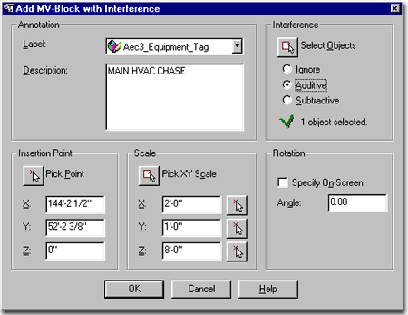
Chases folder offers rectangles with various symbols inside but they are actually Multi-View Blocks
with 3D Interference Blocks. When you drag-n-drop a Chase symbol into your drawing, the
Add MV-Block with Interference dialog box will pop up with options for Labeling, Descriptions, Interference
settings, position and size - as illustrated to the right. The
Chases folder offers rectangles with various symbols inside but they are actually Multi-View Blocks
with 3D Interference Blocks. When you drag-n-drop a Chase symbol into your drawing, the
Add MV-Block with Interference dialog box will pop up with options for Labeling, Descriptions, Interference
settings, position and size - as illustrated to the right.
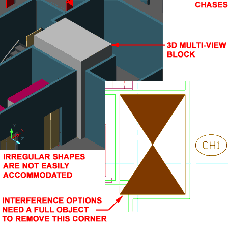
All Chases are rectangular and you cannot
create irregular polygon shapes with this tool. A default rectangular
size will appear under the Scale section of this dialog but you can use the
Pick XY Scale button to match any rectangular size you may need. By
default, the symbol will only display in Plan but if you use the
Interference option to Subtract it from other Objects, you should find holes
in 3D Views. If you Modify the MvBlock Definition, you should find
that an Interference Block has been added. Should you wish to see a
Solid Mass, as illustrated below right, you can Add the same Interference
Block as a View Block under the Model Display Representation.
|
 Label - in order to used this option, you
must have a label object defined in your drawing. Just having a Property Definition
Set Style loaded isn't enough, you will need to have one of the tag symbols in the drawing
for the Label drop-down list to see it. All this does, is automatically activate the
insertion of the label or tag at the end of the Chase creation process, so this is not
critical; in other words, you can just insert the tag later. |
| Adding
Chases Example Description
- this is the same Description field that you get on the Multi-View Block
Properties dialog box and is also not critical. The nice thing about a Description though, is
that it will be easier for another person to know what you had in mind for this Chase when
you created it.
Interference - this is an option similar
to those available for Mass Elements or Interference options with other objects. By using an
interference, you can make a Chase punch out (Subtractive) a hole right through other
selected ADT objects; like floor Slabs. Another option is to make your
Interference Additive so the Selected Objects, like a Slab, expand around it
like a Shrinkwrap effect. The only problem with the Additive option is
that they broke it in ADT 2004 and haven't fixed it yet. In order to
see the actual results of an Additive operation, you will need Modify the
MvBlock Definition of the Chase Object and Add the Interference Block as a
Model Display Representation View Block. Once you have done this, you can
see the results of an Additive Operation by turning Off the Chase Layer.
This is all basically nonsense work to solve a bad flaw for a poorly
designed Object. I recommend that you consider using a Mass Element
Instead.
Insertion Point - is simply where you want
one corner of the Chase to start.
Scale - is simply where you want to other
corner of your Chase to end. Notice that there is a Z-axis value to define how tall
your Chase should be and this is important if you plan to use it as an Additive or
Subtractive Interference condition. It is also important if you want to display your
Chase correctly in a 3D view.
Rotation - this is the same as other
rotation options in AutoCAD and ADT and refers to the Plan View rotation, not the Vertical
rotation. |
 |
| 3Modifying
Documentation Content |
3-17 DOCUMENTATION |
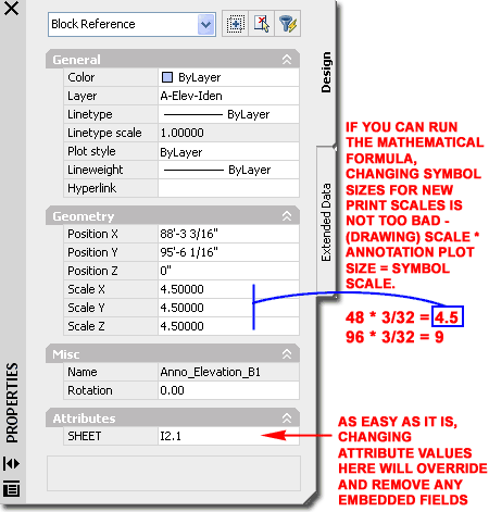
| Modify
Documentation Content Properties Palette
Since most of the Documentation Content is
based on Blocks, you have to think along those lines for basic
modifications. Illustrated to the right I show an example of the Properties
Palette for the Interior Elevation symbol illustrated to the left. As
you can see there is not much that you can alter here but you may want to
know about the Scale X, Y and Z value fields because I find that using them
often saves me a lot of trouble.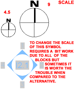
As you become more familiar with Fields, you
will recognize how important it is to keep them alive and connected.
For example, if a user sees the "Sheet" Attribute value field on the
Properties Palette and decides to input a new sheet number, the Field is
overridden and removed. Below I will discuss repairing such damaging
work but
what this means is that the value is no longer connected to the Sheet tab of
the Project Navigator and thus any updates there will not be reflected back
in this symbol.
To avoid losing Fields, obviously it is
better to avoid filling in Attributes manually, but it also better to keep a
symbol that is "connected" than to attempt to Add a new one when print
scales change. Therefore, I show how you can derive the Scale for the
X, Y and Z values so you can input a scale number when you need to increase
or decrease symbol sizes for printing scale issues. All you have to do
is look at the current drawing Scale and Annotation Plot Size ( DrawingSetup
dialog) to figure out the ratio ADT uses when inserting Documentation
Content - see Setting the Drawing Scale for Annotation Symbols |
 |
| Documentation - Block and Attribute Editing Most of the Documentation objects use Blocks with Attributes.
This means that you can use common AutoCAD commands to work with these symbols; commands
like AttEdit, RefEdit, Insert and Explode.
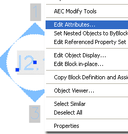 To edit the text within Documentation objects, you should
find that double-clicking on the symbols or text will
activate the Edit Attributes dialog box. If this does not work, try using the "AttEdit"
or "ATE" commands. To edit the text within Documentation objects, you should
find that double-clicking on the symbols or text will
activate the Edit Attributes dialog box. If this does not work, try using the "AttEdit"
or "ATE" commands.
To edit the symbol or attribute within a Documentation
object, you should find that the RefEdit command will allow you to go
inside and change or add linework or text to these symbols. Since these symbols are
Blocks, you can also Insert them at a one-to-one ration ( scale of 1 ), explode them, edit
them and re-Block them with the same name.
Inserting Documentation objects from the Insert
Block dialog box will not produce the same results as with the drag-n-drop
technique from the DesignCenter and Tool Palettes. This is because the
dragging action triggers a
sequence of commands while the insert command simply brings in a Block. |
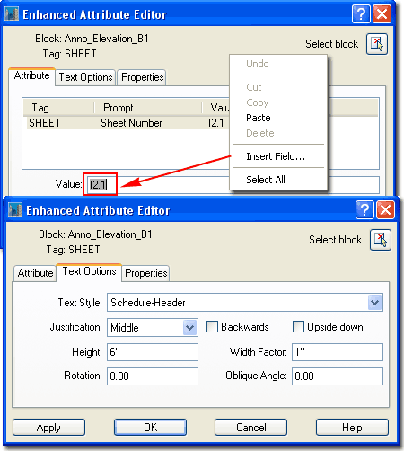 |
| Field
Associations As discussed above,
the act of changing an Attribute Value that has a Field embedded in it, not
only overrides the Field but removes it. It is certainly highly
unfortunate that there is no way to keep a Field while overriding the
Attribute Value but maybe we can hope for improvements in the future.
In the event that a Field has been removed, you can either Delete the
Documentation symbol and Insert a new one to replace it or you can attempt
to reset the Field association. For some symbols, such as Interior
Elevation bubbles, it can be quite frustrating to Insert a New symbol if the
existing symbol has already been set and connected to Views and Sheets.
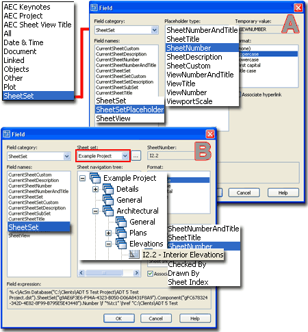
Illustrated to the right I show two examples
of how the Sheet Number Attribute in Callout Marks functions as a Field.
When you first insert a Callout Mark, for example, the Field associations
are set to be "Placeholders" because the associations to Views and Sheets
have yet to be made. If, at this point, an Attribute Value has been
overridden, you can simply use the Attribute Editor to
Insert Field... and
reset the "Placeholder". In the case of the "SheetNumber", use the
SheetSet Field Category and look for SheetSetPlaceholder Field Name.
Then, under the Placeholder type, look for SheetNumber.
If a symbol, such as a Callout Mark, has
already been associated with Views and Sheets prior to being overridden,
resetting a Field may provide a bit more difficult than in the previous
example. Once Field associations or links have been established, the
"Placeholder" is changed to a definitive connection. In example "B" to
the right, I show how an example SheetNumber went from a "SheetSetPlaceholder"
to "SheetSet" that uses the Sheet Set drop-down list to be connected to an
actual Project. Under the Sheet Navigation Tree list, are all of the
Sheets for the current Project and the SheetNumber is associated with one of
them. If you know the Sheet Name and the location, you can reset the
Field by manually selecting these options.
|
 Note:
Though Keynotes employ "Placeholders", I have not found a way to reset them
as discuss above for Callout Marks. |
| Documentation -
Grips Using Grips for
editing Documentation Content Symbols should prove to be rather
self-explanatory for most symbols. For other symbols, however, such as
Callouts, you may need a few tips.
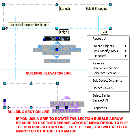
Illustrated to the right I show an example
Interior Elevation and Section Symbol with corresponding
cut-lines. Because the Interior Elevation Symbol includes the cut-line
it is easy to see and consequentially easy to Select but the Section Symbols
don't display anything unique unless you Select the cut-line. On
Section Symbols, be aware that there is a Polyline cut-line and a Building
Section Line Object that share the same location and you can inadvertently
Select the wrong Object and not get the results you seek.
You can use basic AutoCAD commands, such as "Move",
or Grip options such as those illustrated to the right to modify the
Building Elevation and Section Line Objects to control the information
included in your automatically Generated Elevations and Sections.
Building and Section Line Objects are associated with the symbol but are
also independent Objects that you can Modify freely; they don't even have to
be near the symbol itself. |
 |
|
4Properties
and Structure of Documentation Content |
4-17 DOCUMENTATION |
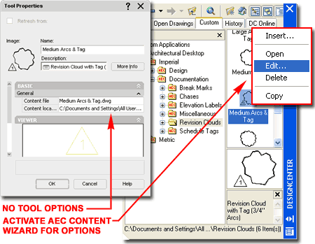
Tools without
Properties
| Links |
Aec Content
Wizard - for information on how the Aec Content Wizard and
DesignCenter work together to create "smart" symbols. |
When it comes to understanding, modifying or
creating Documentation Content, it can get a little confusing. At the
time of this writing, for ADT 2005, a good portion of the default
Documentation Content is still rooted in the old DesignCenter system
that uses the Aec Content Wizard as a predecessor to Tool Properties.
If you think of the DesignCenter images as Tools, then right-clicking over
one of them and using the Edit... Context menu option, is like using
the Properties option from a Tool Palette icon. Like it or not, the
DesignCenter is facing retirement though it may hang out for years to come.
Documentation Content that is still
DesignCenter driven can be dragged over to a Tool Palette ( as all of them
have ), but the only Properties you will find for such Tools are "Name",
"Description", "Content file" and "Content
Location". Such Tool Properties may appear as if all you are doing
is inserting a Block, but the fact of the matter is that much more may
actually be happening. You see, the Aec Content Wizard can
embed numerous settings and functions within the Symbol as long as it
resides under the Custom Applications Folder Structure in the
DesignCenter.
Below I will discuss Tool Properties for
Documentation Content that has been fully migrated to Tool Palette tools.
See Aec Content Wizard for information on
Documentation Content that has not been migrated. |
 |
|
Stock Tools and
their Properties
In Architectural Desktop there are two types
of Tool Palette tools: AutoCAD based and ADT based. In the case of
Leaders, for example, if you drag an ordinary AutoCAD based Leader on to
a Tool Palette, you will only get the AutoCAD tool Properties but if you
Copy an
 existing Architectural Desktop Leader Tool, you will find a much
larger list of Properties. existing Architectural Desktop Leader Tool, you will find a much
larger list of Properties.
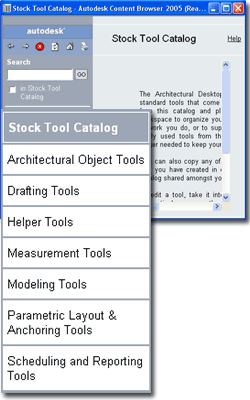
Illustrated to the left I show how you can
access the Stock Tool Catalog in ADT for tools such as the one illustrated
to the right: Text Tool (accessed via the Drafting Tool Catalog).
For more specific Documentation tools, you can access either the Imperial or
Metric Documentation Catalogs.
Illustrated to the right I show the Tool
Properties of the "Text (Straight Leader)" tool and the enormous list of
options and settings that you can work with to create custom results.
For ADT users, the most important feature is the option to set a Layer Key
so the Leader will automatically be layered. You can, of course,
create custom versions of a Tool such as this one and have them Key to
different Layers. You can also take advantage of the Leader and Text
options to vary the appearance and functionality as needed. |
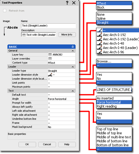
The "Default text" option,
under the Text section is one of my favorite options because you can use it
to preset a series of common notes that are used over and over in different
projects.
The Text Tool is actually a Leader Tool
in disguise controlled by the Leader type Tool Property setting;
which offers "None", for Mtext and "Spline" or "Straight"
for AutoCAD-like Leader Objects. If you use the "None" option this
tool will act like the Mtext command but you can use the Layer Key and
Text options, like "Default text", to make it more sophisticated. |
| Callout Marks
and their Properties The Detail,
Elevation and Section Marks are all based on the same set of Tool
Properties and are arguably the most complicated to comprehend. Not
only do these types of Symbols tend to have more information and components,
but now they are also tied to Named Views and tools within the Project
Navigator.
 When
working with these Symbols and their Properties, you must accept the
hard-coded functions programmed into each of the Callout Types. Unlike
inserting basic Blocks or MvBlocks, these Symbols have been designed to
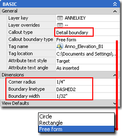
produce more sophisticated results. The Detail Boundary type,
for example, will always be a Symbol connected to a "boundary" form that can
either be a "Circle", "Rectangle" or "Free form"
as illustrated to the left. When you choose the Detail Boundary
Callout form, notice that a few additional options become available under
the "Dimensions" section. When
working with these Symbols and their Properties, you must accept the
hard-coded functions programmed into each of the Callout Types. Unlike
inserting basic Blocks or MvBlocks, these Symbols have been designed to
produce more sophisticated results. The Detail Boundary type,
for example, will always be a Symbol connected to a "boundary" form that can
either be a "Circle", "Rectangle" or "Free form"
as illustrated to the left. When you choose the Detail Boundary
Callout form, notice that a few additional options become available under
the "Dimensions" section.
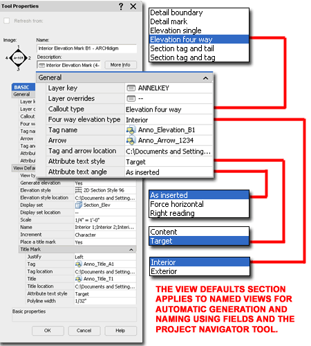
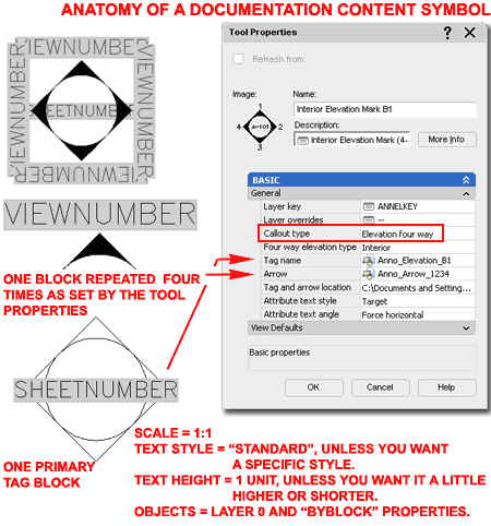
Illustrated to the right I show the Tool Properties for the default "Interior
Elevation Mark B1" Documentation Symbol which uses the "Elevation
four way" Callout type. By using the "Four way
elevation type" drop-down list you can set this symbol to either Interior or
Exterior; illustrating that there is little difference between the two.
This Callout type utilizes two Blocks or MvBlocks to allow independent
control over the annotation center and the surrounding arrows. |
 |
|
Callout Marks and Block
Structure All of the default
Callout Marks have annotation components that have been designed for use
with the Project Navigator. This fact does not mean that you must use
the Project Navigator when using these documentation symbols but it does
mean that their behavior may prove irritating when you don't. With the
interior Elevation Marks, for example, you will find that the View Numbers
default to the term "View Number" instead of the more logical "1, 2, 3, 4"
or "N,S,E,W".
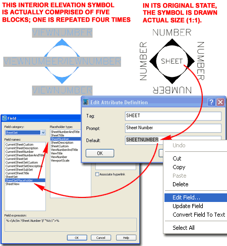
Illustrated to the right I show what the
default "Interior Elevation Mark B1" Callout Mark looks like when first
inserted into a drawing (left) and what it looks like in its original
pre-Block state (right). When you insert this symbol, you actually
acquire two Blocks that are scaled and matched according to the Tool
Properties discussed above. For this particular example, there are two
Blocks and each was drawn at a scale of one-to-one before being converted
into Blocks. Symbols, like this, are typically set to Layer "0" with
all Properties set to "ByBlock". The Attribute Text can be any Text
Style, often "Standard", if the Tool Property is set to "Target" for
"Attribute text style"; otherwise you can use a specific Text Style and set
the Tool Property to "Content".
Since Attributes can have Fields embedded as
the Default value, you will find that these symbols all use this feature to
provide the best of two options: automatic Field-based data or manual
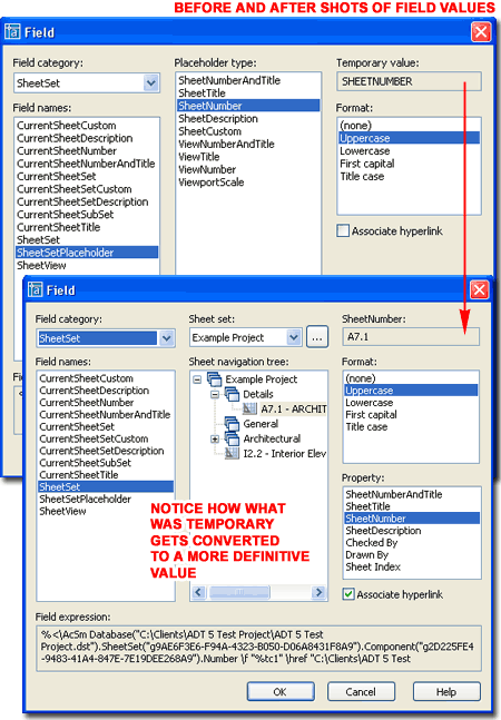
typed-in overrides. In the illustration, lower right, I show how the
"Sheet" number Attribute is actually a Field that has a temporary
placeholder value that points to a future "SheetNumber" value. This
value is temporary because the Field cannot determine the actual value until
data has been provided by the user who must use the Project Navigator to
thread Views to Sheets. |
 |
| Callout Marks
and Fields As discussed in the cell
above, Callout Mark symbols utilize Fields that are embedded in Attribute
Text and those Fields have been designed to acquire their values through the
actions of the user who is supposed to use the Project Navigator to
establish Object and Data Links.
 Callout
Marks use a unique Field Name called a "SheetSetPlaceholder" under the
SheetSet Field category. Currently, the Placeholder type list is fairly
short and rather limited but for this example, the "SheetNumber" illustrates
how the placeholder can defer data acquisition until future action is taken
within the Project Navigator. Callout
Marks use a unique Field Name called a "SheetSetPlaceholder" under the
SheetSet Field category. Currently, the Placeholder type list is fairly
short and rather limited but for this example, the "SheetNumber" illustrates
how the placeholder can defer data acquisition until future action is taken
within the Project Navigator.
Since Callout Marks typically refer to a
specific frame or region of a drawing, this frame can be thought of as a
"view". In Architectural Desktop all of the Callout Marks include Tool
Properties that automatically link the symbol to a View ( referred to as a
"Named View"). Views of this type are stored and managed on the Views
tab of the Project Navigator where they await assignment to your
construction documents (referred to as "Sheets").
When you physically drag a Named View from
the Views tab of the Project Navigator over to a Sheet, the Fields within
the Callout Marks symbols are fed the data they need to become complete.
Once this data linking has been established, the "Placeholder" is changed by
the Project Navigator to a more specific and definitive Field Name. In
the illustration to the right I show how the "SheetSetPlaceholder" for the "SheetNumber"
changes to "SheetSet" with a very specific target listed under the Sheet
navigation tree.
Notice that not only does the Field dialog
change in appearance by providing more information and options but that the
Field expression code expands by several fold in order to thread this
information together. |
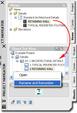
In the Project Navigator illustration to the
left, notice how Detail Marks acquire both Detail Numbers and Sheet Numbers
from the Sheets tab. You can right-click or double-click over any
Detail View to Rename or Renumber them and this data will automatically be
fed back to the corresponding symbols. Unfortunately, you cannot
Renumber by changing the symbol values directly on the Sheets where they
have been placed; i.e., this data-linking system is not bilateral. |
|
Callout Marks
and Views After you have
completed the insertion and placement of a Callout Mark, you should find
that the "Place Callout" dialog pops up. This dialog
provides you with the option to work with the Project Navigator features by
Naming the Callout, setting a target location for the Callout drawing,
automatically placing a Titlemark under the Callout drawing and setting an
anticipated print scale.
PLACE CALLOUT DIALOG
Callout Only - use this button to inset the Callout Mark without
creating any Views or data. When you use this option you are basically
treating the symbol as a common Block without using any of the special Field
and Project Navigator features.
New Model Space View Name - use this
character field to type in the name of the View as you would prefer to see
it under the Views tab. The View Name is also used for the Titlemark
title.
Create in:
New View Drawing - use this button to create a New drawing under the
View tab that will acquire the Generated Section/Elevation as defined by the
Callout Mark.
Existing View Drawing - use this
button to add the Generated Section/Elevation to an existing drawing under
the View tab.
Current Drawing - use this button to
add the Generated Section/Elevation to the same drawing in which you have
placed the Callout Mark. This option can be a bit deceiving because
it may not produce the results you desire in all cases. If you use
this option in a Sheet or Construct file, for example, no View drawing will
be used to thread the Field data to a Sheet and consequentially the the
Callout Mark will appear much like you used the Callout Only option; i.e.,
you'll have to input the Attribute values manually. This option does
make sense if you are already working in a View file.
Generate Section/Elevation - this
checkbox option can be used to take advantage of the Field data-linking in
Callout Mark symbols without generating any linework. This might be
useful in cases where you want the symbol and the data linking for detail
and sheet numbers but you plan to draw the detail manually with regular
AutoCAD-based linework. In such cases you are likely to use the Place
Titlemark option or you won't have a clue where the detail needs to be drawn
because there won't be any physical objects to define it. |
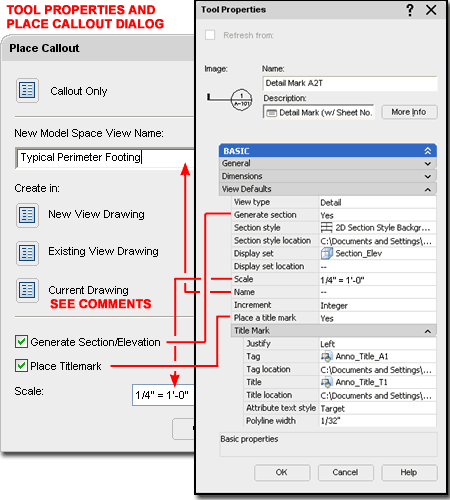
Place Titlemark - this checkbox option
can be used to associate another Callout Mark with the primary one.
This Callout Mark becomes the Title under Saved View and typically uses the
Name you specify under "New Model Space View Name". Titlemarks
typically display a Number and Scale. The Scale value comes from the
Scale value field on this dialog box but the Number comes from work done on
the Sheets tab.
Scale - use this
drop-down list to specify the anticipated Print and Viewport Scale for the
linework and Titlemark created through this process.
Illustrated above I show how the
View Defaults section of the Tool Properties dialog for any
Callout Mark can be used to preset some of the options on the Place
Callout dialog. Of the list, I
think the Scale option is probably the one you are likely to
encounter the most and if you use another scale than the default ones set on
the default Callout Marks, you might as well run through the Tool
icons and make this a little better. |
|
5Creating Documentation Content
Symbols |
5-17 DOCUMENTATION |
|
The Structure of
Documentation Content Symbols Symbol
Anatomy
From the
discussions above you should now be able to identify the different types of
Documentation Content Symbols. Below, I will outline the parts that
form the whole structure of the three primary Symbol types:
Blocks,
Blocks with
Attributes and
Blocks with Fields.
To create
your own Documentation Content Symbols you can either start from scratch in
a blank drawing file or start by using an existing Symbol and modify it
accordingly. Below I will provide an overview of the three primary
Symbol types and how they are constructed. In Section 6, below, I will
discuss how to use existing Symbols to create your own.
Most, but
not all, of the default Documentation Content uses Blocks. Leaders, for
example, use Mtext but you can easily change the Content
Type setting to Block and be on
your way to creating a Keynote Leader.
Some
Documentation Content, like Callout Marks, can use two Blocks and be
associated with other Callout Marks that also use Blocks (like Title Marks
for Views).
The Blocks
themselves may vary in complexity and type. Break Marks, for example,
use a common Block, Callout Marks use Blocks with Attributes and Fields and
Column Bubbles use MvBlocks ( a Block inside a Multi-View Block Definition).
All symbols
are drawn at a ratio of one-to-one and rely on other settings within the
Documentation Content to provide the scale values. |
 |
Symbols with fixed
or no Text
| Links |
Aec Content Wizard
- for more information
on the Create AEC Content Wizard and the settings within it. |
Most of the default
Documentation Content symbols employ some form of adjustable text but
there are a few like the North Arrows, Break Marks and Datum Mark that
either have static text or none at all.
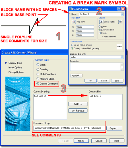
Illustrated to the right I use a Break Mark
as an example of a symbol with no text. As simple as this object may appear,
it is actually a good example to learn from.
To create your own Break Mark, use a blank
drawing such as the Acad.dwt and draw a break mark as you prefer it.
Draw it at a scale of one-to-one but consider that you have three primary
scaling options: None, by Drawing Scale and by Annotation Plot Size.
To keep from introducing unwanted Layer Names, you should put this object on
Layer 0; other properties can be ByLayer or ByBlock as you prefer (
for this, I use ByBlock ).
When done, make sure it is a single Polyline.
Then, place the midpoint of the zig-zag at 0,0,0 and make a Block of this
Object. Do not use spaces in the Block Name as those will be
interpreted as keyboard "Enter" strokes by the Aec Content Wizard.
Activate the Create AEC Content Wizard
(type CreateContent), set the Content Type to "Custom
Command", use the Add>>> button to include your Block Name
and proceed down to the Command String where this Block becomes more
than a common Block.
Command String:
_AecAnnoBreakMarkAdd _SYMBOL Cut_Line_3 _TYPE _Stretched
You can copy and paste the command string
listed above but another and likely safer way to get this string, is to use
the Edit... button on an existing Break Mark symbol in the DesignCenter and
simply Copy its Command String. After Pasting the Command String for
your custom Symbol, be sure to make the "SYMBOL" name match your Block Name
and be very careful about the Spaces between command line options; e.g.,
between "SYMBOL" and "Cut_Line_3", there is a single Space. |
To complete this example exercise, skip down to "AEC Content
Wizard - Insert Options" and continue by finishing the work in the
Create AEC Content Wizard. |
Symbols with
Attribute Text
| Links |
Aec Content Wizard
- for more information
on the Create AEC Content Wizard and the settings within it. |
All Documentation
Content that offers adjustable text uses Attribute Text and all
Attribute Text must be embedded in a Block in order to work as they
do. Working with these symbols is very similar to the work discussed
above but because these types of symbols are generally attached to something
else, like a Leader, Cut line or Cloud, the Command String tends to be more
complex.
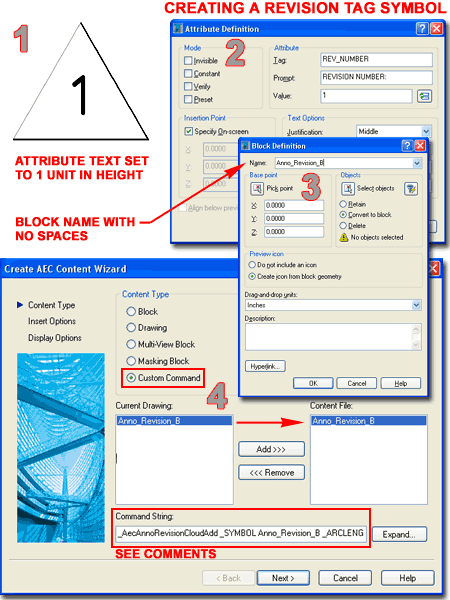
Revision Clouds are an
example of Documentation Content that uses a Block with Attribute Text.
For symbols such as this, all you have to do is draw the form, add one or
more Attributes, make a Block of it and use the AEC Content Wizard to
combine this Block with the Command String you want.
To create your own Revision Cloud Tag, use a
blank drawing such as the Acad.dwt and draw a revision cloud mark as you like it.
For the scale of this symbol use the Attribute Text as a guide by making it
one unit in height. Since text is a key component in this symbol, we
will rely on the AEC Content Wizard's option to scale according to
Annotation Plot Size. This will make the symbol larger than you are
likely to use for one-to-one but that is okay since it will automatically be
scaled when inserted.
As with other symbols, use logical Object
Properties, such as Layer 0 and By Block.
Use the "AttDef" command to
create the Attribute Definition and make a Block of the entire drawing using
a Name that has no Spaces in it. The insertion point should be
something logical. I found the tip or apex to work well for me; better
than the default center. Active the Create AEC Conetent Wizard and
follow the instructions outlined for the symbol discussed above.
Command String:
_AecAnnoRevisionCloudAdd _SYMBOL Anno_Revision_B _ARCLENGTH .75 _WIDTH
.03125 _COLOR _ByLayer
To complete this example exercise, skip down
to "AEC Content
Wizard - Insert Options" and continue by finishing the work in the
Create AEC Content Wizard.
|
 |
Symbols with
Fields
| Links |
Aec Content Wizard
- for more information
on the Create AEC Content Wizard and the settings within it. |
The most sophisticated
Documentation Symbols utilize Fields that are embedded as Attribute Text in
Blocks. Because these symbols use Attribute Text, you always have the
option to override the Field functionality by filling them in as you would
normal Attributed Blocks but this action will actually remove the Field.
Fields can always be reestablished, however, by right-clicking on the
Value
field of the Attribute Editor dialog; the only problem is that you really
need to understand how Fields work in order to do this.
 The
two primary Documentation Content Symbols that use Fields are Keynotes
and Callout Marks but you are free to employ them in as many creative ways
as you can come up with. Illustrated to the right I show a very basic
example of a Viewport Scale symbol that you can create to learn about how
Marks, Blocks and Fields interact with the Project Navigator. The
two primary Documentation Content Symbols that use Fields are Keynotes
and Callout Marks but you are free to employ them in as many creative ways
as you can come up with. Illustrated to the right I show a very basic
example of a Viewport Scale symbol that you can create to learn about how
Marks, Blocks and Fields interact with the Project Navigator.
In a blank drawing file, create an Attribute
Definition with a Text Height of one unit. For the Value field, use
the Insert Field button or right-click on your mouse to acquire the same
option off the Context menu. Once you have activated the Field dialog,
use the Field category drop-down list and set it to "SheetSet".
This action simply filters the list to a shorter length. On the
Field names list, Select "SheetSetPlaceholder" so you can specify
"ViewportScale" on the Placeholder type list. Set the Format as
you prefer your scales to be read. Make a Block of the Attribute Text
using the "Convert to block" option and a logical
Insertion Base Point (like lower
left). Make sure not to use any Spaces in the Block Name (use
underscores instead if spaces are desired). Save the current drawing
with this Block in it using a Name other than the Block Name (something like
"Viewport_Scale_Mark.dwg").
On the default Callouts tab of the Tool
Palette, copy an existing Title Mark and change the Tool Properties as
illustrated to the right:
Tag name - set this to the name of the Block you just created but in
order to do this you will first need to set the Tag Location to the
drawing file you just saved (Viewport_Scale_Mark.dwg).
Tag location - use the Browse option
to set a path to the drawing file you just saved.
Title mark and Title mark location - I
set these values to blanks because for this example we won't need more
Blocks.
Polyline width - We can't remove this
option because of how the Title Mark Tool was written but I set this value
to 0 and use the Esc key when it pops up while inserting the symbol - that
keeps the Polyline from being drawn.
To complete this example exercise, skip down
to "AEC Content
Wizard - Insert Options" and continue by finishing the work in the
Create AEC Content Wizard. |
Note:
The use of "placeholders" for Fields is pervasive with the
default Architectural Desktop Documentation Content. As the name
implies, a "placeholder" allows you to set a link to data that has yet to be
established. This is exactly how and why Sheet Keynotes, for
example, don't receive numbers until the Sheet Keynote Legend has been
inserted.
If you find this subject
confusing, hopefully you will find solace in the knowledge that there are
very few placeholder types at this time and I found myself desperate for more as
soon as started making my own symbols. If you look at the list of
placeholders for SheetSetPlaceholder, there are only nine; five are
for Sheet information and four are for View information. When I
attempted to create an Interior Elevation symbol like those I tend to use, I
found that I couldn't because there is no "placeholder" for Interior
Elevation Number. You have the option to work with the ViewTitle
( like Room Name ), ViewNumber ( direction), ViewportScale (
print scale ) and an option that combines ViewNumberAndTitle.
As you may notice, there is no ViewCustom option to allow you to create your own
"placeholder". |
|
6Modifying Documentation Symbols to Create your Own |
6-17 DOCUMENTATION |
| Working With
Existing Documentation Content
Symbol 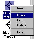 A lot of Architectural Desktop users start
the process of creating their own custom Content by working with the default
Content. Many users are also perplexed by the results of their efforts
when it doesn't work properly. In the following discussion I will use
the "customcolbub" from the Miscellaneous folder as my example of how you can
use existing content to create new content; of course, you can use this
information for most of the Content found in the DesignCenter A lot of Architectural Desktop users start
the process of creating their own custom Content by working with the default
Content. Many users are also perplexed by the results of their efforts
when it doesn't work properly. In the following discussion I will use
the "customcolbub" from the Miscellaneous folder as my example of how you can
use existing content to create new content; of course, you can use this
information for most of the Content found in the DesignCenter
Illustrated to the right I show that I have
used the Open Context menu option on the "customcolbub"
symbol in the DesignCenter. One of the more interesting things
about this symbol is that the drawing you see when you open this file has
little to do with the tool it serves as. The first clue is the fact
that the symbol is not in the form of a Block and the second clue is that
the Scale is enormous. As it turns out, this drawing is basically just
there to create a preview picture in the DesignCenter; you can actually
erase it and still have the tool.
To find the real components of any Content,
you need to look for Blocks. By using the Insert dialog I show that I
have located the only Block in this drawing file and it is Named "BubbleDef".
If you Insert this Block and use "Refedit" to modify it, Saving the Changes
Back to the Block, you will have succeeded in changing this default symbol.
A better method of working with existing Content is to use it as a basis for
your own custom versions.
Users skilled in using AutoCAD are often very
capable of modifying things like Blocks and Saving the File with a new name
but forget that there are other Names to consider. Illustrated to the
right I show the Rename dialog which should always be used if you want to
keep the original Block, however modified it may be. Even if you use
the Save As... option to save your new Content with a different Name, you
need to change the names of internal Blocks to avoid conflicts with Blocks
from existing Content. |
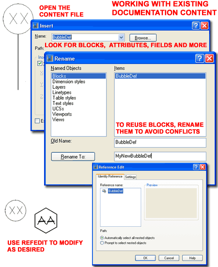 |
| Some Content uses
Multi-View Blocks, particularly Design Content, as a means to change
according to the current Display Configuration. In the case of
Documentation Content, MvBlocks can be used to create results like changing
Scale or turning Off under the Reflected Display Configuration (as is the
case with this example Column Grid Bubble symbol).
Illustrated to the right I show that you can use
the Rename context menu option to Rename existing MvBlock Definition Names.
This is also necessary when creating your own Content because of possible
conflicts similar to those for Blocks.
In Part 12 - Grids I discussed the need for a
grid extension that has no bubble attached to it; a common preference in
architectural drafting - especially for dimensioning. If you create a
New MvBlock Definition Style from Scratch and don't assign any View Blocks
to it, you can use this discussion to create a custom grid extension symbol.
If you wish to do this, Delete the existing "StandardGridBubble" MvBlock
Definition. Then, Purge the "BubbleDef" Block discussed above because
you won't need it and you certainly don't want it floating around in this
new file. |
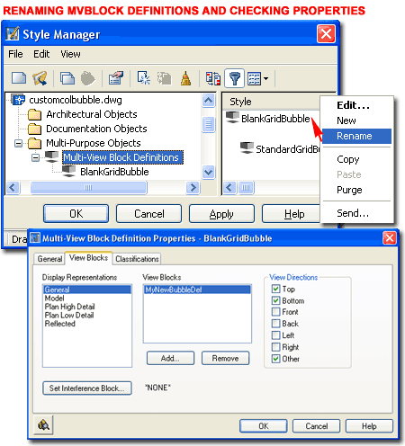 |
| After having
completed any and all modifications to existing Content, use the Save As...
menu option to Save the file with a New Name. The best location for
this new Content is next to the existing Content. If you wish to put
your new Content somewhere else, just make sure that you place it within the
"..\AEC Content\" folder for Architectural Desktop. If you don't place
your custom Content with this folder structure, it won't read under the
Custom tab of the DesignCenter and thus won't exhibit the proper
functionality designed into it with the Aec Content Wizard. You can
create new sub-folders within the existing system if you wish.
Illustrated to the right I show that I have
activated the Save Drawing As dialog to Save my example grid extension line
as "Grid Extension Line.dwg" to the same "Miscellaneous"
folder that the
existing "customcolbub" came from. As soon as you Close the
current drawing file, the DesignCenter will be able to show your new Content
item. I find that I usually need to go to another Content folder and then
back in order to force a full Refresh. Though there is a Refresh
Context menu option, it never seems to do the trick but jumping out and back
to the Content folder always works.
Once you have added New Content to the
DesignCenter, you can use the Edit... Context menu option, as illustrated in
the lower right, to activate the "Create AEC Content Wizard" where you will
need to make changes to accommodate any Block and/or MvBlock name
changes you may have made earlier.
In the case of this example Grid Extension
Line, I will need to keep the Custom Command Content Type, Add>>> the new MvBlock Name (BlankGridBubble) and change the "_SYMBOL"
Command String to
use this new MvBlock Name. The new Command String would read as
follows:
_AecAnnoGridBubbleAdd _SYMBOL GridBubbleBlank
- Note the spaces between letters.
After these changes you may or may not need
to make other changes on the remaining two pages of the Create AEC Content
Wizard dialog box. In the case of this example, no changes are needed
for the second page but you may want to create a new Image on the last page.
To learn more about the Create AEC Content Wizard and all of its options,
read the discussion below. |
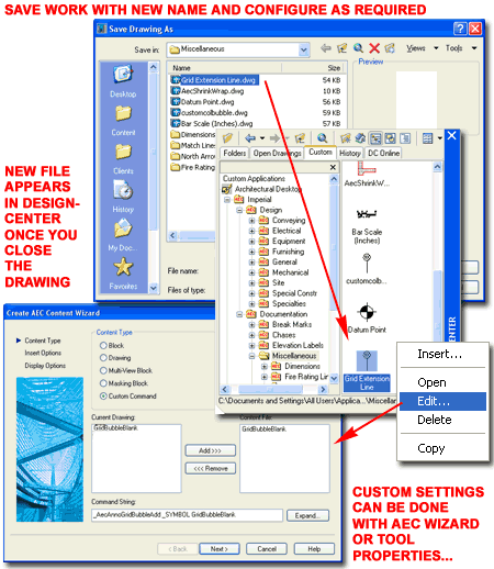
Note:
If the Content you created is not DesignCenter driven, then all you have to
do after you have Saved it with a New Name, is Add it to your New Tool
Palette tool as discussed under Symbols
with Fields. |
|
7AEC
Content Wizard |
7-17 DOCUMENTATION |
|
AEC Content Wizard Overview
The Create AEC Content Wizard is a tool
designed specifically for use with the DesignCenter. As it
stands, Tool Palettes are slowly replacing the special functionality the
DesignCenter offers Architectural Desktop users and with each new release,
more and more of the Command String macros tied to Documentation Content is being integrated into unique
Tool Palette icons.
Upon my last inspection I found
that there are still numerous DesignCenter Content items that only function
properly when using the encoded Command String. This explains why you
will still find ADT Content in the DesignCenter and though most of these
items have been "copied" to Palettes, they still defer functionality to the
original Command String. In the illustration to the right I show how
the Door Tag icon Properties offer no unique options; but if you
compare this to the Callout Symbols, you will see the type of options we
should and eventually will find here.
The unfortunate aspect of this
situation is that we are in the middle of a transition and if you intend to
modify or create custom Content based on some of the features only offered
through the use of the DesignCenter, then you will need to understand how
the AEC Content Wizard works. In my opinion, however, don't bother
learning this tool unless you really need to because I am quite confident
that it and the DesignCenter will be phased out at some time in the future. |
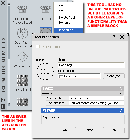 |
Command Strings
and the DesignCenter
| Menu |
Format> AEC Content Wizard... |
 |
 |
| Keyboard |
CreateContent |
| Links |
Create Aec
Content Wizard, Part 25 - 10 - for other information on the Aec
Content Wizard as it applies to custom commands, Blocks and so forth. |
If you look under the Documentation Content
Folder in the DesignCenter you should find a list of Folders categorizing
the type of Content within them. For each of these categories you can
type commands that will access the items within and provide special options
for how they will work in your drawing. I have never seen a list of
these commands nor are they as neatly organized as you might think; in fact,
they are somewhat sporadic and at times appear to have been created at the
time of need (AecAnnoBarScaleAdd, for example).
You can uncover these commands by using the
Edit.. Context menu option over any Documentation Content item to
read the Command String text. Below I list a few of the ones I know:
For each of these commands, you will find a set of command-line options as
they apply to the type of Object or Symbol they work with.
AecAnnoBreakMarkAdd
AecAnnoMvblockInterferenceAdd
AecAnnoElevationLabelAdd
AecAnnoRatingLineAdd
AecAnnoSymbolAdd
AecAnnoRevisionCloudAdd
AecAnnoScheduleTagAdd
Among the list, the "AecAnnoSymbolAdd"
is probably the easiest to understand because it really doesn't do anything
at all. In fact, I ran several tests on the default Content that comes
with ADT and it all works perfectly without the use of this command.
In other words, it is just a fancy way of Adding a Block. |
For a more complex command, you
might want to explore how the "AecAnnoScheduleTagAdd" command works.
If you type this command on the command-line, it will produce the following
output:
Command:
AecAnnoScheduleTagAdd
Property set definitions drawing <PropertySetDefs.Dwg>:
Select object to tag [Symbol/Leader/Dimstyle/Edit/Constrain/Rotation]:
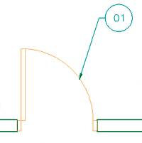 To
make this command behave as it would if you activated it via the
DesignCenter or a Tool Palette icon, you will need to manually input all of
the text typically done as a "Command String". First, you need to
provide the path and/or name (see note below) of the PropertySetDefs.dwg
where this Tag will extract the data to associate with the Object it was
designed for. Second, you will need to specify the Symbol name and
then you can move on to unique options such as Leader, Constrain and so on.
If you explore each option, such as using a Leader set to a specific Dimstyle, turn Edit Off but leave Constrain and Rotation in default mode,
you will soon figure out how simple this system is. If you like some
of these option combinations, you can create new Symbols that employ them
and I will discuss how to do that below. To
make this command behave as it would if you activated it via the
DesignCenter or a Tool Palette icon, you will need to manually input all of
the text typically done as a "Command String". First, you need to
provide the path and/or name (see note below) of the PropertySetDefs.dwg
where this Tag will extract the data to associate with the Object it was
designed for. Second, you will need to specify the Symbol name and
then you can move on to unique options such as Leader, Constrain and so on.
If you explore each option, such as using a Leader set to a specific Dimstyle, turn Edit Off but leave Constrain and Rotation in default mode,
you will soon figure out how simple this system is. If you like some
of these option combinations, you can create new Symbols that employ them
and I will discuss how to do that below.
Note:
You are likely to have trouble getting past the "Property set definitions
drawing <PropertySetDefs.Dwg>:" question because ADT may not understand
where to look for this file. The quick fix is to add the full path to
this file on the File Search Path in the Options dialog. The Statement
may look something like this: C:\Documents and Settings\All
Users\Application Data\Autodesk\ADT 2005\enu\AEC
Content\Imperial\Documentation\Schedule Tags\ |
|
AEC Content
Wizard - Content Type - Custom Command You can use the
Edit... Context menu option over any items in the DesignCenter to activate the
Create AEC Content Wizard dialog and see how it has been configured to work
in ADT. Illustrated to the right I show how a custom Block Tag was
created using the AEC Content Wizard.
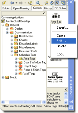 On
the Create AEC Content Wizard dialog, only the Custom Command Content Type
provides the option to use a custom Command String. By using the
Expand... button you can read the Command String a little better than you
can on the single line. You may also notice the Current Drawing and Content
File list fields with the Add>> and <<Remove buttons. These fields are
used to select the Blocks and MvBlocks that you want to insert when the
DesignCenter or Tool Palette icon is Selected. On
the Create AEC Content Wizard dialog, only the Custom Command Content Type
provides the option to use a custom Command String. By using the
Expand... button you can read the Command String a little better than you
can on the single line. You may also notice the Current Drawing and Content
File list fields with the Add>> and <<Remove buttons. These fields are
used to select the Blocks and MvBlocks that you want to insert when the
DesignCenter or Tool Palette icon is Selected.
For the example Block Tag that I show to the
right you will see that I have two items listed under the Conent File list;
one is a Block with Attributes and the other is the MvBlock containing the
Block. In order for custom content to work properly with ADT commands
and features, it must be turned into an ADT Object and the MvBlock is the
logical option for most Symbols.
Under the Command String which, if you
recall, uses one of those unique commands discussed above, the name of the MvBlock
is always specified with the Symbol option. In other words,
when an icon is used to activate the Content, one or more Objects are
inserted while a macro, the Command String, is triggered and it specifies
which Object to use as a "Symbol".
Illustrated above, right, under the Command String,
notice that I have used a Tag as my example. With Tags, you will need
to use the "AecAnnoScheduleTagAdd" command.
If you type this command on the command-line,
the first thing you will need to do is hit the Enter key and thus I show
that I have used a Space created with the Space Bar. The next prompt
for this command refers to the path and name of the Property Data Set
Definition used to attach and/or extract data from the Object to be tagged.
Unless you are using a unique file, the default "PropertySetDefs.dwg" file
will suffice and all you have to do is put this into the Command String as:
"_AecAnnoScheduleTagAdd PropertySetDefs.dwg". |
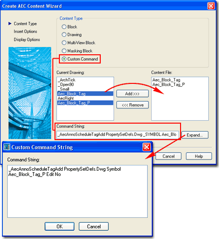
For the third set within the "AecAnnoScheduleTagAdd" command, there are several
options that relate
specifically to the process of tagging and the most important option is the
specification of the Symbol Name. To continue with the logic and
structure of the Command String, notice that it take another Space to get to
this part and then each option can be specified followed by a Space and the
response. In other words, for the Symbol specification I show the
following: "_AecAnnoScheduleTagAdd PropertySetDefs.dwg Symbol
Aec_Block_Tag_P"
Maybe now you start to see why
underscores are used in most long filenames in ADT. After specifying
the Symbol name you may not need to add more to the Command String but I show
that I have added one of my favorite options: the deactivation of the
Property Set Data dialog. You can use this option to avoid having to
fill in information or even see any dialog when tagging objects. My
example Command String now looks like this: "_AecAnnoScheduleTagAdd
PropertySetDefs.dwg Symbol Aec_Block_Tag_P Edit No"
Note:
The use of the underscore character ( _ ) before commands and options
is for language-independence and is actually not required if you only
plan to use your custom work on ADT in one language. The use of the
underscore character in Symbol Names is required to avoid having the Space
interpreted as an "Enter". |
|
AEC Content
Wizard - Insert Options On the
second page of the Create AEC Content Wizard dialog, you will find the same
set of options that you have for all Content created with this Wizard.
When Editing or Creating new Documentation
Content, you will need to focus on the options that relate to Annotation.
INSERT OPTIONS
Explode On Insert - this checkbox option is only available for Blocks,
Drawings and MvBlocks. This option is identical to that for Blocks
where you can have them Explode upon insertion; thus becoming primitive
Object types. This is rarely a good option.
Preset Elevation - this value field
can be used to specify a Z-axis height for insertion relative to the
absolute World Coordinate System. A better choice is to use the X,Y,Z
Offset values available on Tool Palette icons.
Anchor Type - this drop-down list
offers numerous Anchor options for what you want your Symbol to Anchor to
when inserted; i.e., a Wall Anchor declares that you only want to connect
your Symbol to Wall Objects. Fluorescent Light Fixtures, for example
(which are Mask Blocks), Anchor to Nodes because Ceiling Grids have Nodes to
Anchor to and this keeps the Symbols hooked to the Grid. Generally, I
find little reason to specify Anchors for Documentation Symbols but perhaps
you will see things differently. You can easily experiment by Editing
a Symbol and then resetting it if the results are undesirable.
ATTRIBUTE TEXT STYLE
As Defined by Content - this radio button forces the text to remain in
the Style of origin. When creating Content for many offices this is a
tough one to use but in a single office you may find this option quite
useful because users often forget to preset the Text Style when Inserting
Documentation Content.
Target Drawing Text Style - this radio
button changes the Text Style in the Tag to match the current Text Style in
the drawing when inserted. For this option you will find that
using the Standard Text Style is best because that prevents the introduction
of any other Text Styles when the Content is inserted.
SCALE
X,Y and Z - these three value fields can be used to define unique
scalar proportions and can be used as multipliers of the Annotation or
Drawing Scale as set under the "Additional Scaling" section. If, for
example, you find that a Symbol is coming in a little too large you may want
to set the Scale of X,Y and Z to .75 while leaving the Annotation Scale set.
This will allow the Symbol to scale as required to match the drawing and
annotation scale but be 3/4 the original size.
Additional Scaling - this section offers
three options: None, Annotation and Drawing. "None" would
typically be used for Symbols such as Furniture and Appliances that may be
drawn at true size. "Annotation" reads the "Annotation Plot
Size" value back on the
Drawing Setup dialog and matches that against the
drawing Scale to produce the desired size. "Drawing" reads the
drawing Scale and scales directly according to that value; i.e., a drawing
scale of 1:48 would scale the Symbol by a factor of 48.
Enable AEC Unit Scaling -
this checkbox can be used to convert or scale objects based on the Drawing
Units ( as set on the Drawing Setup dialog ). An Imperial based Range,
for example, will scale up by 25.4 when inserted into a Metric drawing
configured for Millimeter Drawing Units. Generally, this option is
used for Objects but not Documentation Symbols.
|
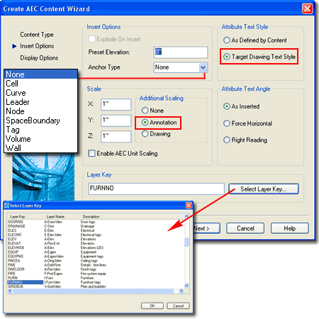 ATTRIBUTE TEXT ANGLE
These options only work with commands that were designed to take
advantage of them; commands like those for section, elevation and interior
bubbles (AecAnnoElevationMarkAdd). Though you can still work
with the old commands, they have been migrated to the Tool Palettes for more
effective and efficient use. For the remaining Content and
corresponding commands, I have found no examples where these "Attribute Text
Angle" options do anything at all.
As Inserted - this radio
button can be set to keep attribute text oriented based on the angle of the
Symbol it is associated with.
Force Horizontal -
this radio button can be set to force attribute text to orient along the
X-axis of the current UCS icon. Typically, this means horizontal along
the X-axis of the WCS.
Right Reading - this
radio button can be set to force attribute text to read from left to right
preventing results like upside-down text. This option is particularly
useful on Symbols using Leaders where you want the Symbol to match the angle
of the leader but the text to read from left to right towards the center.
LAYER KEY
Select Layer Key... - this button can be used to Select a Layer Key from
the current Layer Key Style and will thus place the Symbol on the matching
layer when inserted. The Name and the Properties of this Layer Key can
be read using the LayerKeyStyle command. |
| AEC Content
Wizard - Display Options
For the last phase (third page) in creating custom
Documentation Content with the Create AEC Content Wizard dialog, you simply
specify the File Name and location, the Icon graphic and any Description you
may want to add. Illustrated to the
right I show some of the connections between the AEC Content and ADT tools
that you may want to think about when making custom Content.
File Name - use the Browse...
button if you are performing a Save As.. routine and wish to provide a
new name and location for the Content. Remember that the
location
of the new content is critical if you expect it to work under the Custom tab
of the DesignCenter. Current Drawing
- use this checkbox if you are converting the current drawing file
into the custom Content. Typically I don't use this option because I
see the current drawing as a scratch space where I created the solution to
be Saved As...something else. When you save the current drawing file you may
also include things that you don't want but if this option is what you wish
to use, be sure that the
location
of the file is appropriate as discussed above.
New Icon... - use this button when
you want to use a custom graphic image to be used in the DesignCenter and,
if the Content is dragged over to a Tool Palette, the tool image.
Though the DesignCenter uses a smaller pixel ratio for the image, I
recommend using a 64 pixel x 64 pixel ratio. Though you can use
numerous image formats as tool icons, you can only use .bmp's for the
DesignCenter tools. If one of the DesignCenter tools is dragged over
to a Tool Palette, the .bmp is automatically converted to a .png image.
Default Icon... - use this button
when you want to use the Model Space Extents as the graphic image used in
the DesignCenter. For best results, Zoom to the Extents of your Model
Space drawing and change the background color to White using the Display tab
of the Options dialog. Once complete, the image is embedded with the
drawing file so you cannot Open it with a Photoshop-like program to modify.
If you need a better image, consider creating it with a Photopshop-like
program and use the New Icon... button - see discussion above.
Detailed Description - use this text
field area to write a description of the custom Content. You will
find this text in the Description tile of the DesignCenter and,, on the
Description dialog and tool tip ( when you hover over a tool ). |
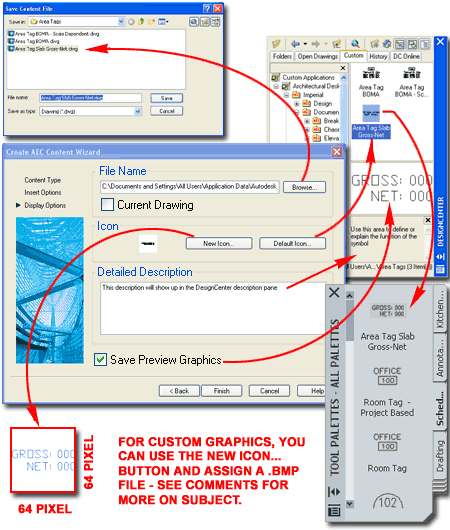
Save Preview Graphics - use this
checkbox if you want the Content saved with the standard Preview image
typically associated with drawing files. This preview image can be
viewed in the preview tile of the DesignCenter and is often helpful for
Objects that are hard to read in the smaller graphic.
Note:
If uncertain or unfamiliar with how the Content Path Settings work with
the Custom tab of the DesignCenter, be sure to read up on this subject
under,
Design Content - Path settings - Options dialog. |
|
8Documentation - Customizing and Tricks |
8-17 DOCUMENTATION |
| Command String for custom commands
The Command String option on the
Create AEC Content Wizard dialog is not limited to Documentation Content
Symbols and you can actually use it to create just about any macro-based
routine you can think of. Consider something as simple as drawing a
Line that Keys to a specific Layer.
Illustrated to the right I show that I have activated the Create AEC
Content Wizard dialog, set the Content Type to Custom Command
and simply written a common AutoCAD command, "Line". On the
second page of the Wizard you can use the Layer Key option to set a specific
Layer and finish the process of saving the work to a unique file to be read
by the DesignCenter; i.e., in a location that the DesignCenter will read
under the Custom tab. If you expand on
this capability you might find some interesting solutions for the work you
do. Keep in mind, however, that Tool Properties are absorbing many of
the options offered by the Wizard and thus you may want to look to them
before investing too much time here. |
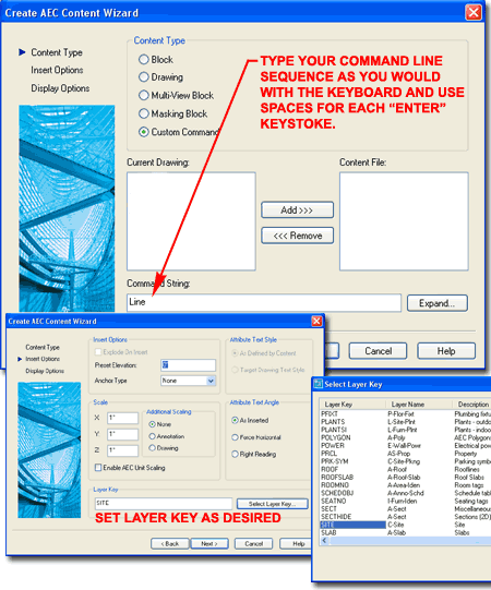 |
 Architectural Desktop
2005 - Development
Guide
Architectural Desktop
2005 - Development
Guide