| 1Stairs - Railings Access |
1-7 STAIRS - RAILINGS |
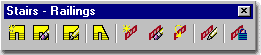
How do I get this toolbar?
You can also acquire access to some of these commands from the Alternate Design
pull-down menu. From the Design pull-down menu, pick Stairs
> and cascade to their respective command options - see image below,
right. This toolbar is an optional tool and is not needed to use this guide but may
help. |
 |
| Stairs and Railings pull-down menu
 Stairs
and Railings are one of the more intriguing Objects in Architectural
Desktop because in most of my professional experience these items are given very little
attention in standard Plans, Elevations and Sections because high detail would be too
complex at those scales. In other words, the complexity is left for details that are
drawn with traditional 2D linework. Stairs
and Railings are one of the more intriguing Objects in Architectural
Desktop because in most of my professional experience these items are given very little
attention in standard Plans, Elevations and Sections because high detail would be too
complex at those scales. In other words, the complexity is left for details that are
drawn with traditional 2D linework.
The primary problem with both Object types is that they
offer (and consequentially require) a growing body of input before you can get useful
results. Railings, for example, are often drawn as a simple line in Plans but in ADT
you can end up with Post, Balusters, Guardrails, Handrails and more. Though I happen
to find great pleasure in working with Railing Styles, it is easy to understand why some
designers get frustrated with these Objects and simply draw 2D lines instead. For
Stairs, the fundamental problem is that a designer really has to understand a great deal
about how the Styles are configured and about how Stairs are really constructed in the
physical world.
The answer to most of the problems you may face in working
with these Objects is to go through the Style Settings and configure your own Styles so
you can get the quick results you expect ( those results should be faster than drawing
treads as 2D lines ). One example of what you are up against is the fact that most
of the default Stair Styles that come with ADT, like Wood-Housed, are configured for
commercial use as defined by the Uniform Building Codes in the United States of America.
In the sections below we will look at numerous options that
I hope will allow you to produce just about any Stair Style you need with just about as
much or as little detail as you desire. Having said that, be aware that there are
also significant limitations and you may not be able to get exactly what you need.
For several years now, for example, I have tinkered with escalators and you can see the
latest work in the i-drop
area. Under the Customization and Tricks section I have a Glass Stair Style that you
might want to look at as well. |
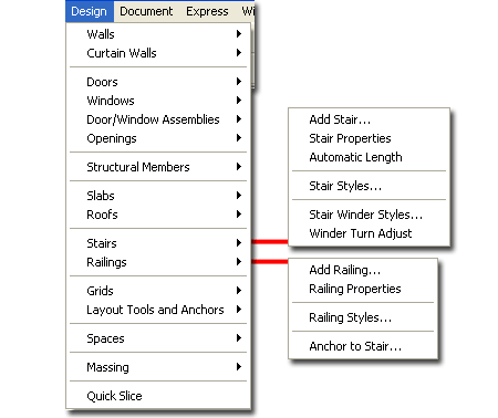 On the command line, you can type "Stair"
or "Railing" when you want access to many of the Stair and
Railing creation options. For direct access to an option within the Stair or Railing
command-line menu, you can type the primary command plus the option you want direct access
to. For example, if you want to Add a Stair, you can type "StairAdd"
or if you want to Modify a Railing, you can type "-RailingModify".
Below is the command-line read-out for "Stair"
and "Railing":
Command: STAIR
Stair [Add/Convert/Properties/Styles/customize Edge]:
Command: RAILING
Railing [Add/Convert/PRoperties/Styles/POsts]:
Note: for metric values
below, I have used parentheses ( ) after most Imperial units. Those
parenthesis without the "mm" in them have been stated that way to avoid
confusion when a user types in these values - since AutoCAD does not accept
"mm". You will see values like ( 200 ) and ( 200mm ) and they are meant to
reflect the same numerical value. |
| 2Loading Stair and Railing Styles |
2-7 STAIRS - RAILINGS |
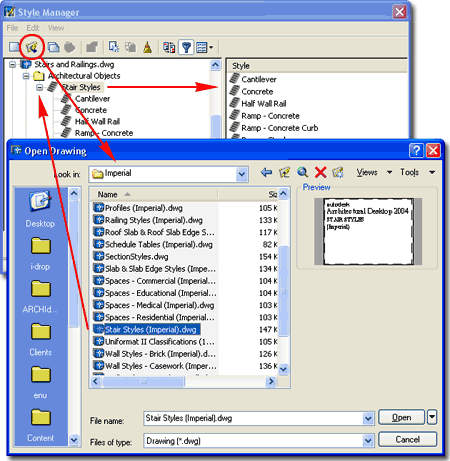
| Opening Stair and Railing Style templates in the Style
Manager
ADT comes with a short list of predefined
Stair Styles but a fairly extensive list of predefined Railing Styles
that you can only access through the Style Manager. If you do a lot of work with
Stairs and Railings, you may want to assemble a list of predefined Styles in the Content
Browser and/or as a Palette
where you can preset the Defaults.
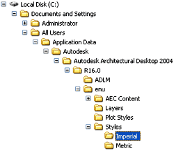 Both
the Imperial and Metric folders contain similar Styles
folders within which you will find one Stair and one Railing Style template drawing file. Both
the Imperial and Metric folders contain similar Styles
folders within which you will find one Stair and one Railing Style template drawing file.
For local installations of ADT, you are likely to find the Imperial
or Metric Stair and Railing Styles in the Styles
Folder as illustrated to the left. The full path to this location may vary
but typically it is as illustrated. On a Network based installation of ADT, these
Styles should be on a captured drive (like "G:\offices standards") or similar
location with a folder name that indicates Styles. Consult your CAD or IT manager if
you cannot locate the Styles Folder.
|
 Stair Styles (Imperial).dwg
Stair Styles (Metric).dwg
Railing
Styles (Imperial).dwg
Railing Styles (Metric).
Illustrated
above, I show how you use the Style Manager, filtered for Stair
Styles, to Open the Stair Style template file from ADT's Styles
folder. The process is much like Opening a drawing for editing. |
| 3Adding Stairs |
3-7 STAIRS - RAILINGS |
Add Stairs Properties Palette
| Menu |
Design>Stairs>Add
Stairs... |
 |
|
| Keyboard |
StairAdd |
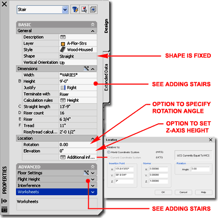
When adding Stairs, the Properties
Palette offers an extensive list of options and features that can be a bit
overwhelming at first glance. Some of the options will change, lock or introduce
other options and some are tied to the current Stair Style as set in the Style drop-down
list. The Straight Shape
is a good place to start. Below is a list of the more common options; look to the
specific Stair Shapes for more options.
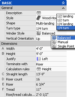
GENERAL
Style - a drop-down list offering a list of currently loaded Stair Styles.
Type StairStyle or use the Content Browser to load other Styles. Since creating
Stair Styles can be a bit tricky, I recommend that you load the default Styles and use
them as a place to start from. Many of these Styles can be modified to produce other
results in less time than it takes to create new ones from scratch.
Shape - a drop-down list offering four
choices: U-shaped,
Multi-landing,
Spiral and Straight.
U-shaped and Multi-Landing Shapes provide the option for yet another Style called a Stair Winder Style when combined with 1/2 or 1/4
Turn Types ( not illustrated ).
Vertical Orientation - a drop-down list
offering two choices: "Up" or "Down".
Stairs drawn Down will drop below the current plane of reference and the Display
Properties will interpret "Up" and "Down" Display Components
accordingly ( which is opposite of the "Up" Stairs ). Spanning Multiple
Floors is a separate subject that is not necessarily resolved by drawing Stairs
"Up" or "Down". Typically I draw all Stairs as "Up".
DIMENSIONS
Width - a value field where you specify the full width, outside edge to outside
edge, of your Stairs.
Height - a value field where you specify
the full height for your stairs. In the default template files, included with ADT,
this measurement is from Finished Floor to Finished Floor but you can
change this default to a measurement from "Rough Floor to Floor"
- see AEC Object Settings tab of the Options dialog
box. The difference between these two settings is how Top and
Bottom Floor Offsets are interpreted by the Height Dimension. If you use Rough Floor
to Rough Floor, the Height will always display as the original specification and will not
display the difference set by Floor Offset Values. For the Finished floor to
Finished Floor, setting, Floor Offsets affect display of the Stair Height. Typically
I use the Finished Floor to Finished Floor option because ADT just doesn't offer enough
general options to get to the detail level of sub-floors, bottom plates and so forth;
Slabs, for example only have one component for the thickness.
Justify - a drop-down list offering three
choices: Left, Center and Right. Typically I find that drawing stairs from an edge
using Right or Left so that I can run along the edge of a Wall is easier than using the
Center Justification. On U-Shaped Stairs, using a Right or Left Justification can
prove to be very beneficial in the creation of this type of Stair Shape ( see comments for
U-Shaped Stairs below).
Terminate with - a drop-down list offering
three choices: Riser, Tread and Landing.
Using the Riser option for the termination of Stairs tends to be the most common
solution even if you don't want to show a Riser on the last step ( I often cover it with
my Floor Slabs ). This allows you to specify the true Floor-to-floor height and take
advantage of the Calculator tools within the Stair Styles. Landing settings are set
on the Stair Style's Properties dialog box under the Landing Extensions tab. This
option produces different results on different Stair Shapes; on U-shaped Stairs, for
example, the termination landing will be a full length landing matching the middle
landing.
Calculation Rules - see comments below.
LOCATION
Rotation and Elevation - value fields only available when Modifying
Stairs.
FLOOR SETTINGS
See the discussion for Height and how the Stair Settings section of the Options dialog can
affect how these values are interpreted.
Top offset - a value field in which you can specify a positive number for
a height above the actual specified Height or a negative number below the actual specified
Height. This type of option is usually used to compensate for finished floor
materials.
Top depth - Note: The Top and Bottom Depth settings currently have no effect on the stair
or stringers. In addition, the top offset has no visible effect on the stair. Bottom
offset extends or truncates any attached stringers. Both offset values affect the rough
floor-to-floor height, if it is displayed. " - quoted from the Autodesk®
Architectural Desktop 2004 User's Guide.
Bottom offset - a value field in which you
can specify a positive number for a height above the stair origin as originally drawn or a
negative number below the original origin. The origin of a Stair is usually at Z=0
of the World UCS icon. Negative numbers on this option may produce unexpected
results relative to Stringers and other design features so be careful when working with
negative number for this value field. This type of option is usually used to
compensate for finished floor materials.
Bottom depth - see comments for Top Depth. |
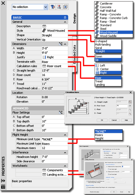 FLIGHT HEIGHT
Minimum Limit type - a drop-down list offering three choices: *NONE*,
Risers and Height. For Risers, you will be able to
specify a Riser Limit in the value field below. For Height, you will be able to
specify a Height Limit in the value field below.You can use these options as additional
design rules on a Stair-by-Stair basis. This Limit option is a little weird and I
generally prefer to leave it set to *NONE*. The Riser Limit, for example, does not
limit the first flight on Multi-landing Stairs but only the flights after the first.
Maximum Limit type - a
drop-down list offering three choices:*NONE*, Risers and
Height. This option is similar to the Minimum Limit type - see
comments above. When used with Straight Stairs, for example, it will force landings
at points where the Maximum height has been reached and can thus be a terrific option for
designing code compliant stairs that need to cover excessive heights ( this often occurs
on exterior stair designs ). Landing
Lengths are set on the Stair Style's Properties dialog box.
INTERFERENCE
Headroom height - a value field where you can specify the head clearance you want
above your stair treads and landings. The primary function of this value is for
cutting or Adding Holes in Slabs. If you have a Slab above a Stair, you can use the SlabHole command to
Select the Stair Object and cut a hole wherever the Headroom height requires it for proper
clearance. The Model Display Representation for
Stairs offers the Clearance Display Component, Off by
default, that you can turn On to see the Headroom as a 3 dimensional mass.
Side Clearance - a value
field where you can specify the headroom clearance for the sides of your stairs.
Just as with the Headroom height, this is an option well suited for use with the SlabHole command to
create a clearance hole in a floor slab around a Stair Object. This value affects
both sides of a Stair equally. See comments for Headroom height.
WORKSHEETS
Under the Worksheets section of the Properties Palette, you should find that there are two
dialog box options: Components
and Landing Extensions.
These are actually tabs of the current Stair Style's Properties dialog box that
have the option for unique settings per Stair Object; ranging from riser and tread
dimensions to landing dimensions. To activate this "freedom", see the
equivalent tabs on the current Stair Style's Properties dialog box and look for the "Allow
Each Stair to Vary" checkbox option at the top. These dialog boxes are
not set to be available for the default Stair Styles that come with ADT. |
| Calculation Rules dialog box Calculation rules - picking on this option will activate the
Calculation Rules dialog box illustrated to the right. The
Calculation Rules are based on the current Stair Style's Design Rules
settings but you can release as many as two automatic settings at a time and 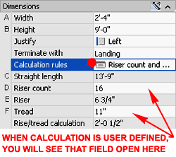 work with these settings in user defined mode. The changes you make on
the Calculation Rules dialog are reflected on the Properties Palette where user-defined
fields will now be free for input values. Though you can use the Calculation Rules
dialog to "tweak" and fine-tune difficult stair designs, I find that leaving all
of these settings as "Automatic" works best. You can quickly determine if
the Calculation rules are all set to automatically calculate the four values by the fact
that C, D, E and F
value fields on the Properties Palette are gray and that the Calculation rules field reads
"Height". work with these settings in user defined mode. The changes you make on
the Calculation Rules dialog are reflected on the Properties Palette where user-defined
fields will now be free for input values. Though you can use the Calculation Rules
dialog to "tweak" and fine-tune difficult stair designs, I find that leaving all
of these settings as "Automatic" works best. You can quickly determine if
the Calculation rules are all set to automatically calculate the four values by the fact
that C, D, E and F
value fields on the Properties Palette are gray and that the Calculation rules field reads
"Height".
One good example of when to use this option is when you are
drawing a Stair from an existing condition that you measured on-site. You may need
to manually set a known Riser height or Tread depth based on those known values. If
both come out incorrect no matter what you do, you will probably need to change the Code Limits on the Design
Rules tab of the current Stair Style.
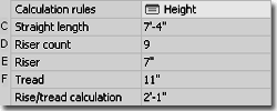
C or A - Straight Length - a way to change
the full length for a flight of stairs that is similar to using Grips to change the
length. When you release this value field, you can only release the Riser Count at
the same time. Since changing this value often produces dialog alerts and even
Defect Warnings, you may need to uncheck the "Use Rule Based Calculator"
option on the current Stair Style's Design Rules tab in order
to use this option more effectively. |
 D or B - Riser Count - a way to
modify the number of Risers over the specified length. When you release this value
field, you can release either Straight Length or Tread. If you specify a
number of Risers that forces the Riser Height value above or below its limits (
7" and 4" or 200mm and 140mm respectively, by default) you will get the
"out of range" error message. To make this error message go away, either
change the Upper Riser value limit on the Design Rules tab of the
Stair Style, or specify an appropriate number of risers for the total height of your
stairs.
E or C - Riser - a way to
modify the height of the Risers over a flight of stairs. When you release this
value field, you can release either Straight Length or Tread. See comments for Riser
Count as they relate to working within the Code Rules range.
F or D - Tread - a way to
modify the width of the Treads over a flight of stairs. When you release this value
field, you can release either Riser Count or Riser. Tread Depth limits, like Riser
Height limits are governed by the Design Rules tab of the current Stair Style; see
comments above. |
Convert to Stair
| Menu |
N.A. |
| |
N.A. |
| Keyboard |
StairConvert |
Another way to create Stairs is to use a command that has
remained undocumented for quite some time now called Convert to Stair.
The only way you can access this command is to type "StairConvert"
on the command line. Once you have tried this command you may come to understand why
this is the only way to access it.
In the illustration to the right I show some examples of
how this command reads Polyline Objects and what it creates as a result. For
multi-segmented Contiguous Polyline shapes, the result is usually a Multi-Landing
1/4 Turn Stair Shape. For single Polyline shapes,
including Arcs, the result is usually a Straight Stair Shape. You
cannot use this command to create cool spiral/winding stair designs.
For other Pline related options as they relate to Stair
Shapes, see Customize Edges below. |
 |
| 4Adding U-shaped Stairs |
4-7 STAIRS - RAILINGS |
Add Stairs - U-shaped
| Alt. Menu |
Design>
Stairs> Add Stair... |
|
|
| Keyboard |
StairAdd |
| Links |
Add Stairs Properties Palette - for more information
on how other Palette settings can be used to create different results. |
Adding the U-shaped Stair Shape is similar
to adding most of the other stairs. For U-shaped Stairs you have two Turn
Type options to choose from: 1/2 Landing and 1/2
Turn. You also get to choose between a Clockwise or Counterclockwise
Horizontal Orientation.
 Illustrated
to the left I show a portion of the Properties Palette for the stairs
created in the illustration above right. When adding U-shaped Stairs, it is helpful
to set the Justify value to assist you in creating an appropriate gab
between the up flight and the down flight. In the illustration I show that I am
using the Left Justification combined with the Counterclockwise direction
to allow me to specify the distance between the two flights directly rather than using
center-to-center or right-to-right. Illustrated
to the left I show a portion of the Properties Palette for the stairs
created in the illustration above right. When adding U-shaped Stairs, it is helpful
to set the Justify value to assist you in creating an appropriate gab
between the up flight and the down flight. In the illustration I show that I am
using the Left Justification combined with the Counterclockwise direction
to allow me to specify the distance between the two flights directly rather than using
center-to-center or right-to-right.
Once completed, I show the results of my Stair which has
more graphical information than I care to show and the need for changes to the landing
dimensions ( see "A" ). One
way to change the graphical information is to choose another Display Configuration,
like Medium Detail, or change the current Display Representation.
For the Landing situation, I had to change the Stair Style's Landing Extension
values in order to create the results that I show labeled as "B"
where the Tread lines meet at the very edge of the Landing.
In the 3D View, I show that though using a Tread to
Tread Alignment Type for this example Stair produced a plausible solution in Plan
View, it did not do so in 3D. To create a more plausible solution for the 3D View, I
show that I changed the Alignment Type to "Riser to Riser" (see
illustration, left).
See below for more on Constraint options for U-shaped
Stairs. |
 |
Creating "U-shaped", "1/2 Turn", Stairs
| Links |
StairWinderStyle - see this
section for more information on Winder Styles and results. |
Illustrated to the right I show two examples of the U-shaped
1/2 Turn Stair Shapes using two different Winder Styles.
In general, I do not find the 1/2 Turn Turn Type useful for any stairs existing or new
that I come across. If you have a practical application for this type of Stair I'd
like to hear about it just out of plain curiosity.
In the illustration to the upper right I show what happens
when you use the default Wood-Housed Style and the default Balanced
Winder Style. This Stair is basically ludicrous
so I also show my efforts to make something more practical.
In the illustration to the lower right I show that I
created a custom Winder Style using the Single
Point Winder Type option. Since this combination of options produced
nothing but Defect Warnings, I also changed the Stair Style to a Cantilever so there would
not be any Stringer cleanup conflicts. Unlike the Balanced Winder Style, the Single
Point left the side treads alone and only wound those around the landing as illustrated to
the right.
When working with these types of Stairs, keep in mind that
you have some extra Modification tools such as the WinderTurnAdjust
command and the Edit Turns
Grip-like Marker. Also, when working with stairs that tend to create Defect
Warnings, try to remove Nosing Values, Landing Extensions and even Risers for better
results. |
 |
| Stair Properties - Constraints For U-shaped Stairs there are several Constraint
options on the Properties Palette to
assist in positioning the Riser alignment. Since
you cannot use Grips to Stretch the Up or Down flights between the Landing, you will need
to use the Constraints to adjust Riser positions and location of any uneven Riser count.
Keep in mind that U-shaped stairs only have a limited amount of flexibility
in Riser Position and if you desire a more staggered relationship between the Up and Down
Risers, you may need to use a Multi-Landing Stair Shape or even two separate Stair Shapes
that are Anchored to a Landing. For control over Riser position directly related to
the Landing, see the Landing
Extension options on the Stair Style's dialog box.
 Alignment - There are four different ways to align the steps
on one side of a U-shaped stair to the other side: Free, Tread to
Tread, Tread to Riser and Riser to Riser. The
Free option does not have an Offset value. Alignment - There are four different ways to align the steps
on one side of a U-shaped stair to the other side: Free, Tread to
Tread, Tread to Riser and Riser to Riser. The
Free option does not have an Offset value.
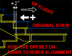
Alignment Offset - the distance you want
your up Treads or Risers to vary from your down Treads or Risers with
respect to the Alignment option. If you use Tread to Tread for an alignment,
for example, and use 0" for the Offset value, then the Stairs should match on both
sides of a U-shape. Use a positive number and the up flight moves forward of
the down flight. Use a negative offset and the up flight moves backwards towards the
landing with respect to the down flight. Be aware that as you move the up flight back and
forth, the down flight will compensate with the gain or loss of an additional riser and
the landing may also be adjusted to compensate for this change. Also,
keep in mind that the down flight ( down from the landing to the floor ) remains static
with respect to the insertion point while the top riser of the up flight will move freely.
|
Extend Alignment - this
drop-down list offers two choices: Lower Flight and Upper
Flight. Choosing one sets the flight affected by the alignment
choices you make for Alignment Type and Alignment Offset; i.e., you can affect the Up
Flight or the Down Flight relative to the Landing.
Uneven Tread On - this
drop-down list offers two choices: Lower Flight and Upper
Flight. Choosing one for Stairs that are unevenly distributed
between the landing will set the flight that gets the extra tread. To see and
understand the effects of this option it helps to set the Stair to "Terminate
With" a "Tread". |
| 5Adding Multi-landing Stairs |
5-7 STAIRS - RAILINGS |
Add Stairs Properties Palette - Multi-landing
| Alt. Menu |
Design>
Stairs> Add Stair... |
|
|
| Keyboard |
StairAdd |
| Links |
Add Stairs Properties Palette - for more information
on how other Palette settings can be used to create different results. |
 Adding
the Multi-landing Stair Shape is similar to adding most of the other
stairs. For Multi-landing Stair Shapes you have 4 Turn Type
options to choose from: 1/4 Landing, 1/4 Turn,
1/2 Landing and 1/2 Turn. Adding
the Multi-landing Stair Shape is similar to adding most of the other
stairs. For Multi-landing Stair Shapes you have 4 Turn Type
options to choose from: 1/4 Landing, 1/4 Turn,
1/2 Landing and 1/2 Turn.
As you create Multi-landing stairs, pay close attention to
the graphic display. If you pick beyond the rectangle and stair riser count, you
won't have the opportunity to shape the stair with landings; i.e., you will just get a
straight run. If you pick somewhere short of the stair's full run, you should notice
that the Riser Count locks while you are able to draw the landing length and direction.
Once you have picked a second point to form the landing, the Stair Riser count should
begin to count again as you see risers form on the screen. Continue this procedure until
you have run out of risers for the given height.
The 1/4 Turn and 1/2 Turn
Multi-landing Stairs do not have landings at the bend point but use a Winder Style instead
to determine how the risers "turn" at the corner. When you specify 1/4
Turn or 1/2 Turn as the Turn Type, you should notice the option to select one or more Winder Styles. For these Stairs,
simply pick a starting point, the bend or turn point and a final point out beyond the end
of the full run.
The 1/4 Turn Multi-landing Stair Shape
will often produce one or more Defect Warnings due to problems with
Stringer conflicts or Riser/Tread conflicts. See comments below for examples of
Stringer changes. For Riser/Tread problems, I have found that reducing the Nosing Length to zero often resolves such
conflicts.
The 1/2 Turn Multi-landing Stair Shape
appears to be a defective design option because I have yet to get this combination to
produce anything but the result illustrated to the right ( Defect Warning ). |
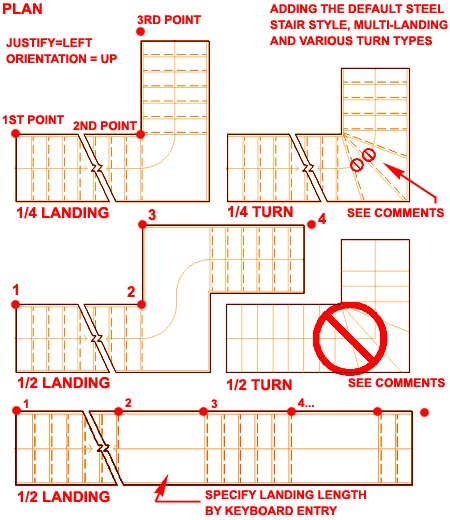
Note:
Remember that you can always specify a length by typing it on the command line. So,
instead of picking a point in space for a landing, you can type 3' ( 914 ) on the command
line and create a landing that is exactly 3'-0" ( 914 ) long. |
| Creating "Multi-landing", "1/4
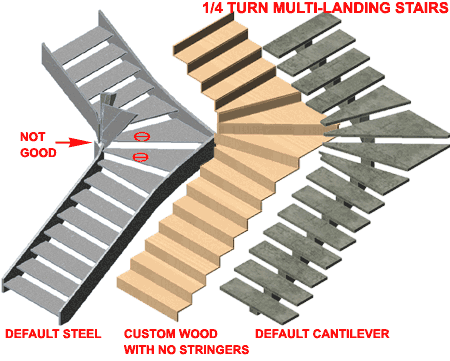
Turn", Stairs Illustrated to
the right I show some three example 1/4 Turn Multi-landing Stair Shapes and
how some Style features may cause Defect Warnings and incorrect 3D results such as that
illustrated by the Default Steel Stair Style.
Though you can work with Winder Styles, Edit Turns and even control the riser numbers at corners, these tools may not
eliminate problematic results.
Illustrated to the right I show how a custom Wood Stair
Style, that has been simplified by eliminating all Stringers, produces no Defect Warnings
like its Steel counterpart. I also show how another Style, like the default
Cantilever, may help to resolve such issues. Though these may not produce the right
results in Sections, Elevations or 3D Views, it may be the only way to get the right
results in Plans. |
 |
| 6Adding Spiral Stairs |
6-7 STAIRS - RAILINGS |
Add Stairs Properties Palette - Spiral
| Alt. Menu |
Design>
Stairs> Add Stair... |
|
|
| Keyboard |
StairAdd |
| Links |
Add Stairs Properties Palette - for more information
on how other Palette settings can be used to create different results. |
Spiral Stair Shapes are relatively easy to
draw provided you are working with large radii. The trouble starts when you start to
pull the radius closer and closer to the center to create actual spirals instead of simple
circular stairs. I will discuss the true spiral stair below and focus on the basic
concepts here.
The Spiral Stair Shape offers unique settings that are all
tied to the Arc Constraint options. This drop-down list offers three Arc
Constraint options: Free, Total Degrees and Degrees
Per Tread. When you select one of these constraints, you should notice that
you will find different options as they relate to constraint type.
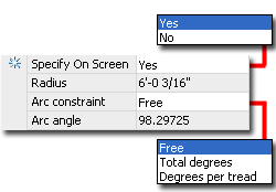 Arc
Constraint: Arc
Constraint:
Free - this option offers the Radius value field and a drop-down list for
the Specify On Screen option: Yes / No.
You can thus either specify the Radius by physical number (typed or picked on
screen) or draw the stair by controlling the Radius based upon the second point picked on
the screen ( a nice option for those in design development phase ).
Total Degrees - this option provides the Arc angle value
field only where you must type in the total Arc angle for the full run of the Stair.
This is a good option if you know that your stairs must be 90 degrees, for example.
Degrees Per Tread - this option provides the Arc angle
value field only and you must type in the Angle for each Tread. This option is quite
handy if you are attempting to input information from specifications such as those
provided by Architectural Graphic Standards.
Arc Angle - only available for the
Total Degrees and Degrees Per Tread Arc Constraints. See
comments for Arc Constraints.
Illustrated to the right I show that in addition to using
the Arc Constraint options, you can also work with the Calculation Rules
to control how your Spiral Stairs are constructed. True Spiral Stairs, for example,
often use more Risers than the Rules may utilize so you can increase the number manually.
And finally, you will also need to consider the role of the Design Rules tab under the Stair
Style which, if poorly configured for Spiral Stairs, can cause you a lot of frustration.
|
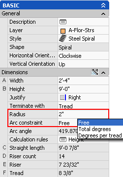
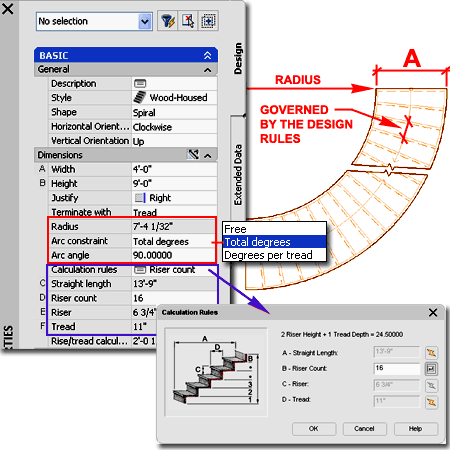 Radius - this value field is
only available for the Free Arc Constraint option. The Radius value is measured from
the center point of a Spiral Stair out the the Justification point, so a Center Justified
Spiral Stair will be tighter than one Left Justified ( assuming the Radius value is the
same for both). Flipping Horizontal does not affect Left or Right Justification
sides, so don't worry about that happening.
Justify - This option
does not really play much of a role in the outcome of your Spiral Stair except when used
in conjunction with the Free Arc Constraint option since
that allows control over the Radius relative to the Justification Point. |
Creating "Spiral" Stairs
| Links |
Part X - Appendix - to download
this example stair and see what I did to create it. |
 Creating true Spiral Stairs is something you would think this option makes easy
based on the name but if you attempt to create those tightly wound pre-manufactured
spirals, you'll soon realize that you really need to understand the broader aspect of
Stair Styles. My first suggestion when working on this problem is to create
a custom Stair Style designed specifically for Spiral Stairs. For
this custom Stair Style, you will need to specify Code Limits under the Design
Rules tab that meet manufacturer specifications and/or local building codes
(usually narrower tread depths and taller risers ). You will also need to create a single
side Stringer designed under the Stingers tab for a
Clockwise or CounterClockwise Horizontal Orientation since the center will be supported by
a Column. For the example illustrated to the right, I reduced the Style to a bare
minimum of essential settings: no Calculator Rule, no Nosing Length and if you intend to
include a Landing, be sure to minimize those settings as well because all extra
dimensional data adds to potential Defect Warning conditions. Creating true Spiral Stairs is something you would think this option makes easy
based on the name but if you attempt to create those tightly wound pre-manufactured
spirals, you'll soon realize that you really need to understand the broader aspect of
Stair Styles. My first suggestion when working on this problem is to create
a custom Stair Style designed specifically for Spiral Stairs. For
this custom Stair Style, you will need to specify Code Limits under the Design
Rules tab that meet manufacturer specifications and/or local building codes
(usually narrower tread depths and taller risers ). You will also need to create a single
side Stringer designed under the Stingers tab for a
Clockwise or CounterClockwise Horizontal Orientation since the center will be supported by
a Column. For the example illustrated to the right, I reduced the Style to a bare
minimum of essential settings: no Calculator Rule, no Nosing Length and if you intend to
include a Landing, be sure to minimize those settings as well because all extra
dimensional data adds to potential Defect Warning conditions.
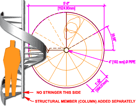
The 60" [1524 mm] Diameter Steel Spiral Illustrated to
the right comes as close to the standard dimensional criteria set forth in many
architectural guidelines. It is not perfect but I have honestly not been able to get
a perfect one yet. One of the primary problems is that each tread is centered on the
column so having a wider tread at the column is really not possible without having a wider
column. My personal attitude is that I'd like to get close but will rely on
shop-drawings to refine the details ( nonetheless, stair treads usually measure 22.5, 27
or 30 Degrees per tread and I only got 29.98 Degrees ).
To create this type of result, confirm that you have a custom
Stair Style and then set an appropriate Width ( Radius of full
Stair - Radius of Column). On the Arc Constraint drop-down
list, set this option to Free so you can type in the Radius
of the center Column ( typically the diameter is 4" [394 mm] ). If you look at
the results of this input under Arc Angle, Riser count, Riser
and Tread, you can determine how close you are to what you really want
and if you want to fine tune the results, you can either use the Calculation Rules
dialog or the other Arc Constraint options. If you attempt
to set the exact Degrees per tread, for example, you should find that the
Radius will also change and that's where this games starts. Eventually the game gets
old. |
 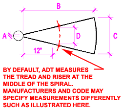 Setting the Design Rules
values for pre-manufactured Spiral Stairs can be a bit tricky since the Design Rules were
not really designed to assist in the specifications for Spirals that are a bit different
than most other stairs. Illustrated to the left I show some common dimensional
reference points that standard guidelines take into consideration. the Red
centerline indicates how ADT measures the Tread Depth: the Arc Length
drawn at the true midpoint between the inside stair edge and the outside stair
edge ( usually indicated by the Graphics path ). Setting the Design Rules
values for pre-manufactured Spiral Stairs can be a bit tricky since the Design Rules were
not really designed to assist in the specifications for Spirals that are a bit different
than most other stairs. Illustrated to the left I show some common dimensional
reference points that standard guidelines take into consideration. the Red
centerline indicates how ADT measures the Tread Depth: the Arc Length
drawn at the true midpoint between the inside stair edge and the outside stair
edge ( usually indicated by the Graphics path ).
|
| 7Adding Straight Stairs |
7-7 STAIRS - RAILINGS |
Add Stairs Properties Palette - Straight
| Alt. Menu |
Design>
Stairs> Add Stair... |
|
|
| Keyboard |
StairAdd |
| Links |
Add Stairs Properties Palette - for more information
on how other Palette settings can be used to create different results. |
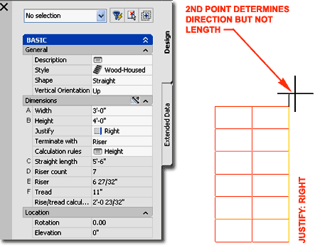
Straight Stair Shapes offer the least
amount of options in this list of Shapes but it is still a fairly extensive list of
options which includes Landings. Drawing a Straight Stair Shape is a bit easier than
the other Shapes because the first and second points define start position and direction
respectively. For the Direction, which may appear as a Length, you may pick close to
the first point or far away from it with no difference in the outcome unless you have
specified Flight Height limitations.
Using Flight Height settings you can make a Straight Stair
act more like a Multi-Landing Shape. With a Maximum Riser Limit of four Risers, for
example, a Landing will automatically occur after the fourth Riser in a Straight Run.
The length of this automatic landing is controlled by the Landing Length setting on
the Landing Extensions tab
of the Stair Styles dialog box. |
 |
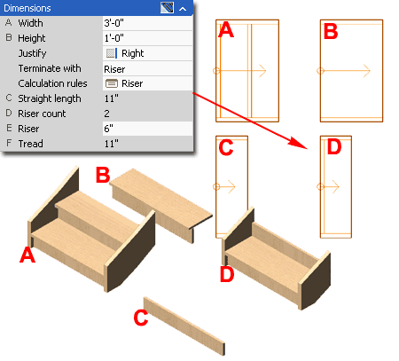
| Creating "Straight" Stairs Drawing the Straight Stair Shape is arguably the
easiest stair to draw and you should not have any difficulty in getting this type of stair
to display correctly for your projects. You may have to work on the Style to set
Rise and Run rules or design related information but generally a Straight Run of Stairs
should be straight forward ( pun intended ).
Having said that, however, in the illustration to the right
I show the one scenario for Straight Stair Shapes that I continue to find problematic: the
single riser Straight Shape. For Stair "A",
I show that a two riser Straight Stair is easy to create but once you attempt to create
the single riser Straight Stair you may end up with "B"
or "C" where display problems may
occur in one or more Views.
So far, the best and most consistent solution I have come
up with for the single riser Straight Stair is illustrated as "D".
For this solution, I limit the Riser Count to 2
and allow it to Terminate with a Riser. In
Elevation View I then push the top Riser into my Floor Slab or equivalent Object so it
disappears. It's not great but as you can see, "B",
which looks correct in a 3D View, produces an erroneous result in Plan View.
|
 |
| 8Modifying Stairs |
8-7 STAIRS - RAILINGS |
Modify Stair Properties Palette
| Alt. Menu |
Design>
Stairs> Stair Properties |
 |
|
| Keyboard |
StairProps or
-StairModify |
| Mouse |
Double pick on Stair Object
with left button |
| Links |
Add Stairs Properties Palette - for information on all
of the various options on this Palette. |
For Modifying Stairs you can use the Properties
Palette which offers nearly all of the same options as those found when Adding
Stairs. Once you have created a Stair in a drawing, you cannot change its Shape
so you may be disappointed when you notice that this drop-down list is now gray. You
should find, however, that all of the other options are available for you to modify and
you can now use the Rotation, Elevation and Additional information options as well.
 Width
- The Width of a Stair adjusts relative to the current Justification setting and you can
change the Justification for different width settings. Width
- The Width of a Stair adjusts relative to the current Justification setting and you can
change the Justification for different width settings.
Height - The Height of a Stair adjusts
relative to the current Vertical Orientation and you can change the Vertical Orientation
while working with different Heights. Adding Height to a Down Stair will project it
downward as if anchored at the top.
Justify - The Justification of a Stair is
not visible on the Stair Object itself and does not appear to change a Stair when set to
different values. However, it will affect the outcome of adjusting the Width value
as stated above.
Rotation - use this value
field to rotate the Stair much like using the Rotate command.
Elevation - use this value
field to assign a Z-axis height for 3D work. This is similar to moving the object up
or down in Elevation View. Since Stairs should relate correctly to other Objects
such as Floor Slabs, be careful about moving them in Elevation since you may end up with
erroneous results. I tend to follow simple rule that Z=0 is the top of my finished
floor.
|
 Additional information - use this dialog
box to check for erroneous coordinate settings such as improper Z-axis values or to set
unique position, scale or rotation values. This option is not available on Stairs
that have been Anchored to Landings.
Anchor - this dialog box is only available
on Stairs that have been Anchored to other Stairs with the AnchorToStairLanding tool - see below for
more information on this subject.
For Worksheets and other
options on this Palette, see the discussion under Adding Stairs for more information.
Illustrated to the left I show the
object-specific pop-up menu and the options you have for a Stair Object. In addition
to these options, you will find a great deal of flexibility for controlling the design of
Stairs through the use of Grips. |
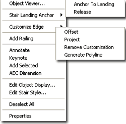
Anchor To Stair Landing
| Menu |
N.A. |
| |
|
| Keyboard |
AnchorToStairLanding |
| Mouse |
Select Stair, right-click,
select Stair Landing Anchor > and cascade to Anchor To Landing |
The AnchorToStairLanding tool simply
connects one Object, like a Mass Element, Wall or Stair, to a Stair Object. When
used to Anchor one Stair to another, the affected Stair is moved into a default position
in all three dimensions relative to the source Stair. It is interesting to note that
neither stair actually needs a landing for this tool to work.
Illustrated to the right I show that I have used the
AnchorToStairLanding tool to anchor an Open Steel Stair Style to a Wood Saddle Stair
Style. In Plan View the graphic of this connection may appear
correct but in other Views you may not find that the same can be said for this
"anchoring". For some issues, you can use the Anchor dialog box to adjust
the Anchored Object but for other issues I could not find any solutions anywhere.
In the illustration, lower right, I highlighted a slightly
irritating problem that has to do with the fact that you don't have any "Position
Along Landing Height (Z)" control on the Anchor dialog box. This means that you
must accept the vertical position set by the Anchor and the Stair Style Components even if
they don't make sense. |
I did not find that this was a problem with all of the Stairs but what I
show in the illustration did occur on some combinations. Another
odd phenomena that occurs with this tool is that your Stair may not always
Anchor to the Stair Landing that you want it to. Clearly, this routine was
designed for Multi-Landing Stairs and thus you may find it difficult to
employ on Straight Stairs - and virtually impossible if you happen to have a Straight and
a Multi-Landing in the same file. |
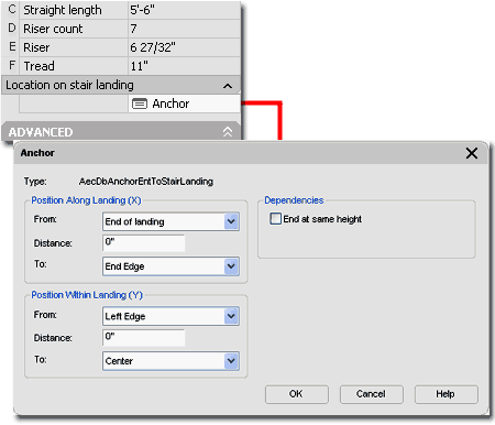
| Anchor dialog Once an Object such as a Stair has been Anchored to the Landing of a
Stair, you will find that "Location" section of the Properties
Palette will be replaced with an "Anchor" option as illustrated to the
right.
The Anchor dialog box provides options for controlling
where the Anchored Object is positioned in the absolute X and Y planes By working
with the "Position Along Landing (X)" and the "Position
Within Landing (Y)" options you can make some adjustments to the position of
the Anchored Object in the absolute X-Y Plane only. Notice that there is no option
for a Z-axis position.
End at same height - this checkbox option
seems to have been designed for stairs that split in opposing directions, like a
"Y" with a common landing in the middle; i.e., one stair is a Multi-Landing with
a full height while the other is a Straight Shape Anchored to the lower Landing.
With this Checkbox active, you can control both Stair Heights by working with the primary
one.
Note:
There are some rather odd aspects of working with this Anchor system that I find annoying.
This may have to do with my lack of knowledge about the use of this tool but you
may find that the Position options don't produce the results you might imagine. For
one, the Anchor does not really seem to read the Landing ( supported the fact that a
Landing isn't necessary for it to work ). The other irritating aspect is the
limitation of the Anchor; you can't Rotate the Anchored Object so if you want to continue
a new stair style straight it cannot be achieved with this tool since it only allows a Left
or Right Edge position. I really hate these types of limitations,
don't you? |
 |
Customize
Edges
| Menu |
N.A. |
 |
|
| Keyboard |
StairCustomizeEdge |
| Mouse |
Select Stair, right-click,
select Customize Edge > and cascade to a desired option |
 There are two primary tools to modify Stair Edges: Offset and Project.
Offsetting Stair Edges is basically an obsolete tool since you can use Grip Points to
achieve the same exact result with less effort but the Project option is fantastic. There are two primary tools to modify Stair Edges: Offset and Project.
Offsetting Stair Edges is basically an obsolete tool since you can use Grip Points to
achieve the same exact result with less effort but the Project option is fantastic.
StairOffset - this command will ask that
you "Select and edge of a stair" and then "Enter distance to offset
...". By typing a value on the command line you can increase or decrease the
width of a Stair's Edge. See also the use of Grips for this task.
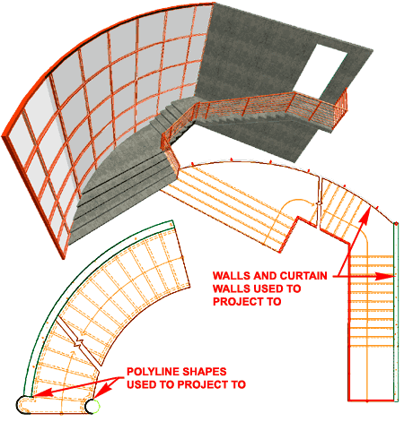
StairProject - this command will ask that
you "Select an edge of a stair" and then "Select a Polyline or connected
AEC objects to project to". In my own experience with this tool, I have found
that using a Polyline and Walls have been the two primary objects that I have
"projected" to on a regular basis but you can project to Columns, Mass Elements
and many other ADT Objects.
StairRemoveCustomization - this command
will remove custom edge modifications from the selected Stair Edge and restores the Stair
to the original settings. One indication of the need for this tool or the success of
having used it is that the Width field in the Properties Palette will stop reading
"*VARIES*".
|
 StairGeneratePolyline - this command will
create a Polyline outline of the selected Stair Edge even if no customization has been
performed.
Command: _AecStairCustomizeEdge
Customize Stair Edge [Offset/Project/Remove customization/Generate polyline]:
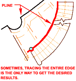
Note:
For best success with Projections, make sure the edge you are projecting your Stairs to
extends beyond or across the stair itself. When having problems, particularly with
Spiral Stair Style Edges, trace the entire edge with a Pline so your custom edge reads as
one full edge rather than just the portion you want to modify - see illustration left. |
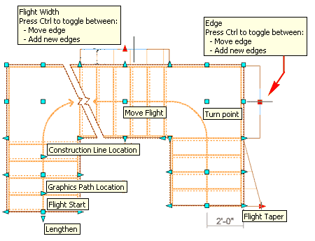
| Stair Grip Points Stair
Objects, unlike many other Objects in ADT, have the fewest Grip Points in
3D Views so Plan View is where you will find the greatest number of
things you can change through the use of Grips.
Illustrated to the right I show a sample of the various
Grip Points and options that you have for changing a Multi-Landing Stair Shape.
Notice that some Grip Points offer options via the Ctrl key for Moving
or Adding a New Edge. Be aware that not all Stair Shapes react the
same way when working with specific Grip Points. U-shaped and Spiral Stair Shapes,
for example, are more closely tied to their shape than Multi-Landing and Straight Shapes.
If you accidentally use a Grip Stretch on a Stair object
and create a non-linear edge, you can always come back and undo such a mistake with the Customize
Edge, Remove customization option - see discussion above.
|
 |
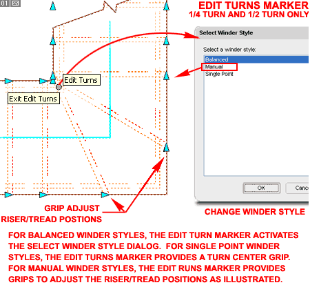
| Edit Turns and Grip Points
For U-Shaped and Multi-landing
Stair Shapes using 1/4 or 1/2 Turn Types, you will find a unique
Grip-like maker that toggles between "Edit Turns" and "Exit
Edit Turns". This marker is distinguishable by looking for a gray
circle near the corner at a stair turn as illustrated to the right.
Two of the amazing features this icon offers is the ability
to Change the Turn Centerpoint and/or Change
the Riser/Tread position. Though you cannot change the Center
Position and Riser/Tread positions at the same time, there are tricks to getting such
results if you are careful with your Winder Style Selection. You can, for example,
set a Stair to Single Point Winder Style to adjust Riser/Tread Positions and then change
the Winder Style to Manual for a Centerpoint adjustment and then change the Winder Style
back to Singlepoint. You can use a simple approach to achieving other results that
are not possible under one particular Winder Style but be careful of the Balanced Winder
Style since it can really throw a design off into the land of the unreal.
For stairs using the Balanced Winder Style, the Edit Turns
marker will only activate the Select Winder Style dialog which is the
same option as changing the Winder Style on the Winder Style drop-down
list offered on the Properties Palette. |
 |
Winder
Turn Adjust
| Alt.Menu |
Design>
Stairs> Winder Turn Adjust |
| |
|
| Keyboard |
WinderTurnAdjust |
| Links |
Stair Winder Styles - for more
information on Winder Styles and the "Adjust Winder Turn" checkbox. |
|
The
WinderTurnAdjust command sounds straight forward when you read the
command line prompt: "Select a Stair to adjust No. of Treads in Winder
Turns:". However, when you attempt to use it you may find that it does not
appear to do anything at all and you would be correct because this option only works when
the Winder Style Settings
have the "Adjust Winder Turn" checkbox checked. |
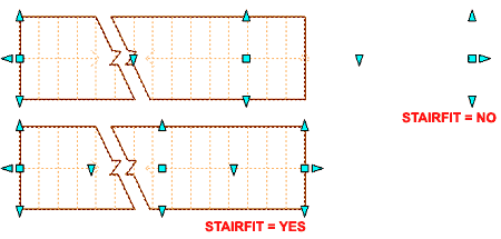
Automatic Length
| Alt.Menu |
Design>
Stairs> Automatic Length |
| |
|
| Keyboard |
StairFit |
The StairFit command provides the option
to Turn Off the default setting that automatically resets the Grip Points on Stairs as you
make changes that affect the original Length. This is a rather odd option that you
may never use. If you are experimenting with a fixed length and working with
Landings at the end of your Stair Run, this might be useful since the original length will
remain in place as you switch from Terminating with a Riser to Terminating with a Landing.
The actual Stair Length, as measured on the
Properties Palette, is not affected by this toggle. |
 |
| 9Stair Style Properties |
9-7 STAIRS - RAILINGS |
Style
Manager - Stairs
| Alt.Menu |
Design>
Stairs> Stairs Styles... |
 |
|
| Keyboard |
StairStyle |
| Mouse |
Select Stair, right-click,
select Edit Stair Style |
| Links |
Object Style Management - for more
information on Object Styles |
| |
Stair Winder Styles - for information on styles
for Stairs with 1/4 and 1/2 Turn Types. |
For Stair Styles, you can use the Style Manager
to load, modify, delete and create new Stair Styles.
Though you can easily create New Stair Styles from Scratch
using the New button, you may want to use the Copy/Paste
technique instead because it is far easier to Modify Settings of an existing Object Style
than it is to create one from Scratch. In some cases, you may even miss specific
settings that can come back to haunt you much farther down the road on a project - things
like Display Representations or Data for Schedules. |
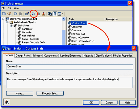 Illustrated above I show the process of creating
a New Stair Slab Style that I have Named "Custom Stair".
By double-clicking on this new style, I show that I have also activated
the Stair Styles Properties dialog box where all of the custom settings
can be made for the size, shape, rules and look of this particular object style.
The General tab provides
access to the Name and Description fields for a Style;
plus access to the attachment of Notes and Property Sets. |
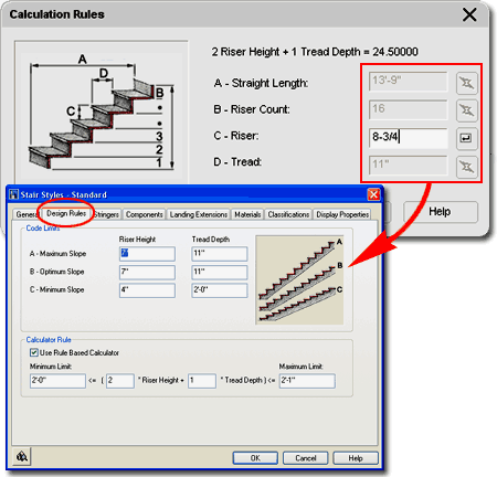
Stair Styles - Design Rules tab
| Links |
Ramps -
for an example of where you may want to define the slope as the same for all three
settings. |
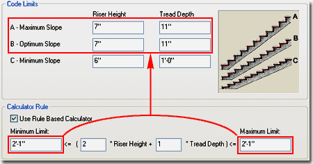
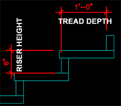 On the Design Rules tab of the Stair Styles
dialog box, you will find two areas of stair slope or rise-and-run control. Code
Limits is relatively straight forward in that you have three ranges to constrain
your stair Riser Height and Tread Depth: Maximum,
Optimum and Minimum. The Calculator Rule
is optional and may not be as straight forward upon first inspection but its function is
to allow you to further constrain the slope of your stairs and is thus a limit for your
limits. On the Design Rules tab of the Stair Styles
dialog box, you will find two areas of stair slope or rise-and-run control. Code
Limits is relatively straight forward in that you have three ranges to constrain
your stair Riser Height and Tread Depth: Maximum,
Optimum and Minimum. The Calculator Rule
is optional and may not be as straight forward upon first inspection but its function is
to allow you to further constrain the slope of your stairs and is thus a limit for your
limits.
In trying to understand how to use all of these options,
you may want to start by working without the Calculator Rule checked ( I highly recommend
this ). Working without the Calculator Rule checked will allow you to set three or
less ranges under the Code Limits and then test the results of those numbers without also
having to consider what the Calculator Rule is doing. See comments in the next cell
for more on this subject.
Code Limits:
When setting these values you may want to consider standard construction code rules as
defined by BOCA, UBC and similar organizations. Riser Heights and Tread Depth values
often vary between Residential and non-Residential architecture so you might use different
Code Limits on Stairs for Residential work than those for Commercial work.
Consequentially, you might consider creating a set of Stair Styles for different
disciplines and label them accordingly.
A - Maximum Slope - the maximum
slope would be defined by the greatest Riser Height you can use and the shortest
Tread Depth you can use.
B - Optimum Slope - the optimum slope
should be set to what you would like in a best case scenario. |
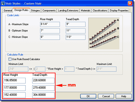 C - Minimum Slope - the
minimum slope would be defined by the shortest Riser Height and the greatest
Tread Depth you can use. Keep in mind that the Riser Height and Tread Depth values
you set here are not necessarily the low end of possible results. In other words A,
B and C are all ranges that can be combined so you could end up with a Minimum Riser
Height with a Maximum Tread Depth or any possible numbers in between.
Note:
Just because you can set a variety of Riser Height and Tread Depth values under the Code
Limits does not necessarily mean that you should. You can limit the possible
outcomes by using the same Riser Height and Tread Depth for more than one Slope and even
use the same pair of numbers for all three. If you do set all three Slopes to the
same value pairs, like 6" ( 152 mm) and 12" ( 305 mm) for example, your stairs
will only work if you specify a Height devisable by 12" ( 305 mm ). That's a bit
extreme but interesting to know since you may want to employ tighter constraints than
those that come with the default Stair Styles. |
| Stair
Styles - Design Rules tab - Calculator Rules In
the discussion above we looked at the basic Code Limits which allow you to provide three
ranges for the Slope of your Stairs. In reality you typically only need two ranges
for the highest and the lowest and that is why you find that most of the default Stair
Styles use the same value pairs for the Maximum Slope and the Optimum Slope. Having
the Optimum Slope can prove rather useful in difficult residential design, however, where
this point is hit if possible while allowing you tremendous freedom to adjust the default
results via the Calculation Rules dialog
on the Properties Palette. One problem with straight ranges is that sometimes two
results are possible within the same range and you may prefer one over the other. To
set rules for the Code Limits, you can employ an even more restrictive tool: the Calculator
Rule.
Calculator Rule:
Use Rule Based Calculator - check this box to use the default values or set your
own limit values. In the United States, the Uniform Building Code ( UBC ) provides a
formula for the optimum Stair Slope as 2R+T= 25" (636mm) which is usually achieved by
using a 7" (178mm) Riser Height and an 11" (280mm) Tread Depth.
Minimum Limit <= [(N *
Riser Height)+ (M * Tread Depth)] <= Maximum
Limit
In this formula, you can use just about any number positive or negative for the
Limits and any whole positive number for N and M but despite the freedom to input these
numbers, you may not be creating a formula that makes sense. ADT will not provide
you with an error message but you can use the Floating Viewer button to see if the result
is producing a Stair Error. The Limits are based on the results of the equation as
it applies to the Code Limit values you have specified; for example, 2*( A -
Maximum Slope for the Riser Height) + 1*(C - Minimum Slope for
the Tread Depth) could be used as the Maximum Limit.
 Though
the default Stair Styles have their Calculator Rule settings set as follows, "2'-0"<=(2*Riser
Height + 1*Tread Depth)<=2'-1", you can tighten the formula to have the
same Minimum and Maximum Limit and that will guarantee that you meet that exact criteria;
such as 2'-1" or 25". In contrast, you can also expand the range Though
the default Stair Styles have their Calculator Rule settings set as follows, "2'-0"<=(2*Riser
Height + 1*Tread Depth)<=2'-1", you can tighten the formula to have the
same Minimum and Maximum Limit and that will guarantee that you meet that exact criteria;
such as 2'-1" or 25". In contrast, you can also expand the range
|
 In the illustration above, I show an extreme case
of restricting the Stairs to only follow one Rule as set by Maximum and Optimum Slope and
the Calculator Rule. In this case, the Calculator rule simply guarantees that the
Minimum Slope will never be used. If you draw Stairs with this configuration, all
stairs whose Height is not divisible by 7" will result in Stairs with the Defect
Warning marker. If you increase the Maximum Slope values, this Rule becomes a little
more flexible while remaining fixed by the Calculation Rule of 25".
Illustrated to the left I show how on the Properties
Palette, under the Dimensions section, you can read the results of your Stair
Design Rules.
Note:
In your efforts to make sense of this information, keep in mind that you don't
have to use the Calculator. If you set an acceptable Slope range using the Maximum,
Optimum and Minimum values your Stairs should come out fine. I find that when I need
to recreate existing building conditions, for example, on older buildings that the use of
the Calculator prohibits my freedom to try different options while drawing the Stairs (
see the Calculation Rules dialog on the Properties Palette ). On the other hand,
when designing new commercial spaces that must follow strict building code requirements,
the Calculator can be quite beneficial in letting me know what is and is not possible. |
| Stair Styles - Stringers tab 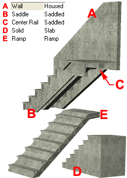 On the Stringers
tab of the Stair Styles dialog box, you will find four types of Stair
Stringers (bases) that you can work with: Saddled, Housed,
Slab and Ramp. Stringers are generally considered
structural support members for the Risers and Treads but you can take some liberty with
this idea to create things like Ramps. On the Stringers
tab of the Stair Styles dialog box, you will find four types of Stair
Stringers (bases) that you can work with: Saddled, Housed,
Slab and Ramp. Stringers are generally considered
structural support members for the Risers and Treads but you can take some liberty with
this idea to create things like Ramps.
Stringers - when you use the Add button,
this column acquires a new row. You can name your Stringers as you see fit.
This name will appear in the Materials Component list but not as a separate Display
Component under the Display Properties list.
Type - for each Stringer row, you can use
the Type drop-down list in the matching row cell to specify one of the four Stringer
Types: Saddled, Housed, Slab or Ramp.
Other options are affected or limited by the choice made here.
Alignment - Saddled and Housed Stringer
Types provide four Alignment options: Left, Right, Center
and Full Width. Ramp and Slab Stringer Types are
locked to Full Width.
A - Width - for Stringers that do not have
an Alignment of "Full Width", this value controls the width of the stringer.
Negative values are not allowed.
B - Offset - this option is only available
for Stringers using the Saddled Type. Use Positive and Negative values to control
the offset direction for Stringers Aligned to the Center.
C - Waist - this value field is available
for all Stringer Types. See graphic on dialog box for explanation of what portion of
a Stringer this setting controls. Negative values are not allowed. By using
extremely large values for this option, you can force the stringer to height the floor to
create a completely solid solution as illustrated above left ( example "D" ). For Ramp Stringer Types, you can
use the Waist and the Offset to create a Ramp under regular Stairs for such solutions as
stadium seating ( example "E" ). |
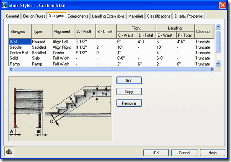 D - Total - this value field is
not available for Saddled and Slab Stringer Types. Negative values are not allowed.
E - Waist - this value field
is not available for Saddled and Slab Stringer Types. This value affects Landings.
F - Total - this value field
is not available for Saddled and Slab Stringer Types. By working with large values
you can use this option to create the appearance of Walls as illustrated above left (
example "A" ). This value affects
Landings.
Cleanup - this drop-down list
offering two options is available for all Stringer Types. All of the default Stair
Styles that come with ADT have this value set to "Truncate". I think the
term cleanup connotes a confusing interpretation about the "Truncate"
versus "Cleanup" options since truncate is typically what you
will want to see. When you use the "Cleanup" option, you should find that
Stingers do not actually clean up but extend fully beyond adjacent stringers at points
like Landings ( in some cases this is actually more appropriate for true framing
conditions but may produce more linework than you want to show in Plans ).
Illustrated to the left and above I show a
series of different Stringer Types and some corresponding values to create unique results.
By using trial and error experiments on these options, you can come up with some
pretty interesting results that will hopefully save you time and effort in your production
drawings. |
| Stair Styles - Components tab On the Components tab of the Stair Styles
dialog box, you will find numerous control values for the Treads, Risers and Landing.
Allow Each Stair to Vary - checking this
box allows you to change these values uniquely per Stair Object by using the Worksheets
section on the Properties Palette. Though allowing this freedom might seem like a
great idea, it is much like allowing for overrides on the Style settings so be sure you
comprehend the consequences of this option. Don't check this box while trying to
learn - trust me.
Flight Dimensions
Display - check boxes for turning Treads and Risers on or off. You
can also turn these components On or Off under the Display Properties for specific Display
Representations.
 A and B Thickness values should be self-evident
by the graphic on the Components tab, but C - Nosing Length actually has
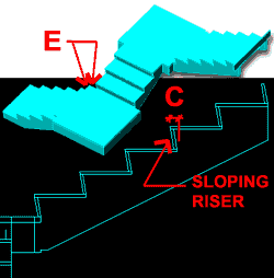
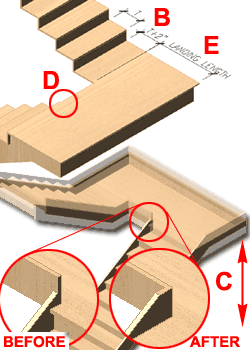
two roles. By default it serves as the overhang or lip on the Treads but when the Sloping
Riser checkbox is checked, it serves as the amount of slope. This also
means that you cannot create a Sloping Riser with an overhang. A and B Thickness values should be self-evident
by the graphic on the Components tab, but C - Nosing Length actually has
two roles. By default it serves as the overhang or lip on the Treads but when the Sloping
Riser checkbox is checked, it serves as the amount of slope. This also
means that you cannot create a Sloping Riser with an overhang.
|
Landing Dimensions
D - Landing Thickness should be self-evident by the graphic on the
Components tab, but E - Additional Width will behave differently than the
graphic on this tab depending on which justification you use to draw your Stair object.
If you justify by Center, as the illustration on the left ( E ), the E - Additional Width will occur on both
sides of the landing. By the way, 1/4 Landing is the Turn
Type I used to create this example. |
| Stair
Styles - Landing Extensions tab On the Landing
Extensions tab of the Stair Styles dialog box, you will find
numerous value and check box options for controlling how Landings appear and behave
relative to the current Stair settings. Some settings affect how Railings appear.
 Allow Each Stair to Vary - see comments for Components tab
above. Allow Each Stair to Vary - see comments for Components tab
above.
Extension Distances
A - Distance to First Tread DOWN - this value option provides the means to
control how far out a landing will extend to the top down riser. Absolute zero can
only be achieved if there is no Nosing Length on the Components tab. Constraint
values, such as Alignment type
( Tread to Tread ) set on the Properties Palette can also affect the relationship of
landing to riser distances. Add Tread Depth - this check box simply
adds the Tread value you for the Stair run to the Landing extension.
B - Distance to first tread UP - see
comments for A - Distance to First Tread DOWN.
C - Extend Landings to
Merge Flight Stringers with Landing Stringers - in the illustration to the left I
show an example of how this option can be a great tool to resolve Housed Stair Styles so
the Landing Stringer Merges properly with the Flight Stringers. Be aware that using
this option adjusts the height of the Landing in order to make this feature work.
|
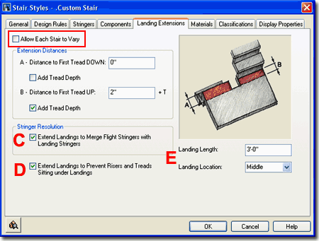 D - Extend
Landings to Prevent Risers and Treads Sitting under Landings - in the
illustration to the left I show an example of where you might notice how this option
affects Stair Flights at Landings. If checked, you should notice that the Riser
Thickness and Tread Nosing Length will shift back away from a Landing so there is no
overlap with the Landing itself. If your Stairs have been drawn with a Tread to
Tread, Tread to Riser or Riser to Riser Alignment Type instead of the Free Alignment Type,
you may not notice how this option works.
E - Landing Length - use this value field to specify the
depth of your Landing relative to other settings on this Tab and the other Tabs such as
Nosing Length. Typically, Building Code has limitations on how narrow Landings can
be so be sure to check for such values.
Landing Location - Middle, Top or
Bottom - this drop-down list can be used to preset whether or not you want a Top
or Bottom Landing on some Stair Shapes like the U-shaped. This option does not
affect Straight or Multi-landing Shapes. |
| Stair Styles - Materials tab
The subject of Materials is one of the
most expansive and confusing topics in Architectural Desktop because it requires a
complete comprehension of the product in order to take full advantage of this feature;
from object styles to display representations. This subject will be discussed under Part 1 - Display
and in the Presentation eGuide.
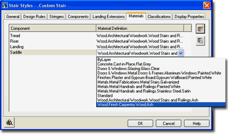
Illustrated to the right I show that Stairs will offer
three fixed Components ( Tread, Riser and Landing
) and as many Stringer Components as you care to Add on the Stringers
tab. If you create a Stair Style from scratch, the default Material
Definition Name will be set to "Standard". If you have imported
any of the Architectural Desktop Stair Styles from the Object Style Library, you should
find that you will be able to use the Material Definitions that come with those objects -
as illustrated to the right where I am selecting
"Wood.Finish.Carpentry.Wood.Ash".
|
 Though you are not required to use Material Definitions in
Architectural Desktop, you are likely to find it difficult to avoid using them since most
of the predefined Styles use them. Materials have thrown a monkey wrench into the
whole Display System because they can actually take over control of how your linework
appears in Plan View for Construction Documents ( discussed below under Display Properties
). The best thing to do when learning about Material Definitions is to match how
most of the predefined Stair Styles have been configured; i.e., reverse engineer the ADT
Styles. |
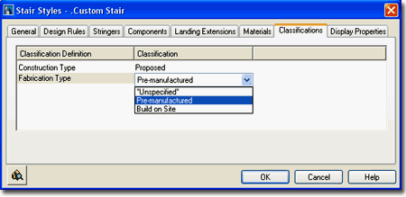
| Stair
Styles - Classifications tab
The subject of Classifications is
thankfully no where near as complicated as that of Materials so the only real question you
will need to consider is if you need to use them. Classifications offer another way
to separate Object Styles into categories that can be used in Schedules
and even in Display Representation Sets ( as "Show"
or "Hide" ).
Illustrated to the right I show that I have two Classification
Definitions ( see Format pull-down menu), each with a list of Classification
Names or Types. Generally you will not have any options on this Tab but if
you have created at least one Classification Style that has been set to "Apply
To" Stair Styles, you will be able to use it here. The range of use is really
up to your imagination but it is fairly obvious that Classifications can be quite handy in
Schedules. This topic will be discussed further under Part 18 - Schedules. You
can also read a bit more about how to create Classification Definitions in Part 1 -
Display. |
 |
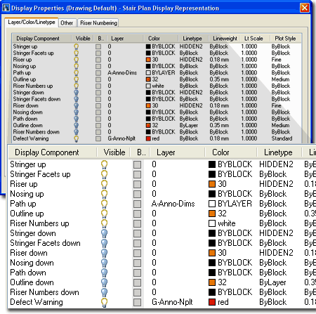
| Stair Styles - Display Properties tab
The Display Properties tab of the Stair
Styles dialog box, illustrated right, provides access to the display
characteristics of the components of your Stair objects; from Visibility to Cut Plane
Height overrides. This is also where you would go to have Stairs change color or
Materials, for example, when you switch from one Display Configuration to another.
See the discussion on Stair Display Properties below for more information on this subject.
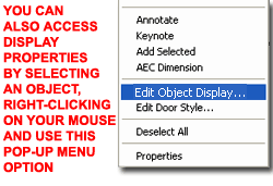 Illustrated
to the left, is another way to access the Display Properties tab; select
the specific object, right click on your mouse
to invoke the object-specific pop-up menu and select Edit Object Display... Just
be aware that when you use this approach, you can actually set an Object Override as
opposed to a Style Override. Object Overrides can be extremely useful because they
allow you to add things like Riser Numbering to any object within a Style Family but they
can also be problematic because they lock you out from more centralized, Style level,
controls. Illustrated
to the left, is another way to access the Display Properties tab; select
the specific object, right click on your mouse
to invoke the object-specific pop-up menu and select Edit Object Display... Just
be aware that when you use this approach, you can actually set an Object Override as
opposed to a Style Override. Object Overrides can be extremely useful because they
allow you to add things like Riser Numbering to any object within a Style Family but they
can also be problematic because they lock you out from more centralized, Style level,
controls.
|
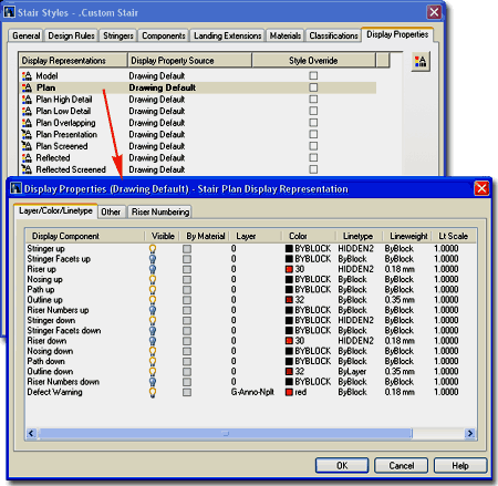 |
| Stair - Display Properties - Component Layers 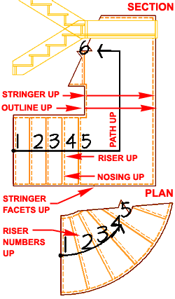 Illustrated
to the right and left I show all of the Stair Display Components for the "UP"
portion of a Stair ( the "Down" portion has been turned off for clarity ). Illustrated
to the right and left I show all of the Stair Display Components for the "UP"
portion of a Stair ( the "Down" portion has been turned off for clarity ).
Under the default Plan Display Representation,
you should notice that you cannot control any of the Stair Display Components "By
Material" so all settings are controlled right here on the Display
Properties dialog. The Components should be fairly easy to figure out and
since they are related to their dimensional counterparts on the Stair Style dialog box,
the display may or may not produce visible results ( in other words, no Nosing Length will
produce a line right on top of the Riser so you won't see the Riser line ).
Generally, the scale of the drawing and the level of detail
you wish to communicate at that scale will determine what Display Components you wish to
have Visible. For Plan View, I tend to show very little detail by only displaying
the Outline, Nosing and Path. |
 |
| 10Stairs - Display Properties |
10-7 STAIRS - RAILINGS |
| When working with Stairs,
adopting a "less is more" approach may prove
to be your best option for graphical display since more detail requires more complexity
which, in turn, adds to more potential for problems such as Defect Warning icons.
However, since stairs can be a significant architectural design statement and since
drawing them in the traditional 2D way can prove to be exhausting there are times when you
just have to push for as much as you can. Illustrated
to the right I show an example of one of my efforts to "push" the capabilities
of the Stair and Railing Styles. I am by no means satisfied due to all sorts of odd
limitations but I hope this example shows that some reaching may be worth the end results.
The primary problem with working towards custom and unique design results is the
time it takes to make all of the adjustments in trail-and-error fashion to get as close as
possible to what you really want.
As with most of the other ADT Objects, my primary focus is
on the Plan View. The Plan Low Detail Display Representation for Stairs
tends to be a fairly good option for standard plans. The Plan View illustrated to
the right uses the default Plan Low Detail Display Representation for the default Wood-Saddle
Stair Style. Both the 3D Perspective ( High Detail ) and the Section were derived
from default settings. The only extra work I did was some Edge
Customization, addition of a custom round Column and the Hiding of one Railing Post. |
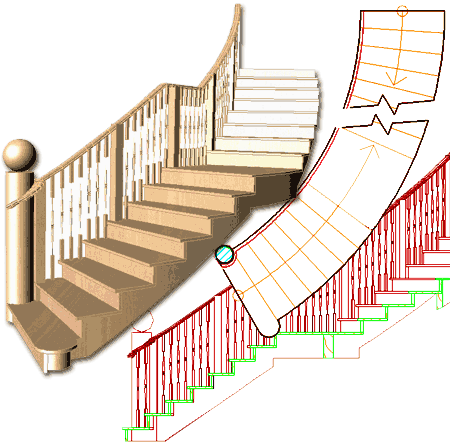 |
Stairs in
Plan
| Menu |
Format> Display
Manager... |
 |
 |
| Keyboard |
DisplayManager |
| Keyboard |
DisplayProps [Attach] |
| Mouse |
Select Object, right-click,
select Edit Door Style... or Edit Window Style... or Edit Object Display... |
| Links |
Part 1 - Display - Object
Display Properties Overview - for more information on how to access the Display
Properties of this Object. |
In Plan View, it should be obvious that
your Stair display is derived from a 3D object that passes through a cut plane that
establishes which components belong to the "Up" Display and which belong the the
"Down" Display. By working with the Cut Plane settings on the
"Other" tab of the Stair Style's dialog box, you can control where the cut plane
shows up and where the differentiation of Above and Below occurs.
For the most part identifying what each of the Display
Components control should be relatively easy and since the list repeats for the
Up and Down Components, it is actually far shorter than it appears at first glance.
The Facets indicate where Stringers change slope and probably doesn't
provide much information for typical floor plan drawings. Having Risers
and Nosing Display Components Visible at the same time is often too
detailed and causes more confusion than anything else so I tend to keep the Risers Off.
The Outline not only wraps the outer edge of a Stair but also
controls the Break Mark ( unfortunately ). The Path
is a graphic element that uses a Dimension Style to produce a leader. The Riser
Numbers allow you to have sequential numbers displayed for each riser.
There is no Hatch Display Component for Plan. |
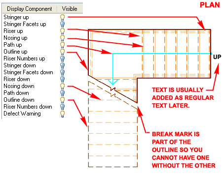 Illustrated above I show a slightly modified
version of the default "Medium Detail" Display
Configuration which uses the "Plan" Display
Representation for most Objects. In order to illustrate how you can lighten
the detail for the higher or "Down" portion of a Stair, I turned Off the
Visibility of most of these Display Components but left them on for the "Up"
portion. |
| Stairs
Above and Below the Cutting Plane
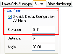 Since Stair Object Display Components have been divided in half under several
of the Display Representations, it is fairly easy to turn the Visibility On
or Off for all of the "Up" or "Down"
Display Components as illustrated to the right.
This makes the task of getting a Stair to look right in one plan a simple job and you can
use the "Override Display
Configuration Cut Plane" checkbox to set any desired Cut Plane Elevation
height which controls the point at which Display Components are "Up" or
"Down". Since Stair Object Display Components have been divided in half under several
of the Display Representations, it is fairly easy to turn the Visibility On
or Off for all of the "Up" or "Down"
Display Components as illustrated to the right.
This makes the task of getting a Stair to look right in one plan a simple job and you can
use the "Override Display
Configuration Cut Plane" checkbox to set any desired Cut Plane Elevation
height which controls the point at which Display Components are "Up" or
"Down".
By using the Edit
Object Display... option to (right-click pop-up menu) to set an Object Display
Override, you can work with different Stair Objects independently though they may all be
part of the same Style; i.e., they could have different Cut Plane Overrides, for example. |
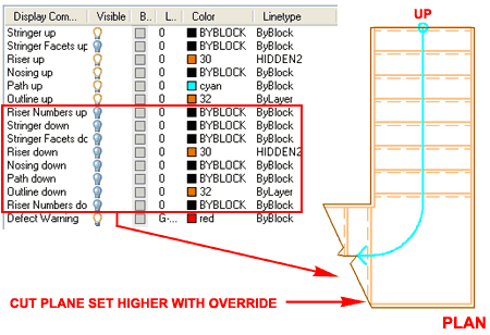 The
real problem with the "Up"/"Down" Display of Stairs is that you
usually want the Stair(s) to display as "Up" on one Floor and "Down"
on another. In addition, you would like to use the same Stair Object so changes are
reflected in both Floors ( assuming you keep your floors in separate drawing files ).
This can be achieved but is a lengthy subject that I have covered in a separate
article on the ARCHidigm.com website - see Up-Down Display of Stair in Architectural Desktop 2004. In
essence the solution utilizes the Display Representations of Stairs to create two
solutions for the Plan Display; one for the "Up" and one for the
"Down". These Display Representations are then associated with Display
Configurations so you can toggle between them. |
| Stairs in Model
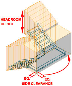 On the Properties Palette for Stair Objects, you can set Headroom Height and Side Clearance values to
assist in cutting Holes in objects like Slabs. By default, you will not see these
values but should you want to see them, you can use the Model Display
Representation to access a Display Component called "Clearance"
and turn its Visibility On. This will allow you so
see the Headheight and Side Clearance values as a 3-dimensional mass but only while
viewing the Model; it will not display as a Plan graphic. On the Properties Palette for Stair Objects, you can set Headroom Height and Side Clearance values to
assist in cutting Holes in objects like Slabs. By default, you will not see these
values but should you want to see them, you can use the Model Display
Representation to access a Display Component called "Clearance"
and turn its Visibility On. This will allow you so
see the Headheight and Side Clearance values as a 3-dimensional mass but only while
viewing the Model; it will not display as a Plan graphic.
|
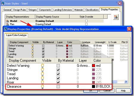 |
| Display Properties - Stairs - Other
tab On the Other tab of the Display
Properties dialog for a Stair Style, you can work with numerous drop-down lists and value
fields to affect the Plan Representation of a Stair's Cut Plane, Arrows and Break Mark.
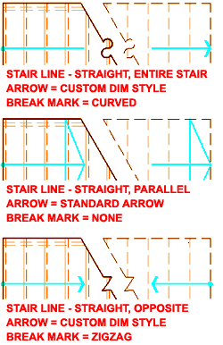 CUT PLANE CUT PLANE
Override Display Configuration Cut Plane - use this checkbox option to allow a
unique cut plane height setting that is not the same as the global one for Walls, Doors,
Windows and other Objects. It is often desirable to allow stairs to run up higher
than the standard global cut plane height so using this option is not unusual.
Elevation - the vertical ( z-axis )
height of your cut line. You can set a huge height if you are in a hurry and want no
cut line. Setting a value to match a landing or turn often affects the Angle in
strange ways that requires adjustments to the Angle.
Distance - the perpendicular distance
between parallel cut lines illustrated by the Break Mark.
Angle - the angle of the cut line(s) as
displayed by the Outline Display Component. Though all sorts of interesting Angles
can be specified, the Elevation will limit what is possible and you may get another angle
than what you have defined. An Angle of zero will produce a straight horizontal or
vertical cut depending upon the direction of the Stair Flight.
ARROW
Size - the length of an arrow for the UP / DOWN indicators unless the "Arrow
Size from Dimension Style Only" has been checked. This value is not scaled for
the drawing like Dimension Styles so you need to specify a true size.
Offset - the distance an arrow sits away
from the cut line.
Dim Style - the Dim Style name that
controls the look of the UP / DOWN arrows and the base dot for first riser. Exit this
dialogue box and use "DDIM" to access the Dimension Style specified on this
drop-down list. Due to the unique settings and how they affect the graphic of a
Stair, it is best to use a unique Dimension Style for Stairs.
Standard Arrow - a check box that will
override the Dim Style and use a triangular shaped arrow that is as wide as the Stair
Width and as tall as the depth of Tread. Not available if Stair Line
- Apply to: is set to Cut Plane - Opposite.
STAIR LINE
Draw for Each Flight - a check box that will draw separate Up / Down
arrow for each Flight of stairs rather than one set that wraps around a landing. Not
available if Stair Line - Apply to: is set to Cut
Plane - Opposite.
Shape - a drop-down list offering two
stair line shapes: Straight or Curved. These affect
the appearance of the graphic or leader line as it traces around bends for landings or
other changes in direction. The Curved option often has trouble with non-standard
arrow heads ( you'll see the little tail ). |
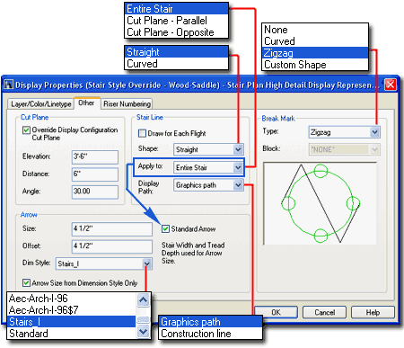 Apply to - a drop-down list
offering three ways the stair line can be applied: Entire Stair, Cut
Plane - Parallel and Cut Plane - Opposite ( see illustration to
the right ). These settings affect how the arrow lines behave with respect to the
total stair run and the break mark position. Entire Stair creates
one single full length stair line with an arrow at the end. Cut Plane -
Parallel is similar to full length but draws same-direction arrows at both
sides of the break line. Cut Plane - Opposite is similar to Cut
Plane - Parallel but flips the arrows at the break line so they are in opposite
directions.
BREAK MARK
Type - a drop-down list offering four types of Break Marks: None,
Curved, Zigzag and Custom Shape.
The Curved is fairly dreadful but you can create your own if you desire a cool
curve. To do this, create a 1:1 ratio break mark and make a block out of it.
Now use the Custom Shape option and assign your custom block on the Block
drop-down list. Hint: for your custom break mark block, don't add any part of
the diagonal lines, draw only the break mark itself and don't exaggerate the wave too much
( see illustration in the Break Mark preview). I haven't figured out the ratio but
it appears that the block gets changed a little via this option.
Block - a drop-down list of
all the blocks in the current drawing file. This option is only available if you set
Type, above, to Custom Shape. |
| Display Properties - Stairs - Riser
Numbering tab 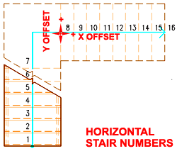 On the Riser Numbering tab of the Stair Style's
Display Properties dialog box, illustrated to the right, you can control a rather
impressive set of options for placing numbers next to your Stair Risers. On the Riser Numbering tab of the Stair Style's
Display Properties dialog box, illustrated to the right, you can control a rather
impressive set of options for placing numbers next to your Stair Risers.
Illustrated to the left I show the results of the setting
that I have used on the dialog box illustrated to the right. I think it safe to say
that you are probably savvy enough to figure these settings out so I won't bore either of
us with a lengthy explanation.
Text Style - this is just like the text
style option for Dimensions, however, in my tests I found that the dot-dot-dot button does
not work.
Text Orientation - the Force Horizontal
really works and no matter how you rotate the Stairs, the text comes out horizontal. |
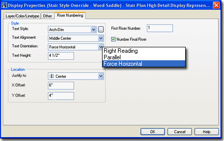 Text Height - unlike Dimensions, this is the final text
height so you will have to consider your printing scale to set a height large enough for
proper reading.
First Riser Number - I
attempted to use non-numeric values but you can't get away with that so I was not able to
come up with slick tricks like "Up" or "R1" but I guess that's
okay. It seems to me, however, that more people would have been interested in being
able to label the Stairs with "Up" or "Down" using similar
options. Why not offer both? Also, sometimes all architects want is the final
Riser count. |
| 11Stair Winder Style Properties |
10-7 STAIRS - RAILINGS |
Stair Winder Styles dialog box
| Alt.Menu |
Design>
Stairs> Stair Winder Styles... |
|
|
| Keyboard |
StairWinderStyle |
| Mouse |
N.A. |
| Links |
Object Style Management - for more
information on Object Styles |
| |
Edit Turns and Grip Points - for information on how
to use the Edit Turns Marker relative to these Styles. |
| |
WinderTurnAdjust - for a command that allows you to change
the number of risers in a turn. |
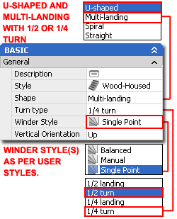 Architectural
Desktop 2004 introduced the Stair Winder Style in an obvious effort to
assist users in their efforts to create unique winding stairs. Unfortunately, in my
tests with this new option, I could only find one winder solution that I could actually
employ on projects that I work on. The other winder styles, such as the default
"Balanced" is so ridiculous that I don't believe such a winder has actually been
built unless it was at an amusement park. Architectural
Desktop 2004 introduced the Stair Winder Style in an obvious effort to
assist users in their efforts to create unique winding stairs. Unfortunately, in my
tests with this new option, I could only find one winder solution that I could actually
employ on projects that I work on. The other winder styles, such as the default
"Balanced" is so ridiculous that I don't believe such a winder has actually been
built unless it was at an amusement park.
Perhaps you will have better results so lets break the
options down. Illustrated to the left I show the places on the Properties Palette
where you can employ the Winder Styles. Winder Styles can only be used as part of
the U-shaped + 1/2 Turn and Multi-Landing + 1/2 Turn or 1/4
Turn combinations. By default, you should have the "Balanced"
Winder Style option and this Style produces the same winder result previous releases of
ADT created.
Illustrated to the right I show the Stair Winder Styles
dialog box where you can choose between three Winder Types: Balanced, Manual
and SinglePoint.
Use Riser Line - this checkbox will set
the winding point off the Riser Line in Plan View instead of the Nosing Line ( unchecked
). I did not find this option very useful since it produces the Defect Warning and
erroneous Riser or Stringer results in 3D Views. It does seem to work okay if you
don't have a Nosing value but then that's pretty much the same as leaving it unchecked. |
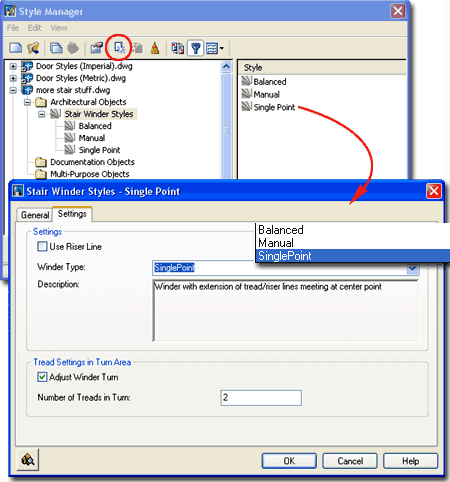 Winder
Type - The Balanced Winder Type produces the most absurd
winder results that I have ever seen where all risers wind. The Manual
Winder Type will allow for Grip Editing of All the Riser positions which is rather
powerful but you may find how they adjust a little frustrating. The SinglePoint
Winder Style is the one that might be the most practical but it too has some frustrating
limitations. Thus far I find that the best results come from switching back and
forth between Manual and SinglePoint to take advantage of each Style's Edit in Place
capabilities.
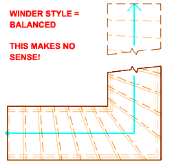 Adjust Winder Turn - this check box activates the option to
specify "Number of Treads in Turn" and must be checked in order to use the
WinderTurnAdjust command to edit these types of Stairs. Adjust Winder Turn - this check box activates the option to
specify "Number of Treads in Turn" and must be checked in order to use the
WinderTurnAdjust command to edit these types of Stairs.
Number of Treads in Turn - by
using this value field you can specify how many Risers and Treads you want in a Stair
Turn. Unfortunately, though you can type the number one it will not be accepted
upon return to this dialog so you cannot set the value to one and get a single winder; one
of the most common stairs I come across in residential work. |
| Stair Winder Styles - Adding Illustrated to the right is the only example Winder Stair example that I
could honestly say is practical. Even this particular example has a problem in 3D
where you can see that the cut of the Riser has a slight extension. By changing this
from a SinglePoint Winder Type to a Manual Winder Type, the Edit Turns marker will provide
the freedom to Grip Stretch each Riser/Tread but you may find how the Risers pivot a bit
frustrating and basically impractical for serious use.
 If
you are determined to work with the Winder Styles to produce winder stairs, I recommend
that you remove as many of the obstacles that produce Defect Warnings as you can.
Stairs with Housing Stringers tend to produce the most problems. Removing Nosing
values seems to help as well. If
you are determined to work with the Winder Styles to produce winder stairs, I recommend
that you remove as many of the obstacles that produce Defect Warnings as you can.
Stairs with Housing Stringers tend to produce the most problems. Removing Nosing
values seems to help as well.
The illustration to the left was created by working with a Single
Point Winder, switching it to Manual to Grip adjust the corner
Riser and then going back to the Single Point to adjust the Turning Point. In order
to get just one Riser in a Turn, you may need to use the WinderTurnAdjust
command. |
 |
| 12Stairs - Customizing and Tricks |
10-7 STAIRS - RAILINGS |
Ramps
| Alt. Menu |
Design>
Stairs> Add Stairs... |
|
|
| Keyboard |
StairAdd |
| Links |
Stair Styles - for where to access the default
Ramp Stair Styles. |
 When it
comes to Ramp designs, there are usually a lot of architectural
guidelines to take into consideration particularly related to the disabled. This
means that you are likely to want very specific numbers for your slope and since Ramp
Slope is controlled by the Code Limits on the Design Rules tab of the Stair Style
dialog box, you may want to read up on that information above. When it
comes to Ramp designs, there are usually a lot of architectural
guidelines to take into consideration particularly related to the disabled. This
means that you are likely to want very specific numbers for your slope and since Ramp
Slope is controlled by the Code Limits on the Design Rules tab of the Stair Style
dialog box, you may want to read up on that information above.
As an object, a Ramp is just a Stair Style without Risers
and Treads; in other words, it's a Stringer set as a "Ramp" Type on the
Stringers tab of the Style dialog box. In addition to using a single Stringer to
form the Ramp, you can add other Stringer components to create such things as side walls
or other structural elements.
Architectural Desktop comes with three example Ramp Stair
Styles: Ramp - Concrete, Ramp - Concrete Curb and Ramp
- Steel.
Note:
One trick I have found that often works on Ramps that use the small values illustrated the
right, is to let these Stair Style Terminate with a Tread.
This trick does not necessarily work on all Ramp Stair Styles since some may have
Tread Depths that affect the overall Length dramatically. |
 The one major flaw with the Ramp is that it is
based upon a Stair that uses a Riser-to-Tread system that does not really apply to
Ramps. Ramps are typically based on Slope and though Slope can be expressed in the
form of a rise over a run, the Code Limits were not designed for Slope but for Riser
Heights and Tread Depths. This means that if you attempt to create a Ramp Slope
with a very definitive ratio of 1:12, for example, you will be limited to heights of
1" and/or depths (lengths) of 12". In other words, this ratio will only
allow ramps that have lengths that are divisible by 12". Since not all Ramps
are divisible by 12", you might want to change your Riser Height and Tread Depth to
smaller rations of the same Slope. This trick works up to a point. When I
attempted to set a Ramp Tread Depth to 1" ( to allow for Ramp Lengths of 1"
increments - the perfect solution for me ), I found that setting the Riser Height to
1/12" could only produce 0.08333333" which resulted in design errors.
If you are facing this problem I must tell you
that there really is no way around the calculation error and that if you really want a
valid calculation, you must do the work yourself. You may even need to use another
object, such as a Mass Element to create a reliable Ramp solution. However, if small
margins of Error are not that big a problem for you ( not good for ADA compliance ), use
the smallest evenly divisible ratio but don't use numbers that are too small because ADT
will actually attempt to produce Risers and Treads to those values even though you don't
see them ( it will slow your system down ). For 1:12, I found a Riser Height of
.01562500 and a Tread Depth of 0.18750000 too small despite the fact that it comes closer
to good results than other numbers I used. |
| Stair Problems Though there are numerous things you can do to make the stair
routine produce errors, I have illustrated two common causes to the right. As
mentioned above, when discussing Spiral stairs, you cannot overlap ADT stairs yet nor even
bring them full circle - not even on a Spiral.
Another Error, illustrated by a "No-Stair" red
circle, is often caused by editing mistakes. A common mistake I make is to use the
Grips to make rapid adjustments where a single stretch can create this error. Within
the Yellow circle I show the centerline of this stair and how the end of the centerline
must be, at least, at the true end of the defining rectangle. To fix this, just Grip
the stair and pull the centerline out to the rectangles edge.
You cannot increase a Stair's Height with Grips even if you
try it in Isometric or Elevation views so you will have to use the Properties Palette to
accomplish this. |
 |
| Creating a Custom Stair Style
Designing Custom Stair Styles is often a matter of how you
visualize your options figuratively rather than literally. In the example
illustrated to the left, the solution may be more about what you don't add than what you
attempt to create. In fact, this Glass Stair example only has five parts to it: the
default Tread ( no Risers ) and four Stringers ( two of which are on top of each other ).
The rest of the product comes from two custom Railing Styles.
Before I take you through the overview of how I created
this example Stair, you should know that the primary problem with Stair Styles for custom
solutions is that they don't offer the option to Add... Blocks to change or Replace
Components. Railing Styles, however, offer tremendous features for Adding Blocks to
create your own Railing Style solutions.
For the Glass Stair, I turned off the Riser and used the
Stringers tab ( labeled as "A" )
on the Stair Style dialog box to create two solid metal rails at the bottom. For the
Glass, I added another Stringer in the exact same location as the bottom rail but with a
significantly greater height so it will act as a guardrail. Getting the look of
Glass is a matter of using the Materials tab to assign a Glass Material Definition to
these Components.
For the Railings, I had to create two because one was for
the handrail and the other was for the support structure under the Stair Treads. The
handrail Railing Style is so simple to create that you can just copy one from the existing
Railing Styles template file but the center support Railing Style is the most difficult
part of this whole exercise.
Illustrated below right, labeled as "B", I show that I have used the Add... button
on the Display Properties tab of my custom center Railing Style dialog box. For this
style, I used none of the default Components but created two Blocks of Components that I
wanted to use instead: the center steel support tube or spine and the steel arch.
One block was just a cylinder made out of a Mass Element and the other block was a Mass
Element of the whole arched support system holding the glass. On the Custom Block
dialog, after Adding these Blocks, I replaced the Baluster Component with the cylinder
block and did the same thing with the support. Though I could have used the Post
Component, I chose the Baluster because of the extra spacing options that are available on
the Post Locations tab of the Railing Style dialog box.
More on this later... |
 |
 |
| Stairs Across Levels and
Up Down Display
|
|
| 13Adding Railings |
13-7 STAIRS - RAILINGS |
Add Railing Properties Palette
| Alt.Menu |
Design>
Railings> Add Railing... |
 |
|
| Keyboard |
RailingAdd |
| Mouse |
Select a Stair Object,
right-click and select Add Railing |
| Links |
Loading Railing Styles - for information on loading
Railing Styles. |
When adding Railings, the
Properties Palette offers a fairly short list of options so hopefully
this will come as a nice relief when compared to the list for Stairs. The most
common question I have been asked over the years about the Railing options is why you
cannot use the Railing Locations and Post Locations dialog boxes under the Dimensions
section of the Properties Palette. The answer to that question has to do with the
Railing Style and I will explain more about that later on. When adding your first
Railing, I recommend that you keep it simple despite all of the incredibly articulated
Styles that come in the Railing Styles template file.
The reason for this recommendation is that those highly detailed Railing Styles can
cause your system to slow down dramatically; particularly in 3D Views with the Full Detail
Display Configuration and active Materials.
GENERAL
Style - a drop-down list offering a list of currently loaded Railing
Styles. Type RailingStyle or use the Content Browser to load other Styles. In
the list of Railing Styles that come with ADT, the ones with Balusters affect system
performance the most and of this list, those with the Wood Balusters take the greatest
toll on system performance.
DIMENSIONS
Rail Locations dialog - activating this dialog brings you to the Rail Locations
tab of the current Railing Style's dialog box. By default, all of the Railing Styles
that come with ADT, have this setting locked so you cannot make unique changes to
individual Railing Objects. Though you can release this option, it is similar to
allowing Overrides and can result in frustration and irritation if not properly employed.
To release, look for the "Allow Each Railing to Vary"
checkbox on the Rail Locations tab of the current Railing Style's dialog
box. For more on this subject see Modifying Railings
and Railing Style Properties.
Post Locations dialog - see comments for
Rail Locations dialog above.
LOCATION
Attached to - a drop-down list offering three choices: "*NONE*",
Stair and "Stair Flight". Once set, this option
will not be available on the Properties Palette when making Modifications. You can,
however, use the AnchorRelease command to free a Railing Object and even use
RailingAnchorToStair command to re-attach it.
None - no objects are used for attachment
but rather you are queried to pick points along the path for your railing. You might
use this technique to create a fence along a yard, for example, or on decks and porches.
Stair - a Stair object must be selected
and the Railing will be attached to the full flight of stairs and any landings in the
flight. Since the Railing gets anchored to the Stair with this choice, it is a
better method than using None.
Stair Flight - a Stair object must be
selected but the Railing will only be attached to the single Flight of stairs where you
picked to select the Stair; i.e., this won't put a Railing along the full flight but only
along a portion of it. |
 Offset - a distance measured
from the justification of the railing. Railings are generally placed automatically
at Center, Right or Left of Stair objects so the Offset would occur from one of those
three points depending on where you pick when you select your Stair. Depending upon
the Railing Style, its Anchoring position is usually through the Center of the Posts.
This is why Posts often dangle halfway over the edge of Stair Edges ( an Offset of
zero ). Use negative numbers to push a Railing out past a Stair's Edge and positive
numbers to bring it in.
Automatic - This option is
only available when using the Attached To: Stair option. When set to "No",
you can control the length of the Railing along the Stair Path. |
| Adding Railing Attached To: none Using the Attached To: "none"
option basically frees the Railing object from anchoring to any other ADT object and is
thus a free floating object that will not automatically adjust when the object you have
traced over is changed. This option is useful when you want to Add Railings to
anything other than Stairs or Stair Flights; which means
a lot of cases such as fences, porches, decks, unique landings, floor holes around stairs
wells and even on top of Mansard Roofs if you like the French look.
Illustrated to the right, I show the points you might pick
along an ADT object ( Slab ) to trace its edge for Railings ( 1,
2, 3,
4 ). Unfortunately, this technique center
justifies a Railing and there are no options for changing this when you Add the
Railing so you will either have to Grip edit it after you are done, or plan ahead by using
a correctly justified Pline. If you want an offset to match the thickness of your
columns on a deck, for example, draw a Plane around the edge and offset
it before Adding a Railing. Then, use the Convert to Railing
button.
If you change an object that you want your Railing to
match, you will have to Modify your Railing or delete it and go through the tracing
process again because Railings are not anchored to objects that are not Stairs. You
may be able to use Anchors to help this problem but that would only assist in keeping a
Railing object locked to a position; it still will not adjust in size. |
 |
| Adding Railing Attached To: Stair  Using the Attached To: "Stair"
option not only Anchors your Railing to your Stair
objects but reads the object and produces a Railing that runs the full flight from floor
to floor; around landings and even Customized Edges (see image, left ). If you
change your Stair, the Railing will automatically adjust. Using the Attached To: "Stair"
option not only Anchors your Railing to your Stair
objects but reads the object and produces a Railing that runs the full flight from floor
to floor; around landings and even Customized Edges (see image, left ). If you
change your Stair, the Railing will automatically adjust.
When you Add Railing and are queried to select a Stair
object, the point at which you pick is use to determine the closest justification option (
Left, Center or Right ) and thus you may often end up with a Railing in the Center ( as is
illustrated to the right ). If you end up with a Railing justified on the wrong side
or in center, you can use the Railing Properties command to easily change the
Justification - Anchors tab
of Railing Properties. |
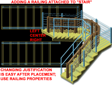 |
| Adding Railing Attached To: Stair Flight Using the Attached To: "Stair
Flight" option is very similar to the Attached To: "Stair"
option, but only produces a Railing that runs the length of one flight from floor to
landing or from landing to landing/floor. The anchoring and amazing ability to
adjust to Customized Edges is also a part of this type of Railing option.
The only unfortunate aspect of this, that I see, is that
you cannot use this option to place a Railing on a Stair landing. In some cases, for
example, you want one type of Railing for open stairs but another at a landing that might
be surrounded by walls (you might even want to switch to a simple guardrail at such a
point ). To achieve this result, you will have to use Attach to "none" for
the landing portion and draw a separate Railing at the landing as discussed above. |
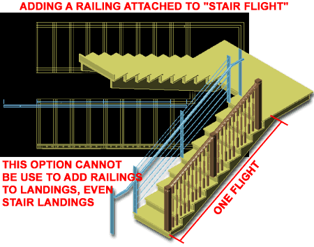 |
| 14Modifying Railings |
14-7 STAIRS - RAILINGS |
Modify Railing Properties Palette
| Alt.Menu |
Design>
Railings> Railing Properties |
 |
|
| Keyboard |
RailingProps or
-RailingModify |
| Mouse |
Double pick on Railing
Object with left button |
| Links |
Railing Styles - for how to create a Railing
Style. |
For Modifying Railings you can use the Properties
Palette which offers nearly all of the same options as those found when Adding
Railings. Under the Dimensions section you should find several dialog box access
buttons but unless the Railing Style is set to "Allow each Railing to Vary",
these dialog boxes will remain inaccessible.
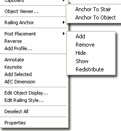 DIMENSIONS DIMENSIONS
Rail locations - see cell directly below.
Post Locations - see cell directly below.
Railing Extensions - see cell directly
below.
LOCATION
Side Offset - this value field is not available for Railings that have
been Attached to "None". For all other Railings, this value field provides
the option to move a Railing, Posts and all, horizontally relative to the Justification.
See also Anchor dialog.
Automatic Cleanup - at the time of this
writing I could find no evidence that this Yes/No option actually did anything to the
Posts. |
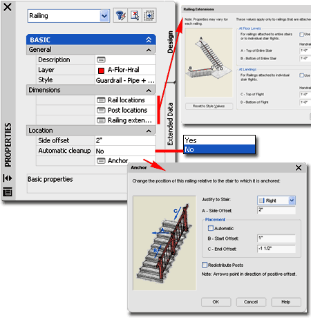 Anchor - this dialog box
provides the option to change the original Justification to Left, Right
or Center and another place to change the Side Offset value as discussed
above. Post Placement is typically Automatic
but can be set manually by using negative or positive values for "B - Start
Offset" and "C - End Offset". If you move
the first and/or last post position you may also want to have the remaining Posts and
Dynamic Post positions redistributed based on the specifications within the Railing Style;
use the "Redistribute Posts" checkbox for this
feature.
Illustrated to the left I show the object-specific pop-up menu and the
options you have for an un-Anchored Railing Object. In addition to these options,
you will find some flexibility for controlling the design of Railing through the use of
Grips. |
| Railing Styles dialog box - Allow Each Railing
to Vary
On the Rail Locations tab of the
Railing Properties dialogue box, you may find that every value is gray and that
you cannot edit any of the value fields. In fact, you may find that this is
also the case for the Post Locations tab and the Extensions
tab. This is because the Railing Style controls these settings.
If you go to a Railing Styles dialog box
and look at the same set of tabs, you should see a check box on each of these tabs that
offers "Allow Each Railing to Vary" as an option - see
illustration, right. By checking these checkboxes, you provide the freedom to modify
the value fields and settings through the Add and Modify Properties Palettes.
The Good vs. the
Bad:
If you work with Allow Each Railing to Vary, you can end up with numerous different
permutations of a single Railing Style in your project making it difficult to change all
of them from a single dialog box. The good news about this is that you can always
change your mind and go to the Railing Style tabs and uncheck this option to regain
control of all Railing permutations. Doing this, however, means you will lose unique
changes you may have made to those Railings. |
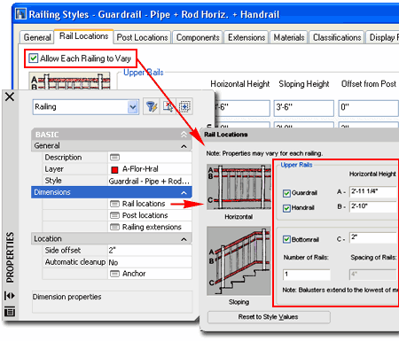 |
| Railing Properties - Anchor tab On a Railing Attached to a Stair
or Stair Flight, the Modify Properties Palette will offer access to
the Anchor dialog box.. This dialog box also allows you to change
the Justification of an Attached Railing, which is a great option if you simply want to
move a Railing form one side of a Stair to the other.
Justify to Stair - Left, Center and Right
are the three choices you have and if you want something beyond those points, you will
have to use Side Offset.
A - Side Offset - this is the same offset option you should see directly
on the Properties Palette when you Add a
Railing or Modify a Railing. This value has to do with how far in from the Stair
edge you want the centerline of your Railing Posts.
Sometimes I have been in a real hurry and simply copied an
existing Railing by picking twice in the same spot on a stair (the Railing is anchored, so
the copy will stay in the same position as the original); then I have used this
Justification option to make the copied Railing hop over the the other side.
Placement
Automatic - on/off checkbox for the manual placement of First and Last Post
relative to a Stair's Riser positions.
B - Start Offset - this is an offset perpendicular to
the Risers so you can move the first post forward or back relative to its current position
and affects the bottom of a Stair. Positive numbers pull a Post back in towards a Riser
and negative numbers push a Post out away from a Riser. By using Grips on a Railing,
you can change this value. Too much of an Offset in either direction may create
unwanted results particularly since all of the Railing detail, such as the Balusters, are
affected by this value. |
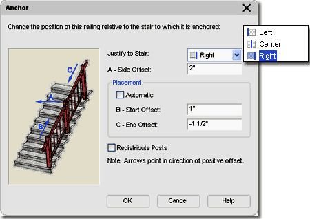 C
- End Offset - this is just the same as Start Offset but for the top post. By
using Grips on a Railing, you can change this value.
Redistribute Posts - The
first thing you should be aware of about this unusual checkbox is that it is really more
like Apply option; i.e., you check it to use it once to make a change and then it unchecks
automatically. This box will never remain checked because of how it is works. This
option can really mess up your work or fix mistakes. Redistribute is like a reset
button where the posts get placed according to the default positions and new ones will be
added at the ends if any Start or End Offset values have been set. |
Post Placement Options
| Keyboard |
RailingPostAdd,
RailingPostRemove, RailingPostHide, RailingPostShow,
RailingRedistributePosts |
| Mouse |
Select Railing Object, right
click, select Post Placement and cascade to a desired option |
For Railings you can work with the Object-Specific pop-up
menu to Add, Remove, Hide, Show
and Redistribute Posts along a Railing run. If you
prefer to work in an Isometric View, you may need to use an Osnap like Nearest in order to
Select the desired Post(s).
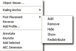 Add - by Osnapping to a specific point or by selecting a
general point between other posts, you can use this option to introduce a new Fixed Post.
You cannot Add a Post beyond a Railing's start or end position. Grips can be
used to relocate an Added Post. Add - by Osnapping to a specific point or by selecting a
general point between other posts, you can use this option to introduce a new Fixed Post.
You cannot Add a Post beyond a Railing's start or end position. Grips can be
used to relocate an Added Post.
Remove - this option can only be used on
Fixed Posts that are not also Corner Posts. Dynamic Posts cannot be Removed with
this option. The Redistribute option can be used to Undo Added and Removed Posts.
Hide - this option can be used to turn off
the display of one or more Posts.
Show - this option turns the display of
all Hidden Posts back on. |
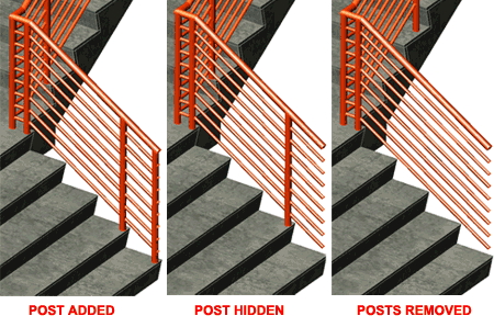
Redistribute Posts - will
match them against the Style settings and will remove custom changes such as Added,
Removed or Hidden Posts. Think of this option as a Reset for Railing Posts. This option can be great after Grip Stretching Fixed Posts to new
Positions since it will redistribute based on the new positions. |
Reverse Railing
| Keyboard |
RailingReverse |
| Mouse |
Select Railing Object, right
click and select Reverse |
The Reverse Object-Specific pop-up menu
option serves a function similar to the Mirror command by flipping the inside edge of a
Railing to the outside edge and is very useful in working with Railing Styles that use a
Handrail on one side. Essentially this is a tool to assist in working with
Asymmetrical Railing Styles. If you need to work with any of the simple Handrail (
or grab bar ) Railing Styles that come with ADT that appear to only work for one
direction, this is the tool to use to get those Railing Styles to work in the opposite
direction. |
|
Add Profile
| Keyboard |
RailingAddComponentProfile |
| Mouse |
Select Railing Object, right
click and select Add Profile... |
| Link |
Profile - Edit in Place - for
more information on Profiles and the process of editing them right on objects |
The Add Profile Object-Specific pop-up
menu option allows for rapid changes to the Profile shape used to determine how the
various Components within an existing Railing Style should appear. You can use this
option to change a Railing Component to any existing Profile Definitions or to a new one
created on-the-fly. When you wish to create a new Profile, you should notice that
the In-Place Edit toolbar will appear and that the current Profile will be available for
In-Place editing. |
|
| Railing Grip Points For
most Railings, the only Grip Points that you will find are on the Fixed
Post Positions as illustrated to the right. Depending on the particular
Style Settings, you may find the Stretch capabilities fairly limited for the Fixed Posts.
In the middle illustration to the right I show how I have only been able to Grip
Stretch the end Post back from the Stair Edge but not Forward.
If a Railing Style has one or more of its Tabs set to
"Allow Each Railing to Vary",
you should find more flexibility and freedom in what can be achieved with Grip Points.
Illustrated to the right I show that in allowing my Railing Style to Vary, I was
not only able to Stretch the End Post forward but also the Guardrail Extensions
( independently ). If your Railing Style has Guardrails and Handrails, you can Grip
Stretch each independently.
|
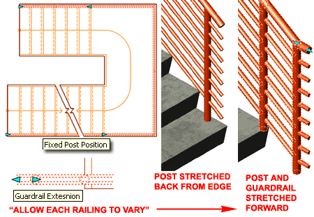 |
Convert
to Railing
| Menu |
N.A. |
 |
|
| Keyboard |
RailingConvert |
Converting a Polyline to a Railing is about as simple as it
can get; just draw a regular Pline and use the Convert to Railing tool to create a Railing
that follows the Pline as a path. When you use the Convert to Railing tool and
select a Pline, you will be prompted to select a Railing Style.
To create sloped Railings, change the UCS icon to match the
slope of your intended Railing, Draw your Pline and then use the Convert to Railing tool.
If you don't adjust your UCS icon, the Railing will not follow the slope because it
only reads the X and Y coordinates of the object as it was drawn, relative to the
coordinate plane. This means that a Pline drawn in Front view, for example, will
produce a sideways Railing. |
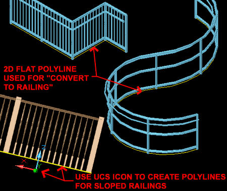 |
Anchor Railing to Stair or Object
| Menu |
N.A. |
 |
|
| Keyboard |
RailingAnchorToStair |
For Railings there are three primary Anchor options: RailingAnchorToStair,
RailingAnchorToObject and AnchorRelease. The
Anchor to Stair option is a bit unpredictable and does not have a consistent result but
there are basically two results that you can expect most of the time. If a Railing
tends to follow the shape of a Stair and is very close the Anchor option will usually
attempt to transfer the Railing on to the Stair as if Attached to it. If the Railing
is not particularly close to the Stair nor particularly similar to the Stair path, the
Anchor simply sets a link between the two Objects so any Movement of the Stairs also Moves
the Railings. This later option can be really handy when you have a Railing that
wraps around a Stairwell.
The Anchor to Object option can be rather amazing since it
has an internal option to "Follow Surface" allowing such results as Railings
that wind over and around a Mass Element Sphere.
Note:
When using the Anchor to Stair option to control a Railing such as that in the
illustration to the right, make sure to position the posts outside the edge of the Stair
Object (on all sides) to prevent the Railing from jumping to the Stair Object itself. |
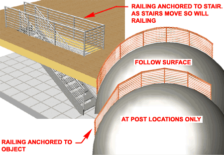 |
| 15Railing Styles |
15-7 STAIRS - RAILINGS |
| Railing
Properties - Schematic Diagram of Components Before you venture into the world of the Railing Styles dialog box and all of
its settings, take a look at the illustration to the right and notice that there are five
primary parts of Components to a Railing Object. In the physical world each
Component Name connotes a certain function but in the digital world these names are more
like placeholders and numeric controllers for just about anything you can dream up.
This means that you can work with the Style settings in a very literal fashion or in a
completely creative fashion to produce results that may not even have anything to do with
Railings.
Unfortunately, on each tab you will find the same letters,
like A, B and C used to represent different dimensional settings; i.e., A on the Rail
Locations tab refers to a Guardrail's Horizontal Height and Offset from Post while A on
the Post Locations tab refers to the Extension of ALL Posts from Top Railing height.
On the graphic illustration to the right, I attempt to show some of the locations
settings from two different tabs by using RL for Rail Locations tab and
PL for Post Locations tab. |
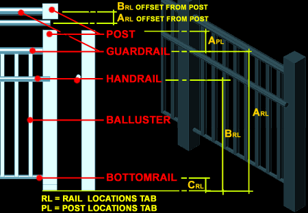 |
Style Manager - Railings
| Alt.Menu |
Design>
Railings> Railing Styles... |
 |
|
| Keyboard |
RailingStyle |
For Railing Styles, you can use the Style Manager
to load, modify, delete and create new Railing Styles.
Though you can easily create New Stair Styles from Scratch
using the New button, you may want to use the Copy/Paste
technique instead because it is far easier to Modify Settings of an existing Object Style
than it is to create one from Scratch. In some cases, you may even miss specific
settings that can come back to haunt you much farther down the road on a project - things
like Display Representations or Data for Schedules.
Illustrated to the right, I show the process of creating a New
Railing Style that I have Named "Custom Railing". By double-clicking
on this new style, you will invoke the Railing Styles dialogue box - as
illustrated. |
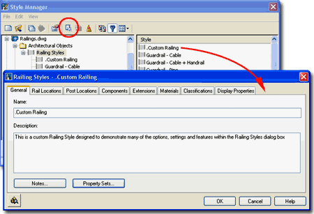 The General tab provides access to the Name
and Description fields for a Style; plus access to the attachment of Notes
and Property
Sets. |
| Railing Styles - Rail Locations tab On the Railing Locations tab of the Railing
Styles dialog box, you will find height and justification setting for Guardrails,
Handrails and Bottomrails. Though each rail type
connotes a certain function in reality, you do not always have to take these terms
literally and understanding what each rail type controls is the most important thing to
master. Likewise, setting values here does not necessarily mean that you will see
the rail because there are other options for sizes and Component Display Properties for
visibility control.
Allow
Each Railing to Vary - this checkbox will provide access to these settings
through the Properties Palette.
Guardrail - on/off checkbox but you cannot
have both Guardrail and Handrail off. If you don't want either, you can
set their dimensions to zero under the Components tab or use the Display Properties tab to
turn their Visibility Off.
A - The height values should be self-evident from the graphics
on this tab; the measurement is from base of column to centerline of Guardrail. Offset
from Post refers to how far out from the centerline of a post you want the
centerline of your Guardrail in cross-section view. Side for Offset
refers to which side of the Posts you want the Guardrail; there are four options: Center,
Left, Right and Auto. I have
found that Auto works rather well but you may need to use the other options for cases
where you are not attaching your Railing to a Stair or Stair Flight.
Handrail - on/off checkbox but you cannot
have both Guardrail and Handrail off.
B - The height values should be self-evident from the graphics
on this tab; the measurement is from base of column to centerline of Handrail. Offset
from Post refers to how far out from the centerline of a post you want the
centerline of your Handrail in cross-section view - if you also use Guardrails, you will
most likely want to run your Handrails on the outside of your columns. Side
for Offset refers to which side of the Posts you want the Handrail; there are
five options: Center, Left, Right, Auto
and Both. I have found that Auto works rather well but you may need
to use the other options for cases where you are not attaching your Railing to a Stair or
Stair Flight. Both is really nice for cases where you are running a Railing down the
center of a wide set of stairs.
|
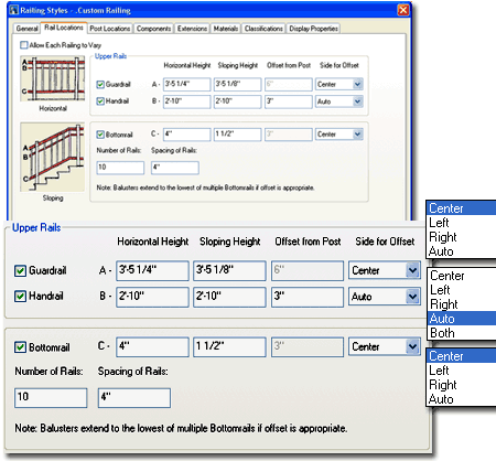 Bottomrail - on/off checkbox; if off,
Balusters will run all of the way down to the Floor (Tread).
C - The height values should be self-evident from the
graphics on this tab; the measurement is from base of column to centerline of Bottomrail.
Number of Rails allows you to create unique Railing designs by
adding more horizontal members. If the number is set to a value greater than or
equal to 2, you will be able to specify a Spacing of Rails in the value
field below this value field. The Spacing of Railings refers to a
centerline distance between the Bottomrail for each consecutive Bottomrail specified in
the Number of Rails value field. |
| Railing
Styles - Post Locations tab Allow Each Railing to Vary - this
checkbox will provide access to these settings through the Properties Palette.
Fixed Posts - on/off
checkbox for posts. If you uncheck this, you will also be turning off Dynamic Posts.
A - Extension of ALL Posts from Top Railing - This value actually is only
affected by the position of either the Handrail or Guardrail. If the Guardrail is
on, no matter what height, it will control the Extension of the posts if you want a low
Guardrail and a high Handrail, you will have to Extend the Posts up to compensate.
B - Extension of All Posts from Floor Level
- this value field can be used to project Posts down beyond the Tread (Floor) level using
a positive number. Negative numbers can be used to raise Post bases up from the the
Tread (Floor). Values used here lengthen or shorten the Post. Extreme negative
values can actually project a Post up past it's top. This option is useful for Deck
Railings where the posts need to be fixed to the ground but does not work well for
achieving the same results on Railings that are Anchored to Stairs because of the slope.
Fixed Posts at Railing Corners - this
checkbox option places a Post at every Railing transition point from horizontal changes in
direction to vertical transitions such as riser to landing. It will place a Post not
only at all corners of landings but also at corner breaks where you may have done
extensive Custom Edge modifications to
your Stair.
Dynamic Posts - on/off
checkbox for spacing of posts not to exceed Max. Spacing value.
C - Maximum Center to Center Spacing - a value used to determine the
greatest distance allowed before a Post must be placed. This value does not mean
that all Posts will be exactly this far apart; Fixed Posts at Railing Corners, for
example, will override this setting where needed.
Note: if you uncheck Dynamic Posts, you can place Post
locations manually when creating Railings that are Attached to
none. |
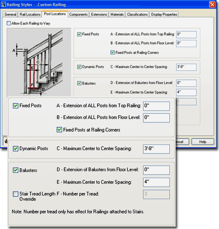 Balusters - on/off checkbox for
Balusters and spacing value.
D - Extension of Balusters from Floor Level - this value
field can be used to project Balusters down beyond the Tread (Floor) level using a
positive number.
E - Maximum Center to Center Spacing -
this value field is used to specify the centerline to centerline distance between the
Balusters. Keep in mind that Building Codes typically specify a dimension from
inside face to inside face rather than from centerline to centerline. In the U.S.,
for example, you cannot allow a 4" diameter sphere to pass through your Balusters.
Stair Tread Length - on/off
checkbox for the Override value field.
F - Number per Tread Override - When you use this value field, you are specifying
how many Balusters you want for each Tread on a Stair Object, regardless of
center-to-center spacing, per Tread Length. |
Railing Styles - Components tab
| Link |
Profiles - for more information on Profiles. |
The Components tab of the Railing
Style dialog box, illustrated to the right, is where you can specify the
dimensional proportions of your Railing Style's Components. By default, you will
find that there are two Profile Names that define two primary shapes: Rectangular and
Circular.
Components - this column of Components,
lettered A-F is fixed. Though you cannot add Components, you can set change their
shapes or set the dimensional values to zero. Custom items can be added through the
Display Properties tab.
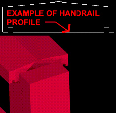 Profile Name - by picking within one of these
cells, you should get a drop-down list of all the Profile names currently available in
your drawing. There are two unique names specifically designed for Railings: *circular*
and *rectangular*. You can think of these as cylinders and columns
depending upon the Width, Depth and Heights of Guardrails and Handrails. For custom
shapes, you can select a Profile drawn as a cross-sectional view of how you want your
component(s) to look. Profile Name - by picking within one of these
cells, you should get a drop-down list of all the Profile names currently available in
your drawing. There are two unique names specifically designed for Railings: *circular*
and *rectangular*. You can think of these as cylinders and columns
depending upon the Width, Depth and Heights of Guardrails and Handrails. For custom
shapes, you can select a Profile drawn as a cross-sectional view of how you want your
component(s) to look.
Scale - this drop-down list
is only available for custom Profile Names and offers the option to control custom Profile
shapes uniquely. The scale is based on the Width and/or Depth values so "Scale
To Fit, for example, will scale to fit the Width and Depth values.
Width and Depth - these value
fields allow you to specify the physical dimensions of the Components in cross-section or
profile view. Therefore, Width and Depth will be represent different directions in
space depending upon the Component. |
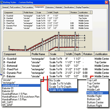 Rotation
- this value field allows you to rotate your Component relative to its cross-sectional or
profile view; Posts, for example, would be rotated based upon a Plan View.
Justification - this
drop-down list offers an extensive number of Justification types including
"Insertion" for custom Profile Names. The types will vary relative to the
Component and the direction of Justification; i.e., Plan versus Elevation. Though
these justifications refer to the cross-sectional or profile view of each Component, their
position is always relative to an absolute centerline. Some Components, like the
Guardrail, Handrail and Bottomrail have an Offset direction that determines how they are
placed relative to this absolute centerline while this justification affects the position
of the profile relative to that offset direction. |
| Railing Styles - Extensions tab Allow Each
Railing to Vary - this checkbox will provide access to these settings through
the Properties Palette.
On the Extensions tab of the Railing
Properties dialog box, you should find control settings for how you want your
Guardrail and Handrail Extensions relative to Stairs or Stair Flights.
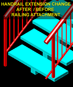 At Floor Levels At Floor Levels
Use Stair Landing Extension - on/off checkbox that defers to the Stair Style for how much to Extend the
Handrail and/or Guardrail at Floors.
A - Top of Entire Stair - for all of these value fields, you can use
positive ( out ) or negative ( back ) numbers and you can Add the depth of the Tread
to these values as well ( +T ).
If you check the "Allow Each Railing to Vary"
checkbox for this tab, you can actually use Grips to Stretch the Extension of Guardrails
and/or Handrails. Guardrail Extensions also affect Balusters and Bottomrails.
|
 B - Bottom of Entire Stair - see comments for A - Top of
Entire Stair.
At Landings
Use Stair Landing Extension - on/off checkbox that defers to the Stair Style for how much to Extend the
Handrail and/or Guardrail at Landings.
C - Top of Flight - see comments for A - Top of Entire Stair.
D - Bottom of Flight - see
comments for A - Top of Entire Stair. |
| Railing Styles - Materials tab
The subject of Materials is one of the
most expansive and confusing topics in Architectural Desktop because it requires a
complete comprehension of the product in order to take full advantage of this feature;
from object styles to display representations. This subject will be discussed under Part 1 - Display
and in the Presentation eGuide.
Illustrated to the right I show that Railings will offer
six fixed Components: Guardrail, Handrail, Bottomrail, Fixed Post, Dynamic Post
and Baluster. If you create a Railing Style from scratch, the default Material
Definition Name will be set to "Standard". If you have imported
any of the Architectural Desktop Railing Styles from the Object Style Library, you should
find that you will be able to use the Material Definitions that come with those objects -
as illustrated to the right where I am selecting "Metals.Metal Handrails and
Railings.Stainless Steel Satin".
See also Stair
Styles - Materials tab. |
 |
| Railing
Styles - Classifications tab
The subject of Classifications is
thankfully no where near as complicated as that of Materials so the only real question you
will need to consider is if you need to use them. Classifications offer another way
to separate Object Styles into categories that can be used in Schedules
and even in Display Representation Sets ( as "Show"
or "Hide" ).
Illustrated to the right I show that I have two Classification
Definitions ( see Format pull-down menu), each with a list of Classification
Names or Types. Generally you will not have any options on this Tab but if
you have created at least one Classification Style that has been set to "Apply
To" Railing Styles, you will be able to use it here. The range of use is really
up to your imagination but it is fairly obvious that Classifications can be quite handy in
Schedules. This topic will be discussed further under Part 18 - Schedules. You
can also read a bit more about how to create Classification Definitions in Part 1 -
Display. |
 |
| Railing Styles - Display Properties tab
The Display Properties tab of the Railing
Styles dialog box, illustrated right, provides access to the display
characteristics of the components of your Railing objects; from Visibility to Custom
Blocks and Cleanup Settings. This is also where you would go to have Railings change
color or Materials, for example, when you switch from one Display Configuration to
another. See the discussion on Railing Display Properties below for more
information on this subject.
Illustrated
to the left, is another way to access the Display Properties tab; select
the specific object, right click on your mouse
to invoke the object-specific pop-up menu and select Edit Object Display... Just
be aware that when you use this approach, you can actually set an Object Override as
opposed to a Style Override. Object Overrides can be extremely useful because they
allow you to add things like Riser Numbering to any object within a Style Family but they
can also be problematic because they lock you out from more centralized, Style level,
controls.
|
 |
| Railing - Display Properties - Component Layers  Illustrated to the right and left I show all of the Railing Display
Components for the "UP" portion of a Railing Anchored to a Stair Object ( the
"Down" portion has been turned off for clarity ). Illustrated to the right and left I show all of the Railing Display
Components for the "UP" portion of a Railing Anchored to a Stair Object ( the
"Down" portion has been turned off for clarity ).
Under the default Plan Display Representation,
you should notice that you cannot control any of the Railing Display Components "By
Material" so all settings are controlled right here on the Display
Properties dialog.
Generally, the scale of the drawing and the level of detail
you wish to communicate at that scale will determine what Display Components you wish to
have Visible. For Plan View, I tend to only want the Handrail or Guardrail linework
and definitely not the Posts or Bottomrails but it all depends on what you are trying to
communicate.
|
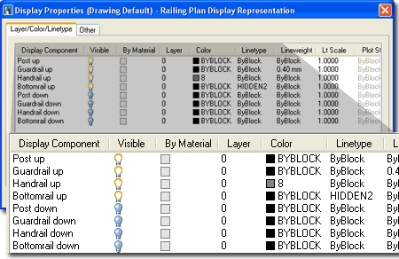 |
| 16Railings - Display Properties |
16-7 STAIRS - RAILINGS |
| As with the Stairs, when it
comes to Railings you may need to use even more retrain to adopt a "less is
more" approach since adding detail is not only easy but fun. The price
for detail, however, is significant and just a few railings can affect display performance
on your system in very dramatic ways; especially when Zooming or Panning while Shademode
is on and Materials are active. Having said that, I
have to admit that Railing Styles are one of my favorites and I continue to come up with
odd new things that I can use them for. The whole Fences Kit that I offer on the
ARCHIdigm.com website was created with Railing Styles. You see, Railings do not need
Stairs to work so you can draw with them much like a Wall, Curtain Wall or other linear
Object type. If you need curved Railings, you can use Polylines as a source for
Converting. You can also Anchor Railings to other Objects such as Mass Elements and
wrap them over the top of Domes, for example.
The primary feature that makes Railing Styles so useful for
me is the option to Add custom Blocks and substitute them for the default internal
Components. By using your own custom Blocks you can, for example, use Railings to
create Street Lamp layouts or even planting systems.
Illustrated to the right I show a simple example of a
default Metal Railing Style whose Display Properties were modified slightly. In Plan
View I turned the Posts off and changed the Color of the Handrail
Components so they will print lighter than the Guardrail
Components. In Model View, I changed the Handrail Material to a Red Metal.
When I Attached this Railing to the default Steel Stair, I use the Side Offset Property to
center the Posts on top of the exterior Stingers.
|
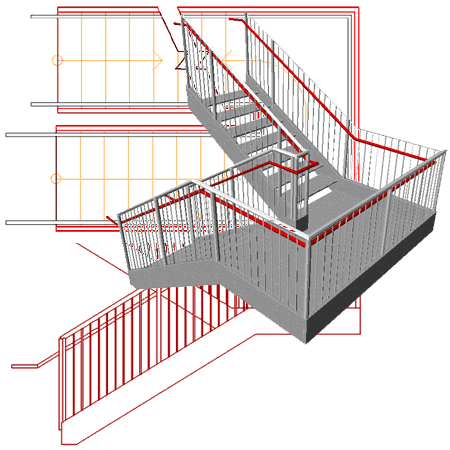 |
Railings in
Plan
| Menu |
Format> Display
Manager... |
|
|
| Keyboard |
DisplayManager |
| Keyboard |
DisplayProps [Attach] |
| Mouse |
Select Object, right-click,
select Edit Railing Style... or Edit Object Display... |
| Links |
Part 1 - Display - Object
Display Properties Overview - for more information on how to access the Display
Properties of this Object. |
In Plan View, Railings will pretty much
all look the same but there is one major option that produces a different effect:
Anchoring to Stairs. Railings that are not Anchored to Stair Objects will not
distinguish between Up or Down Display Components nor will they offer a Cut Plane.
This means that Stairs affect the Display of Railings.
Illustrated to the right I show two different Railing
Styles that have been Attached to a simple "Standard" Stair
Style. By default, most of the default ADT Railing Styles display Posts in Plan View
even when those posts are completely hidden by a Guardrail so I show the "Post
up" and "Post Down" Display Components
turned Off.
For the most part identifying what each of the Display
Components control should be relatively easy and since the list repeats for the
Up and Down Components, it is actually far shorter than it appears at first glance.
Bottomrail display is usually too much detail for common Construction
Documents and may be something more appropriate for a Detail. There is
no Hatch Display Component for Plan. |
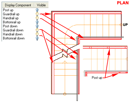 Illustrated
above I show a slightly modified version of the default "Medium Detail"
Display Configuration which uses the "Plan" Display
Representation for most Objects. In order to illustrate how you can lighten
a Handrail I changed its Display Component Color to Gray. I turned
Off the Visibility of the Posts. |
| Railings
Above and Below the Cutting Plane
Since Railing Object Display Components have been divided
in half under several of the Display Representations, it is fairly easy to turn the Visibility
On or Off for all of the "Up"
or "Down" Display Components
as illustrated to the right. Notice, however, that if you turn Off the Visibility
of a Railing but don't match that setting on the Stair, the Stair still gets cut by the
Railing.
To control the Zigzag Break Mark and the Cut
Plane Height for the Railing, you must adjust these settings on the
"Other" tab of the Stair's Display Properties dialog box - see Stairs Above and Below the Cutting Plane. |
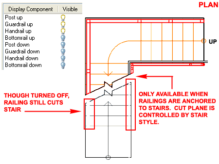 |
| Railings
in Model
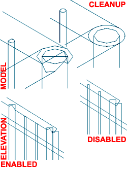 The list of Display Components for the Model Display
Representation is equal to the number of physical components in the Railing
Object Style and for these components, you can use the "By Material"
option to defer display control to the Material Definition Style associated with each
Component. The list of Display Components for the Model Display
Representation is equal to the number of physical components in the Railing
Object Style and for these components, you can use the "By Material"
option to defer display control to the Material Definition Style associated with each
Component.
Generally, you probably will not spend much time fussing
with these settings.
For the Model Display Representation, you should also find
that there is an "Other" tab with a Cleanup section that can be
used to make Railings perform faster on your system. The Cleanup Disable
feature provides an option for making the display of Railings less taxing on your system
while allowing you to work in 3D without having to do something as drastic as turning Off
the Visibility of specific Display Components.
Illustrated to the left I show what a common Railing Style
looks like in a 3D View with Cleanup Enabled and Disabled. For me, Disabling the
Cleanup is find since the flaws don't show in Renderings anyway and I always Generate 2D
Elevations and Sections instead of using the Live Elevations and Sections. |
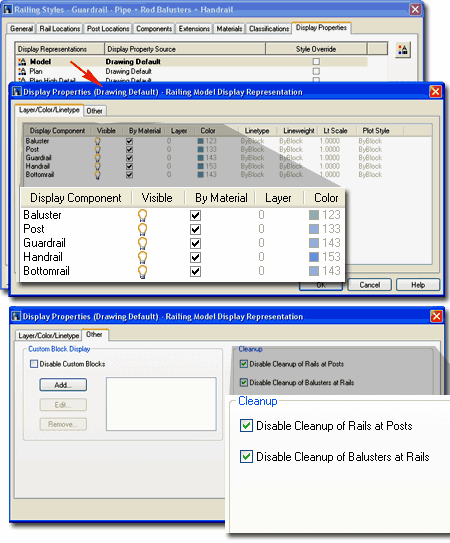 |
| Display Properties - Stairs - Other
tab Depending on the Display
Representation for a Railing Style, the Other tab of the Display
Properties dialog may or may not offer the Cleanup options
( Model only ). The Custom Block Display section provides some of
the most exciting design options for Railing Styles. For this section you have the
option to Disable Custom Blocks so they don't display, Add...,
Edit.. and Remove... buttons to work with Block
attachments. The Add... and Edit... buttons will access the Custom Block dialog box
where you can use the Select Block... button to select one block.
SCALE TO FIT
Depth, Width, Height, Lock Ratio and Between Comp. - by using
any single or combination of these checkboxes, you can control how your custom Block
scales relative to the Component it is associated with. Using only the Between
Comp., for example, will stretch one axis of your Block between Components such
as the Posts and is therefore a fantastic solution for putting a Window (Glazing), Lattice
or fabric Block between posts.
MIRROR IN
Mirror X, Mirror Y and Mirror Z - by using any single or
combination of these checkboxes, you can flip Blocks that may not have been designed
correctly to match desired use in your Railing.
ROTATE
Align Slope - by using this checkbox, you can force your Block to follow
the slope of a Railing as it follows the slope of a Stair or other Object that it has been
Anchored to. When using this option, you can also use the Shear or Use Origin
options below it.
Shear - only works with Align Slope -
using this checkbox option will cut the ends of your custom Block to match the cut of the
Component as in "shear cut".
Use Origin - only works
with Align Slope - using this checkbox option reads the origin of the railing component
and derives a point in space based on a perpendicular vector from this origin relative to
the slope. You will not notice much of an effect if your block is near the origin
but if your block is inserted far from the origin, like on top of all posts, you will
quickly see how this option affects your block. In essence, this is a more accurate
definition of "align slope" because the block is positioned at a point
perpendicular to the slope as opposed to a point straight up from a tread on a stair, for
example. When you might use this option is another matter that is far less common
since we typically build most railing components perpendicular to the ground plane.
COMPONENT
Baluster, Main Post, Dynamic Post, Guardrail, Handrail and Bottomrail
- by using any single or combination of these checkboxes, you can assign your custom Block
to one or more Railing Components to add custom effects or to completely Replace
the component itself. This is how you can, for example, add a decorative top to your
Posts or Replace the default Balusters with a custom design.
|
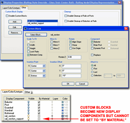 Replace - use this option together with one or more
Components to physically replace the internal Component with your custom Block. The
dimensions of the Component still apply but it just won't display.
Rotate Z: - by using this
value field, you can rotate a custom Block through the absolute Z-axis even as it follow
the curve of a Spiral Stair.
INSERTION POINT
X, Y and Z - by using the drop-down list options such as
Left, Center, Right or Front, Center and Back, you can set matching Insertion Offset
values to control where you want your custom Block to be positioned relative to the
Component it has been associated with.
INSERTION OFFSET
X, Y and Z - value fields that refer to
the relative Insertion Point settings to the left of these fields. You can use
positive or negative values.
ATTACH TO
All, First, Last and Selection
- use one radio button to control which Component is affected by the custom Block.
You can, for example, Add a decorative Sphere to the First or Last Main Post instead of
All of the Posts. The Selection option provides the means to set a Range.
Once a Block has been Added, you should find
that the Block Name will be listed as a new Display Component on the Layer/
Color/ Linetype tab of the same Display Properties dialog box.
Unfortunately, you cannot use the "By Material" option for Blocks so you may
need to be a bit creative and take a long circuitous route by using a custom Mass Element
for your Block. By using a Mass Element, you can attach a specific Material
Definition exclusively to that Object before making a Block of it. |
| 17Railings - Customizing and Tricks |
17-7 STAIRS - RAILINGS |
| Manipulating Railing
Components 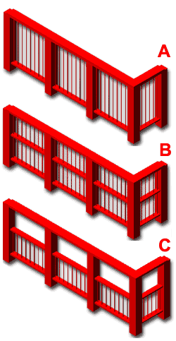 Though the names and terms used to describe the
various components of Railings imply that they have real-world functions that are similar,
the fact of the matter is that these components are simply controls within a larger
framework. Though the names and terms used to describe the
various components of Railings imply that they have real-world functions that are similar,
the fact of the matter is that these components are simply controls within a larger
framework.
Illustrated to the left and right I show some simple
examples of how you can play with the different components within a Railing Style to
produce unique design results.
For Railing "A",
I show that the Guardrail Component is used to control the Post and Baluster height.
For Railing "B",
I show how a slight modification to the same Railing Style will produce horizontal members
between the Bottomrail and Guardrail. These horizontal members are actually copies
of the Bottomrail Component.
For Railing "C",
I show how you can use the Guardrail and Handrail Components to alter how the Balusters
appear while keeping a similar Railing design solution. To shorten the Balusters, I
reduced the Guardrail height to about half of the original height and set the Handrail to
the former height of the Guardrail. In essence, I am using the Handrail as a
Guardrail. The problem with this trick is that the Guardrail also affects the height
of the Posts but I have another trick for that; on the Post Locations tab, compensate for
the reduction in Post height by adding it back as "A - Extension of ALL Posts
from Top Railing".
I |
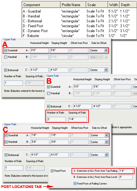 |
Creating a Custom Railing Style
| Alt.Menu |
Design>
Railings> Railing Styles... |
|
|
| Keyboard |
RailingStyle |
| Links |
Railings
in Model - for information on how to access the "Other" tab illustrated to
the right. |
| |
Creating a Custom Stair Style - for more
information on how I created this Glass Stair |
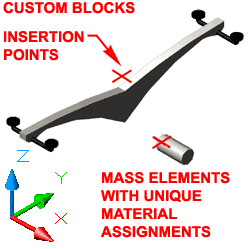 Designing
Custom Railing Styles is actually far more flexible than designing custom Stair Styles
because you can actually replace all of the default physical components with your own
Custom Blocks to create just about any wild repetitive design option you want. The
key is to think in terms of how the Railing Object works and then apply that functionality
to other design problems; from fences to street lights. Designing
Custom Railing Styles is actually far more flexible than designing custom Stair Styles
because you can actually replace all of the default physical components with your own
Custom Blocks to create just about any wild repetitive design option you want. The
key is to think in terms of how the Railing Object works and then apply that functionality
to other design problems; from fences to street lights.
In the illustration to the right and left I show an example
of how I used two custom Blocks within a custom Railing Style to create the Glass Stair
Design discussed earlier under Stairs. For the support structure under the Glass
Treads I created a 3D Model with Mass Elements ( or you can use Solid Modeling ) and
created a Block of it with an Insertion Point that would allow me to easily attach it
under the Stair Tread. For the center support rail connecting each tread support, I
had to create a custom tube because the Railing Style will not permit you to place a
Bottomrail below the Stair ( that was a little irritating to discover ).
Illustrated to the right I show the how I configured the
Custom Block dialog box settings for the glass tread support block. This was
actually quite simple because all I wanted was one block under each tread of the Stair
that this Railing would be attached to. Under Components, you can see that I used
the Baluster Component option to associate this block with. That may seem odd but if
you look at the Post Locations tab for the Railing Style, there is an option to force one
Baluster per tread no matter its length ( nice option ). |
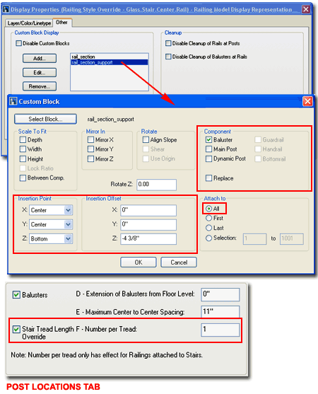 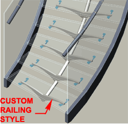 Note: Note:
For the Center Support Rail, I used the Between Comp. option on the Custom Block dialog
box. I also used the Align Slope Rotation option and the Baluster Component.
This solution worked very well on Straight Stairs but had a little bit of error on Spiral
Stairs due to the curvature. For Straight Stairs only, using the Main Post Component
works very well because it stretches the cylindrical block between the top and bottom
positions.
|
 Architectural Desktop 4 - Development
Guide
Architectural Desktop 4 - Development
Guide