| 1Materials - Access |
1-7 MATERIALS |
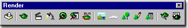
 Render toolbar Render toolbar
How do I get
this toolbar?
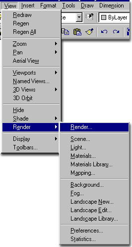
You can also acquire access to these commands from the View pull-down
menu. From the View pull-down menu, pick Render >
and cascade to Materials... |
 |
| Render pull-down menu Illustrated to the right, I show the
Render pull-down menu which consists of all the same tools as those found
on the Render toolbar. In this Part we will be discussing what may prove to
be the most difficult aspect of the Rendering process: Materials.
Below, we will look at a
broad range of possibilities working with Materials for simple Colors, Complex Colors,
Textures, Transparencies and photo-realism. Though a lot of amazing work can be done
with the Materials, it is important to keep in mind what the final product will be used
for, how it will be presented and how much time you have to produce it.
In many cases, it actually
serves a project better to keep Materials simple and plain. This can be seen as a
style in itself much like hand drawn renderings are done in styles. At the time of
this writing, I have noticed that the big architectural firms are currently rendering with
a lot of pastel Colors with varying degrees of opacity. In the early years of
architectural rendering, "photo-realism" was a goal of many renderers but over
the years students with artistic backgrounds have illustrated that computer rendering
styles are not only valid but quite astounding. Clients have often asked me to tone
down the "realism" to avoid drawing attention to elements of a design that are
either incomplete or simply less attractive in a rendered image than in reality.
Two Types of
Materials:
It is important to understand that there are basically two types of Materials: homogenous
(without a pattern) and patterned or textured ( usually from a bitmap ). Simple
Colored Materials are the easiest to work with because mapping and scaling are irrelevant.
Patterned Materials that use a bitmap image are more difficult to work with because
they have a direction ( based upon the normal of the 3D face they are Attached to ),
orientation and scale. |
 |
| 2Materials dialogue box |
2-7 MATERIALS |
Materials dialogue box options broken down
| Menu |
View> Render>
Materials... |
|
 |
| Keyboard |
Rmat |
| Links |
Printing Shaded Views - for
an example of how to work with the *Global* Material. |
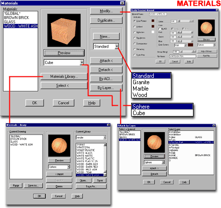
The Materials dialogue box, illustrated to
the right, is the primary tool for managing materials in AutoCAD and Architectural
Desktop. Through this dialogue box you can track the Materials that exist in the
current drawing, create New and Modify existing
materials, access the Materials Library dialogue box and associate
Materials with objects, Colors or Layers. The
default Material for all objects is the *Global* Material which is
automatically Attached to all objects until another Material has been Attached. The
*Global* Material can be Modified as a Standard Material but cannot be renamed.
The Process of working with Materials involves the
following steps:
1. Create a New
Material or Load a pre-defined Material from the Materials Library.
2. Modify the Material to suite your
specific needs or skip to step 3.
3. Attach the
Material with 3D Objects in your current drawing by direct Attachment, by Color ( AutoCAD
Color Index (ACI) ) or by Layer.
4. Render the work
to test the effect of your Material on your 3D Objects.
After running a Render test, you may discover that the
Material requires Modification. You may also discover that the Mapping
( orientation and scale ) of the Material requires adjustment. We will discuss these
issues and more below. |
 |
| 3Standard Materials |
3-7 MATERIALS |
New Standard Material
| Menu |
View> Render>
Materials... |
|
|
| Keyboard |
Rmat |
One of the most difficult Materials to
make is one of the first Materials I looked for in 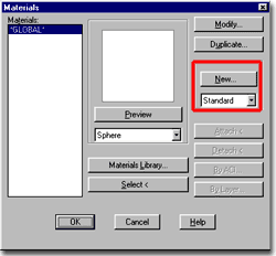 the Material Library only to discover that it
doesn't exist. If you need to create the effect of Water in your Renderings,
you will have to invent your own solution. In the following discussion, we'll take a
look at some tricks for making Water and learn quite a bit about making Materials at the
same time. the Material Library only to discover that it
doesn't exist. If you need to create the effect of Water in your Renderings,
you will have to invent your own solution. In the following discussion, we'll take a
look at some tricks for making Water and learn quite a bit about making Materials at the
same time. |
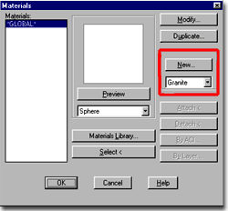
 On the Materials dialogue box, illustrated left, use the Standard
Material type and Select the New... button. This will automatically
activate the Modify Standard Material dialogue box, illustrated below
right. |
Standard Material dialogue box
| Menu |
View> Render>
Materials... |
|
|
| Keyboard |
Rmat |
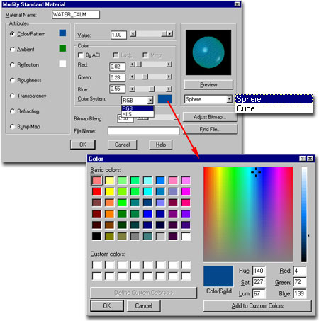
On the Modify Standard Material dialogue
box, you can work with each of the Material Attributes by setting the
Attribute radio button. To the right of each Attribute, you can use the various
settings and controls to define the appearance of the active Attribute.
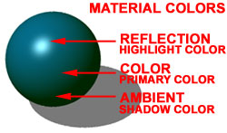 Illustrated
to the left, I have used the Color System to choose my own shade of blue
as the main color for the water. For the Ambient Attribute or
Shadow Color, I have chosen a dark shade of Green using the same Color System as for the
Color Attribute. Finally, for the Reflection Attribute or Highlight
Color, I have chosen a near White shade of Blue. Illustrated
to the left, I have used the Color System to choose my own shade of blue
as the main color for the water. For the Ambient Attribute or
Shadow Color, I have chosen a dark shade of Green using the same Color System as for the
Color Attribute. Finally, for the Reflection Attribute or Highlight
Color, I have chosen a near White shade of Blue.Below
we will go through each of these steps and venture even farther into other Attribute
settings that can be used to make Water. |
Material Name - use this text
field to type in a name that best describes your material. You can use up to 16
characters ( or numbers, spaces, etc.) and there are few, if any restrictions, on the use
of spaces and wildcards so "-", "/" and "*" are all allowed.
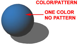
Attributes:
Color/Pattern - this radio button allows you to use the adjacent Value,
Color and Bitmap options to set your Material's primary
appearance. You can choose to work with pure Colors or use Images ( Bitmaps ) to
create the look of the material. Using Bitmaps is one of the best ways to create
photo-realistic materials because they come directly from the image you select. read
more under Bitmaps.
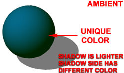
Ambient - this radio button
allows you to use the adjacent Value and Color options
to set a material's Shadow Color. Put together with Color/Pattern
and Reflection, below, you can control the full spectrum of how a material will look from
highlight through to dark shadow.
Reflection - this radio
button allows you to use the adjacent Value, Color and Bitmap
options to set a material's Highlight Color. This Attribute is also
how you control the reflectivity of your Material and what is reflected. By using
the Mirror Color option, for example, you can create a
perfect mirror effect. By using the Bitmap option, you can specify a
"fake" image as a reflection.
Roughness - this radio
button allows you to use the adjacent Value option to control the size of
the Reflection highlight or "smoothness" of your material.
A lower value, smoother, creates a smaller but brighter appearing highlight that
creates a sensation of a smoother object. A higher value spreads the highlight out
and makes an object appear more flat and rough. Think of the difference between how
light appears on a cue ball and blue jeans. |
 Transparency - this radio button
allows you to use the adjacent Value and Bitmap options
to control the opacity of your material. The Value control allows you to set the
Transparency between 0 ( no transparency ) and 1.00 (
completely clear - no opacity ). The Bitmap option allows you to introduce an image
as a source of determining non-transparent images within a transparent material.
This is how you turn a solid 3D object into a chain-line fence, for example.
Refraction - this radio
button allows you to use the adjacent Value option to control the optical
distortion of light as it passes through mediums. Be careful with this option
because the Value control can be set between 0.010 and 100.0 with 1.00 as normal.
Refraction affects Transparency and has to do with the optical effect we often observe
when we look at a jagged spoon in a clear glass of water. Values below 1.00 refract
opposite those above 1.00.
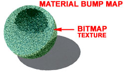
Bump Map - this radio button
allows you to use the adjacent Bitmap options to set an image file for
use as texture in your material and control how intense the "bumpiness" value
should be. A Bump Map works off of the light and dark regions of a raster image to
create a 3 dimensional quality in your materials; the lighter areas appear as high spots
and the dark areas appear as low recessions. |
| New Material - Color Options
Illustrated to the right I show the options available for
controlling the Color of the Color/Pattern Attribute.
 Illustrated to the left, I have used the Color System to
choose my own shade of blue as the main color for the water. I have used a Value of
1.00 ( 100% ) so that my blue will be the primary color and not a merging of the Ambient
Color. Illustrated to the left, I have used the Color System to
choose my own shade of blue as the main color for the water. I have used a Value of
1.00 ( 100% ) so that my blue will be the primary color and not a merging of the Ambient
Color. |
Value - this is a simple range control
that can be used to fade the color from 100% to 0%
pigment. Depending upon the Ambient and Reflection Colors, you can blend in more or
less of these Colors. In the case of a Blue Color/Pattern and a Green Ambient
Attribute, you can bring in more Ambient Color by reducing the Value of the Color/Pattern
Color.
Color:
By ACI - this checkbox deactivates the Color options and uses the Colors
assigned in AutoCAD / Architectural Desktop by the AutoCAD Color Index. In other
words, the Material color is derived by what has been directly assignment to the object(s)
or by the Layer ( hopefully you manage colors by Layer ).
Lock and Mirror - these
checkbox options are not available for this Attribute. |
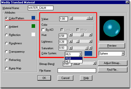 Color
System - this drop-down list allows you to work with the Color palette through
the Control of the RGB ( Red, Green, Blue )or HLS ( Hue,
Lightness, Saturation ) controls. Both are similar but allow you to "dial
in" the specific Color you seek through different control types. I prefer to
use the Color Swatch box to the right of the Color System to access the Color
dialogue box ( see above ) and simply set my color there. It should be
noted that by the time you get to paper the likelihood of getting the same color on paper
as that which you have carefully selected here, is about the same as being struck by
lightning ( that's my unscientific estimate ). In other words, don't worry too much
about exact colors and run print tests early on so you don't end up with a hideous green
when you expected turquoise.
Bitmap Blend - see Bitmap as Color/Pattern Attribute. |
| New Material - Ambient Options Illustrated to the right I show the options available for controlling the
Color of the Ambient Attribute.
 Illustrated to the left, I have used the Color System to
choose my own shade of green as the Ambient or Shade Color for
the water. I have used a Value of 0.80 ( 80% ) so
that the green has a bit of blue blending in. This should make the water material
look a little more alive when texture is added to it. Illustrated to the left, I have used the Color System to
choose my own shade of green as the Ambient or Shade Color for
the water. I have used a Value of 0.80 ( 80% ) so
that the green has a bit of blue blending in. This should make the water material
look a little more alive when texture is added to it. |
The Ambient Attribute controls how a Material appears when
light strikes across its surface and creates a darker side. The Color of the Ambient
Attribute can be used to change the shade of the Material Color on the darker side but can
also be Locked to match the Color/Pattern Attribute Color setting.
Value - see comments for Color/Pattern Attribute. |
 Color
By ACI - use this checkbox to have the Ambient Attribute Color be the
color of the object(s) this Material is attached to. See also comment for Color/Pattern Attribute.
Lock - use this checkbox to
lock the Ambient Attribute Color to that of the Color/Pattern Attribute. Doing this
will keep a Color consistent while allowing a change in the shade via the Value setting. |
| New Material - Reflection Options
Illustrated to the right I show the options available for
controlling the Color of the Reflection Attribute. The terminology
can be a bit confusing at first glance since we often think of reflection as one thing: a
mirror. In the case of Materials, you can create a perfect Mirror but you can also
use the Reflection Color as your Highlight Color and thus present the opposite spectrum of
the Ambient Color ( the Shadow Color ).
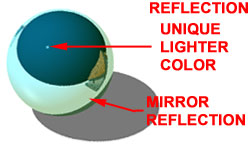 Illustrated to the left, I have used the Color System to
choose my own shade of white as the Reflection or Highlight Color
for the water. I have used a Value of 0.53 ( 53% )
so that a little of the blue blends through with the white but more importantly, so that
the Mirror reflection option is only at about half strength. Since
I don't want my water to be too reflective I have kept the Value setting low and may come
back later to set it even lower. Mirror reflections are "cool" but can be
overdone and they slow rendering time down dramatically. Illustrated to the left, I have used the Color System to
choose my own shade of white as the Reflection or Highlight Color
for the water. I have used a Value of 0.53 ( 53% )
so that a little of the blue blends through with the white but more importantly, so that
the Mirror reflection option is only at about half strength. Since
I don't want my water to be too reflective I have kept the Value setting low and may come
back later to set it even lower. Mirror reflections are "cool" but can be
overdone and they slow rendering time down dramatically. |
Value - this is a slightly more
complicated range control because it can be used to strengthen or weaken the highlight
color but when used with the Mirror checkbox, can also be used to control how reflective
the material is. In other words, if you want a perfect Bathroom mirror, use the
Mirror Checkbox and set the Value to 1.00 or 100%.
By ACI - this checkbox deactivates the
Color options and uses the Colors assigned in AutoCAD / Architectural Desktop by the AutoCAD
Color Index. In other words, the Material's Reflection color ( highlight
color ) is derived by what has been directly assignment to the object(s) or by the Layer.
Lock - this checkbox locks the Reflection
Color to the Color/Pattern Color to provide a non-specular Material. |
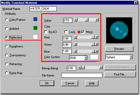 Mirror - this checkbox set the Reflection Color to the scene
and the objects and materials used in it. The Value setting will serve as a Mirror
control setting for how reflective you want your Material. Use this option along
with a Value of 1.00 for chrome and mirrors. Tip: make sure there
are no Bitmaps overriding this setting.
Bitmaps - using bitmaps for
Reflections is a way of "faking" a reflection when either none exist or when
what does exist isn't what you want. Much to my personal irritation, you will find
that most of the default Reflective Materials in AutoCAD and Architectural Desktop have
bitmaps as a Reflection Attribute. You can quickly remove them and use the Mirror
option instead.
Bitmap Blend - see Bitmap as Color/Pattern Attribute. |
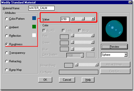
| New Material - Roughness Options Illustrated to the right I show the options available for controlling the Value
of the Roughness Attribute. This is the only option available for
the Roughness Attribute.
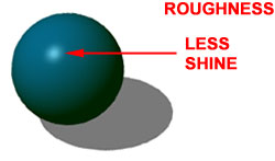 Illustrated to the left, I have used the Value control to
dull the Roughness or Surface Quality for the
water. I have used a Value of 0.50 ( 50% ) so that
the water will not look like plastic but still have some glaring shine. This value
affects the Reflection ( Highlight ) setting by expanding it to more of
the surface as the Value is increased. Illustrated to the left, I have used the Value control to
dull the Roughness or Surface Quality for the
water. I have used a Value of 0.50 ( 50% ) so that
the water will not look like plastic but still have some glaring shine. This value
affects the Reflection ( Highlight ) setting by expanding it to more of
the surface as the Value is increased. |
Value - this range control can be used to
make a material appear more or less shiny. The range is between 0.00 and 1.00 ( 100%
) where 0 is the least rough or most shiny. It works best in combination with the
Reflection Attribute and its Color because you can bring the Reflection Color to a
highlight point ( very shiny ) or spread it out over most of the surface the Material is
Attached to for a dull appearance. |
 |
| New Material - Transparency Options
Illustrated to the right I show the options available for
controlling the Value of the Transparency
Attribute.
 Illustrated to the left, I have used the Value control
to increase the Transparency of the water. I have used a Value
of 0.40 ( 40% ) so that the water has enough opacity to look like a body
of deep water but also have enough transparency so that objects could be seen penetrating
beneath the surface. With transparent water you have to consider what will be below
it; if the background is black, then the material will simply appear darker. Illustrated to the left, I have used the Value control
to increase the Transparency of the water. I have used a Value
of 0.40 ( 40% ) so that the water has enough opacity to look like a body
of deep water but also have enough transparency so that objects could be seen penetrating
beneath the surface. With transparent water you have to consider what will be below
it; if the background is black, then the material will simply appear darker. |
Value - this range control can be used to
make a material appear more or less transparent ( opaque ). The range is between 0.00 and
1.00 ( 100% ) where 0 is the most opaque and 1.00 is so transparent that it can be
invisible.
Bitmaps - using bitmaps for
Transparency is a way creating materials that appear like 3D geometry when they are not
modeled at all. A great example of this is a mesh like that of a steel fence; by
using a bitmap image of a fence as a transparency map, you can have the material show all
black areas between the steel as transparent. You can read more about this under Bitmaps as Transparency Attribute.
Bitmap Blend - see Bitmap as Color/Pattern Attribute. |
 |
| New Material - Refraction Options Illustrated to the right I show the options available for
controlling the Value of the Refraction Attribute.
This is the only option available for the Refraction Attribute.
 Illustrated to the left, I have used the Value control to
add Refraction to the water. I have used a Value of
0.50 to distort the light bouncing off of my water so that this material
will appear more turbulent. Illustrated to the left, I have used the Value control to
add Refraction to the water. I have used a Value of
0.50 to distort the light bouncing off of my water so that this material
will appear more turbulent. |
Value - this range control can be used to
make a material refract light in opposing directions; using the spoon in water analogy,
the spoon can be made to look smaller or larger. Since 1.00 equates to no
Refraction, values below 1.00 create the effect of objects getting larger while numbers
greater than 1.00 create the effect of objects getting smaller. The Value
range is between 0.01 and 100. Refraction settings
affect Transparency and usually require some Value of Transparency to be
effective ( obviously ). Personally, I use this option infrequently and only to
create a less than perfect reflection; something like a bit of noise in the reflection. |
 |
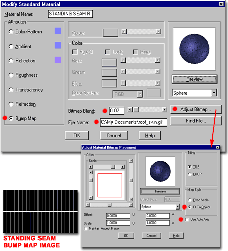
| New Material - Bump Map Options
Illustrated to the right I show the options available for
controlling the Bitmap Blend and File Name of the Bump Map Attribute.
Bump Maps are one of the best options you will find to make custom Materials look
more realistic or more "alive" because they provide the ability make a material
appear three dimensional regardless of what it has been assigned to. In other words,
by using the dark and light colors of raster images you can create valleys and peaks in a
material.
 Illustrated to the left, I have used the Bitmap Blend control
to use an image as a source of texture for the water material. With the Find
File... button, I have assigned the "ashen.tga" bitmap
as the source of my texture for ripples and used a Bitmap Blend value of 1.00
( 100% ) to get the most of this wood grain patter. Illustrated to the left, I have used the Bitmap Blend control
to use an image as a source of texture for the water material. With the Find
File... button, I have assigned the "ashen.tga" bitmap
as the source of my texture for ripples and used a Bitmap Blend value of 1.00
( 100% ) to get the most of this wood grain patter.This
is a personal trick I use where I find one material that has a pattern that can be used to
create another material that I don't have. In many cases, wood looks wavy like water
but you can use other patterns. Using the Adjust Bitmap...
button, you will be able to control the size of the texture relative to the object(s) it
is attached to. |
Bitmap Blend - this range setting can be
used to control the strength of the raster image's effect upon the Material. A Value
of 1.00 ( 100% ) will create the strongest valleys and peaks possible by the bitmap
chosen. |
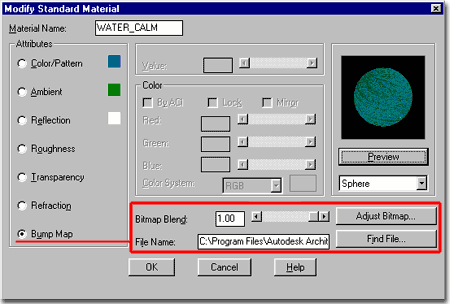 File
Name - this text field is used to specify the Name and Path of the raster image
you want to use as a Bump Map. By using the Find File... button, you should be able
to seek out and select just about any raster image on your machine or network. To
use AutoCAD / Architectural Desktop's materials, set the File Type to
".tga" and look for the Texture
folder under AutoCAD or Architectural Desktop
Adjust Bitmap - this button
will take you to the Adjust Material Bitmap Placement dialogue box where
you can use various bitmap settings to control how the raster image relates to the
object(s) you assign (Attach) it to. See Adjust Material Bitmap Placement for
more information. |
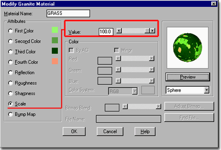
| 4Granite Materials |
4-7 MATERIALS |
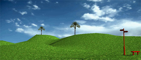
| New Granite Material dialogue box
 The Granite Material, to me, is really just a noise
material where you can specify up to four different colors to
create a pattern that mixes them "randomly" like a bunch of pixels. If the
pattern is set to a very large scale, then it does not look as random but may still
suffice as a quick solution for creating a material that appears complex and more organic
than a plain monotone color. The Granite Material, to me, is really just a noise
material where you can specify up to four different colors to
create a pattern that mixes them "randomly" like a bunch of pixels. If the
pattern is set to a very large scale, then it does not look as random but may still
suffice as a quick solution for creating a material that appears complex and more organic
than a plain monotone color.
|
On the Materials dialogue box, illustrated
left, use the Granite Material type and Select the New...
button. This will automatically activate the Modify Granite Material
dialogue box, illustrated below right.
Note:
These materials will not translate to 3D Studio Viz. |
| New Granite Material dialogue box Illustrated to the right I show the options available for setting
the four different Color Attributes.
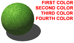 Illustrated to the left,
I have used the four Colors to create four different shades in my grass
material. I used three shades of green and one brown and adjusted each Color Value to
create a blend that I liked. Illustrated to the left,
I have used the four Colors to create four different shades in my grass
material. I used three shades of green and one brown and adjusted each Color Value to
create a blend that I liked. |
Value - this is a simple range control
that can be used to fade the color from 100% to 0%
pigment. Depending upon the Ambient and Reflection Colors, you can blend in more or
less of these Colors. In the case of a Blue Color/Pattern and a Green Ambient
Attribute, you can bring in more Ambient Color by reducing the Value of the Color/Pattern
Color. Since you have up to Four Colors to work with, you may also use the
Sharpness Attribute to Blend the Color Attributes together.
Color - with Granite Materials you do not
get an option for By ACI, since this material utilizes up to four
different Colors to create a Granite-like appearance. |
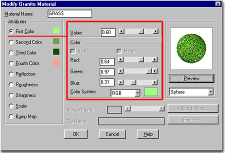 Color System - this drop-down list allows you to work with
the Color palette through the Control of the RGB ( Red, Green, Blue )or HLS
( Hue, Lightness, Saturation ) controls. Both are similar but allow you to
"dial in" the specific Color you seek through different control types. I
prefer to use the Color Swatch box to the right of the Color System to
access the Color dialogue box ( see above ) and simply set my color
there. For Granite-like Materials, you will be able to use up to Four Colors but you
can also set two colors to be identical or simply set one or more Color Attribute Values
to zero if you wish to reduce the variety of Colors. |
| New Granite Material - Reflection and Roughness
|
Reflection
and Roughness Attribute Value settings work the same way on the Granite
Material as with other Materials - see comments under Standard Materials,
above, for more information. |
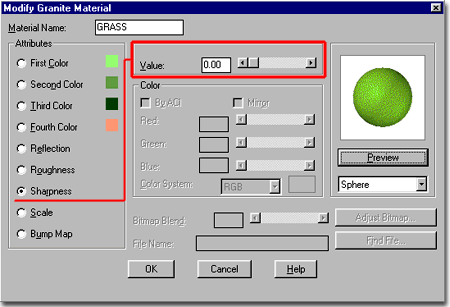
| New Granite Material - Sharpness Options Illustrated to the right I show the options available for
controlling the Value of the Sharpness Attribute.
This is the only option available for the Sharpness Attribute.
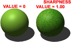 Illustrated
to the left, I have used the Value control to show the two opposite
extremes of how Sharpness can be used to either blend ( Value = 0
) or define ( Value = 1.00 ) the four Colors. In the case of Grass,
you will most likely want to take advantage of a higher and more sharply defined
differentiation between the colors. Illustrated
to the left, I have used the Value control to show the two opposite
extremes of how Sharpness can be used to either blend ( Value = 0
) or define ( Value = 1.00 ) the four Colors. In the case of Grass,
you will most likely want to take advantage of a higher and more sharply defined
differentiation between the colors. |
Value - this range control can be used to
blend all of the Colors or to sharply define them as distinct pixels. Since 0.00 equates
to a complete blend, values above 0.00 create the effect a rougher surface by refining or
sharpening the differences in the colors. The Value range is
between 0.00 and 1.00. |
 |
| New Granite Material - Scale Options Illustrated to the right I show the options available for
controlling the Value of the Scale Attribute. This
is the only option available for the Scale Attribute.
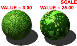 Illustrated to the left, I have used the Value control
to show how two different settings for Scale can be used to either reduce
( Value <=100.0 ) or increase ( Value >= 0.010 )
the color pattern. In the case of Grass, you will most likely want to match a scale
with the size of the object receiving this material in order to get a realistic look. Illustrated to the left, I have used the Value control
to show how two different settings for Scale can be used to either reduce
( Value <=100.0 ) or increase ( Value >= 0.010 )
the color pattern. In the case of Grass, you will most likely want to match a scale
with the size of the object receiving this material in order to get a realistic look. |
Value - this range control can be used to
decrease or increase the Color Attributes over the surface of the object this Material is
Attached to. Getting the right Scale for a scene is a matter of trial an error.
The Value range is between 0.010 and 100.0. |
Note:
On large landscape drawings, you may find that the Scale Value of 0.010 is just not small
enough. Unfortunately, this is the smallest value it will accept but you can work
with the Sharpness to reduce the obvious nature of the pattern effect. If this still
fails to produce the results you need, you may have to use a Standard Material with a
Grass bitmap instead. |
| New Granite Material - Bump Map
|
Bump
Map Attribute settings work the same way on the Granite Material as with other
Materials - see comments under Standard Materials, above, for more
information. |
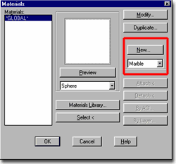
| 5Marble Materials |
5-7 MATERIALS |
New Marble Material dialogue box
| Menu |
View> Render>
Materials... |
|
|
| Keyboard |
Rmat |
Note: these materials will not translate to 3D Studio Viz.
Information will come in a future update to this guide.
|
|
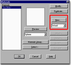
| 6Wood Materials |
6-7 MATERIALS |
New Wood Material dialogue box
| Menu |
View> Render>
Materials... |
|
|
| Keyboard |
Rmat |
Note: these materials will not translate to 3D Studio Viz.
Information will come in a future update to this guide.
|
|
| 7Materials Library |
7-7 MATERIALS |
Materials Library dialogue box
| Menu |
View> Render>
Materials Library... |
 |
|
| Keyboard |
MatLib |
| Links |
Bitmap
Texture Location - for more information on the location of default bitmap images. |
The Materials Library dialogue box,
illustrated to the right, is the primary tool for accessing predefined materials.
The default Materials Library consists primarily of Standard Materials that have been
Modified to use various Bitmap images as their Attributes ( Color/Pattern for the most
part ). AutoCAD and Architectural Desktop come with one default Material Library
file called "render.mli" and you should find that once you
access your Materials Library, this file is automatically opened.
If you do not find a large list of Materials, such as
illustrated to the right, check to make sure your program was installed with the Textures
Folder. Also, use the Options dialogue box and confirm that the Texture Maps
Search Path is set to the proper location of your textures.
Illustrated to the right, I show the process of looking
through the Materials Library, finding a Material to use and Importing it
into the current drawing. Once a Material shows up on the left pan of the Materials
Library, you will be able to use it via the Materials dialogue box ( see
below ).
Current Drawing
Purge - use this button to remove all unused Materials from the Current
Drawing.
Save As... - use this button
to create your own custom Materials Library that you can access through
the Current Library drop-down list. You can save .mli files to any folder you want
and thus keep them within projects folders.
<-Import - use this button
to transfer a Material from the Current Library to the Current
Drawing.
Export-> - use this button
to add a Material from the Current Drawing to the
Current Library. |
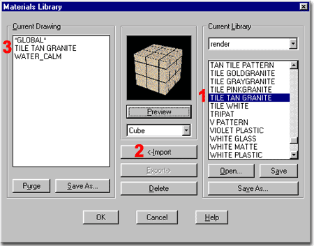 
Delete - use this button to
delete or erase any highlighted material.
Current Library
Current Library drop-down list - use this drop down list to access any Material
Library Files that have been Opened in the current drawing.
Open... - use this button to
open any Material Library ( .mli ) files that have been created with the Save As...
buttons.
Save - use this button to
save any Materials that have been Exported to the Current Library from the Current
Drawing.
Save As... - use this button
to save the Current Library with a different name to a possible new location. |
| Bitmap Texture Location
AutoCAD and Architectural Desktop come with a fairly
extensive list if bitmap files that you usually access automatically through the Materials Library dialogue box. If AutoCAD and/or
Architectural Desktop have been installed with all of the materials, you should find them
in a subfolder called Textures.
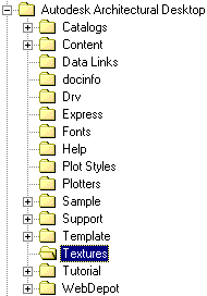 For some reason unknown to me, all of the bitmaps
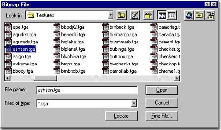
that come with these products are targa files with the extension .tga.
The reason you need to know this is that when you use the Find File...
button on any of the Modify Materials dialogue boxes, the default file extension is set to
.bmp and thus you will not be able to see any of these files unless you set the Files
of Type to .tga. For some reason unknown to me, all of the bitmaps
that come with these products are targa files with the extension .tga.
The reason you need to know this is that when you use the Find File...
button on any of the Modify Materials dialogue boxes, the default file extension is set to
.bmp and thus you will not be able to see any of these files unless you set the Files
of Type to .tga.
You are not limited to the materials in this folder nor
targa files so you can add all of the bitmaps you want to this folder or even keep a
library of folders for different types of materials. Since AutoCAD and Architectural
Desktop usually have a default Path set in the Options dialogue
box to look for materials in the Textures folder, you may want
to work with this folder or Add new folders to the Texture Maps Search Path. |
 One
thing you must keep in mind when creating Materials and working with custom bitmap images
is that just like Xref's and Image Ref's, bitmaps are not imbedded in the drawing file.
Each time a Rendering process is run, AutoCAD\Architectural Desktop must look for
the bitmaps that have been used within the Materials Attached to objects in the current
drawing. This also means that if you want to copy or move a project, you must track
the bitmap files as well. |
| 8Material Attachment |
8-7 MATERIALS |
Materials
dialogue box
| Menu |
View> Render>
Materials... |
|
|
| Keyboard |
Rmat |
Illustrated to the right is the Materials dialogue where
among other things, you use the Attachment or Association tools to put the Materials on
the objects in your drawing. Once Materials have been Imported
to the Current Drawing within the Materials Library dialogue box,
these Materials can be Attached, Duplicated and/or Modified
on the Materials dialogue box.
Since working with Materials from any Material
Library must be done through the Materials dialogue box,
illustrated to the right, it makes more sense to use the Materials Library...
button as a means for accessing the Materials Library dialogue box. It is for this
reason that I never use the Materials Library button or command; I do all Material work
through the Materials dialogue box.
| There are three different ways to associate
the Materials with the objects in your drawing: Attach, By ACI
and By Layer. Attaching
Materials by Attach is the worst way to manage materials since it is very
difficult to track what object received what materials. The Select<
button can be a great benefit in situations where this technique has been used.
Attaching Materials By ACI... will
probably prove to be a preferred method for many of the objects in Architectural
Desktop since their components have unique Color
assignments but not unique Layer assignments.
Attaching Materials By Layer... is a
method similar to using Layers to Manage Colors and Linetypes and is
therefore my personal preference. You can use this method for many of the objects
in Architectural Desktop but can prove to be troublesome for the more
complex objects that have multiple components. |
Preview - use this button to see a
rendered preview of the highlighted Material. The Preview drop-down list offers two
objects that can be used for the Preview: Cube and Sphere.
Materials Library... - use this button to
access the Materials Library dialogue box and Import Materials
into the Current Drawing for use through the Materials dialogue box.
Select < - use this button to
identify the Material Attached to an object in the current
drawing. This process will also identify the type of attachment: Attach,
By ACI or By Layer. |
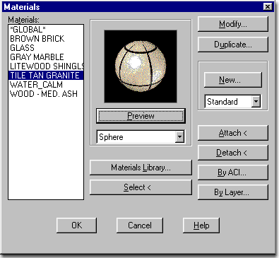
Modify... - use this button
to access the Modify [Material Type] Material dialogue box
for changing all of the Attributes that define a Material's appearance
and mapping behavior.
Duplicate... - use this
button to make a copy of the highlighted Material. Using this
button will activate the Modify [Material Type] Material dialogue
box dialogue box automatically with a copy of all of the Attribute
settings of the highlighted Material but you will need to specify a new Material
Name.
New... - use this button in
conjunction with the New Material drop-down list to create new Standard,
Granite, Marble or Wood Materials.
Attach <
- using this button allows you to leave the Materials dialogue box temporarily while you
Select objects in your drawing that you want the current Material "attached"
to. The problem with this methodology is that it is very difficult to track
materials and objects. The only way to know what material an object has is by
Rendering it or by using the Select < button.
Detach < - use this button
to Undo the work done with the Attach button.
By ACI... - using this button
allows you to work with the Attach by AutoCAD Color Index dialogue box
where you can manage the attachment or association of materials with Colors
- see discussion below.
By Layer... - using this
button allows you to work with the Attach by Layer dialogue box where you
can manage the attachment or association of materials by Layer Names -
see discussion below. |
| Attaching Materials by AutoCAD Color Index (ACI) dialogue box Illustrated to the right is the Attach by AutoCAD Color
Index dialogue box where you establish links between Materials and Colors in the
current drawing. To Attach a material to a Color, highlight the Material
and the Color before using the Attach -> button.
For typical AutoCAD 3D objects, such as those created by
Solid and Surface Modeling, using this technique is probably not as beneficial as using
the Attach by Layer technique.
For many of Architectural Desktop's 3D objects, such as Doors,
Curtain Walls, Windows, Stairs and Railings,
using this technique is probably the most logical way to proceed since all of these
complex objects come with predefined Color Components but not unique
Layer Components.
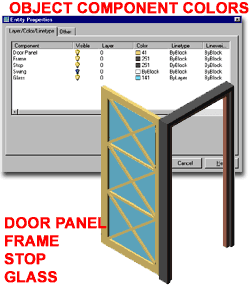 Illustrated to the left, I show an Interior Door and the default Colors
assigned to it by Architectural Desktop ( using a default template for Imperial units ).
Since all of the Components defer to the Layer Key for the Door object, they will
not be separated into various Layers. Therefore, we must use the Colors for each
Component as a way of Attaching Materials. This means that if you Attach Glass to
Color 141, for example, all 3D objects assigned Color 141 will Render as Glass. Illustrated to the left, I show an Interior Door and the default Colors
assigned to it by Architectural Desktop ( using a default template for Imperial units ).
Since all of the Components defer to the Layer Key for the Door object, they will
not be separated into various Layers. Therefore, we must use the Colors for each
Component as a way of Attaching Materials. This means that if you Attach Glass to
Color 141, for example, all 3D objects assigned Color 141 will Render as Glass.
|
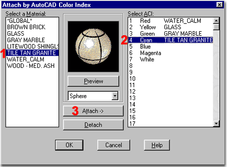 There are 255 Colors to choose from in every
AutoCAD/Architectural Desktop drawing so you can use 255 Materials with
this technique. |
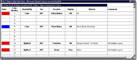
| Entity Properties -
Object Color Chart
In ADT you should notice that objects will change color
when the View or Display is changed. Usually the most dramatic color changes occur
when switching from 2D plan to 3D Model. In order to keep track of all these colors,
I have assembled a long chart to show what colors have been used and which ones are free.
This should help you to modify or add new object colors without getting into too
much trouble. Charting this data is exhaustive so it is not complete but it will be
updated periodically. |
 |
| Attaching Materials by Layer dialogue box Illustrated to the right is the Attach by Layer
dialogue box where you establish links between Materials and Layers in the current
drawing. To Attach a Material to a Layer, highlight the Material
and the Layer Name before using the Attach -> button.
This technique is one that I personally prefer because of
how I try to manage as much as possible through Layers. Having Layer Names that
identify the object types make the process of managing Material Attachment far easier than
by Color Index. The problem is that Architectural Desktop manages
object complexity through Component Colors as opposed to Component
Layers. The reason for this is that we would have a huge list of Layers to
contend with if each and every Component had its own Layer Name.
For simplicity, I recommend using the Attach by
Color Index technique for all of the complex objects in Architectural Desktop -
see comment above.
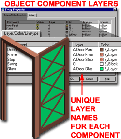 Illustrated to the left, I show an Interior Door and the modifications I had
to make to the Component Layers and Colors in order to
use the Attach by Layer technique effectively. All of the
Components have been set to unique Layers that have unique Colors. In order to see
the Layer Colors on my object, I also had to change the Component Colors to ByLayer. Illustrated to the left, I show an Interior Door and the modifications I had
to make to the Component Layers and Colors in order to
use the Attach by Layer technique effectively. All of the
Components have been set to unique Layers that have unique Colors. In order to see
the Layer Colors on my object, I also had to change the Component Colors to ByLayer.
Unlike the the Attach by Color technique, this technique
offers the ability to use an unlimited number of Materials. |
 Though I recommend using the Attach by Color Index, I personally use the
Attach by Layer method a lot despite the irritation of having to modify the Entity
Properties of all complex objects. The reason for this is quite simple, I
can manage the Materials better and faster by Layer Names than by Colors ( that mean
nothing to me ). This process also provides me with the added benefit of using the
Layer Manager to turn Components On and Off and change
their Colors which is quite useful when working in Shaded Modes. |
| 9Materials - Bitmaps |
9-7 MATERIALS |
| Bitmap Images for use as Materials - Overview
 When you get to the point where you need more than colors and more than the
default AutoCAD / Architectural Desktop Materials Library has to offer,
it's time to begin creating your own Bitmap Materials. The ability
to use any digital image that you can create ( see types below ) allows you to recreate
reality as closely as the rendering tool will allow. On some projects, clients have
supplied me with a bag of samples covering everything from wall applicants to carpeting,
ceiling, furniture, fixture and even wall art. If you find that the job calls for
such high levels of "reality", you should consider using another rendering
program such as Autodesk Viz because the Rendering Engine in AutoCAD /
Architectural Desktop is simply not up to par with programs designed specifically to
produce Renderings. This does not mean that you should not bother with realism but
that you simply need to consider how real is good enough and how real can AutoCAD /
Architectural Desktop feasibly go. The other consideration is TIME.
AutoCAD / Architectural Desktop's Rendering time is dramatically slower than 3D
Studio Viz, for example, and it's amazing how a product can pay for itself simply by being
faster. When you get to the point where you need more than colors and more than the
default AutoCAD / Architectural Desktop Materials Library has to offer,
it's time to begin creating your own Bitmap Materials. The ability
to use any digital image that you can create ( see types below ) allows you to recreate
reality as closely as the rendering tool will allow. On some projects, clients have
supplied me with a bag of samples covering everything from wall applicants to carpeting,
ceiling, furniture, fixture and even wall art. If you find that the job calls for
such high levels of "reality", you should consider using another rendering
program such as Autodesk Viz because the Rendering Engine in AutoCAD /
Architectural Desktop is simply not up to par with programs designed specifically to
produce Renderings. This does not mean that you should not bother with realism but
that you simply need to consider how real is good enough and how real can AutoCAD /
Architectural Desktop feasibly go. The other consideration is TIME.
AutoCAD / Architectural Desktop's Rendering time is dramatically slower than 3D
Studio Viz, for example, and it's amazing how a product can pay for itself simply by being
faster.
Illustrated to the right, I show one of the more difficult
types of Bitmap Materials to create: a pattern material.
In the case of a common brick pattern, the trick is to get a good
brick sample and then to crop it so that it comes out seamless. The Array command in
AutoCAD is a perfect comparison because it works on the same principle. If you don't
set up your linework just right before Arraying, the error is easy to spot.
You can use a digital camera or desktop scanner to capture
one or more bricks and then use Photoshop or an equivalent image editing program to edit
the image for use in AutoCAD / Architectural Desktop. A pattern like bricks is very
difficult because our eyes can easily detect patterns in patterns. If you use one
brick for a whole wall, your eye is likely to see the repetitive pattern. If you use
a few bricks and the pattern has too much variation in it, your eye will see that
repetitive pattern too. In an ideal situation you would have a sample equal to your
use but that's not feasible in most cases so you attempt to make the best of it. The
fact of the matter is that this is art and not science. |
The best news is that there are numerous huge
libraries of materials that can be purchased. 3D Studio Viz comes with an enormous
library of architectural materials that can also be use in AutoCAD / Architectural Desktop
if you use the steps outlined here.
If you are just starting to learn about custom
bitmap materials, try something easier than bricks. One of my favorite tricks is to
do a screen capture with the Print Screen key and then use it as a piece of art hanging on
a wall - see discussion below on Signage and Decals for
a similar example of this technique.
Once you have a material prepared, you will
need to save it in one of the formats outlined below. The size of the material
depends on how clear you want it. |
Bitmap as Color/Pattern Attribute
| Menu |
View> Render>
Materials... |
|
|
| Keyboard |
Rmat |
| Links |
Standard Material dialogue box - for
information on how to get to this dialogue box and how to get started with a new material |
| |
Texture
Location - for where to find default materials |
Illustrated to the right, I show the Modify
Standard Material dialogue box. You can access this dialogue box by either
creating a New Standard Material or
by Modifying an existing Material.
Using the same concepts outlined above under Standard Materials, we can choose to use a Bitmap for the Color/Pattern
Attribute for the Pattern portion of this Attribute. To use a Bitmap, simply use the
Find File... button to locate and Open any bitmap image
that has the three letter extension .bmp, .png, .tga, .tif,
.gif or .pcx. To learn about creating your own
materials, read Photoshop
for Materials.
Once you have entered the path and name of the bitmap
material in the File Name text field, you can use the Bitmap
Blend range setting to control how this bitmap will blend with the Color
you have set and how it will blend with the Ambient Color you have
set. To learn more about Color Values and Ambient Colors, read New Material - Color Options.
For a first run, you might set the Bitmap Blend
to 1.00 ( 100% ) and deactivate the By
ACI checkbox. This will defer the Color to the Bitmap image directly.
Should you want a slightly darker brick, for example, you can set a dark Color and adjust
the Bitmap Blend range setting to allow this Color to affect the Bitmap.
Tip:
Run Rendering tests regularly before going too far.
True Image Format ( .tif ) files will produce the sharpest renderings. |
 |
| Adjust Material Bitmap Placement dialogue
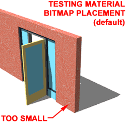 Applying, Attaching Bitmap Materials to architectural
objects can be a tricky job. The primary problem has to do with the scale of the
bitmap image and the scale of your architectural objects. Since we are definitely
not going to change the architectural objects, we have to work with the Material
Bitmap Placement. Applying, Attaching Bitmap Materials to architectural
objects can be a tricky job. The primary problem has to do with the scale of the
bitmap image and the scale of your architectural objects. Since we are definitely
not going to change the architectural objects, we have to work with the Material
Bitmap Placement.
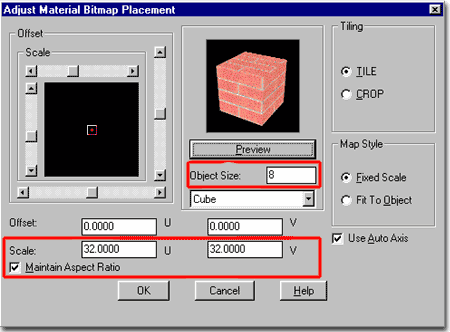
On the Adjust Material Bitmap Placement dialogue
box, illustrated to the right, you can control where a bitmap is
located on an object, the scale of the bitmap on that objects, if it will
be tiled or a single image and the if AutoCAD / Architectural Desktop
should automatically attempt to determine the Axis of orientation for the
material on your objects.
U and V - these are
simply mapping terms for X and Y. In mapping, there is also a term for the 3rd Axis
called W and thus you have U,V,W for bitmap orientation; not to be
confused with objects using the UCS and X,Y,Z coordinates.
Offset - use these number fields to move
an image left and right or up and down relative to the object(s) it has been associated
with. You can use this option to align the mortar of a brick with the exact edge of
a Wall but I find that type of accuracy incredibly tedious. I
typically use this option when applying a "decal" on a surface; something like a
colored rectangle with an image or piece of text in the middle to be Rendered at a
specific point on an object. |
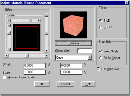 Scale
- use these number fields to control the number of times the image is repeated over an
object, if tiled, or how big or small the image is. The larger the number, the
bigger the image on the object(s) with less tiling. To find the right scale, use the
Object Size number field - see below.
Maintain Aspect Ratio - use
this checkbox if you want the U and V values to remain
proportionally locked to the current setting. In other words, if Scale is set to U
= 1 and V =1 then the Aspect Ratio will keep that ratio and you will only need to type in
the Scale in either of the two Scale value fields.
Object Size - use this value
field to set a dimensional height for the cube or diameter for the Sphere. The value
used is directly proportional to the units used in your drawing so if you read 1 as an
inch or millimeter, then that is what you will see relative to the image. In an
Imperial drawing, for example, you can set the cube to one square foot by typing 12.
The trick is to set a working size relative to your material and then work with the Scale
to set it correctly for your object(s). |
| Adjust Material Bitmap Placement - Scale
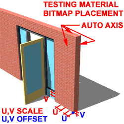 Tiling Tiling
Tile - checking this radio button repeats the bitmap over the entire surface of
the object.
Crop - checking this radio button
uses just the one bitmap. You can use this option for applying a "decal"
to an object, for example, where you do not want more than just the bitmap scaled and
located according to your needs; much like a postage stamp on a piece of paper.
Map Style
Fixed Scale - checking this radio button allows the Scale to be determined by the
U and V values.
Fit To Object - checking this radio button
stretches the bitmap out to cover the entire surface of any object it is applied to.
The use of Offset and Scale can still be used to control how the stretch appears.
This is a great option for objects whose image you have in exact form, like wall
art, television monitors, posters, books, etc.
Use Auto Axis - checking this option can
prove to be one of the most useful features in mapping or one of the most
troublesome. It uses the positive XYZ directions of the objects that this material
is applied to to determine the "front" face of a material and thus you could end
up with backwards material. Generally, this only proves to be a problem with
Bitmaps that have a direction such as artwork, text, television images and posters.
When using the Mapping tool you may
want to uncheck this option because of the contradiction it creates if
you are physically defining the Mapping Coordinates and Projection. I find that Auto
Axis causes problems for all but the Planar Mapping Projection. Note: the Scale
values usually have to be set much lower when using the Mapping tool. |
 Tip:
Create a black and white copy of the brick bitmap making the bricks white and the grout
black and use this new bitmap image as a Bump Map
Attribute. This trick will add a three dimensional appearance to the bricks by
making the grout lines appear recessed by the Bump Map Value. |
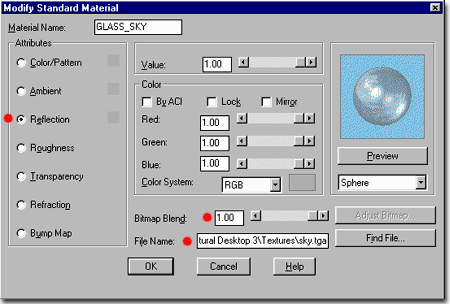
| Bitmap as Reflection Attribute This option should be as magnificent as it is in 3D Studio Viz and Max but
unfortunately it isn't. One of the primary problems with the use of a Bitmap
as a Reflection Attribute is that there are no controls
for how it is mapped to the objects;i.e., there is no Adjust
Bitmap... option. This means that the bitmap position, scale and
orientation are automatically determined and more times than not, the automatic placement
is not very good.
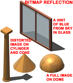 Using Bitmaps as Reflection Attributes works best on Spherical objects
and provides the types of results you would expect on all objects; a complete image.
On Cylindrical objects, the image is distorted because it is improperly mapped for
a cylinder but can produce an interesting effect. On rectangular objects, the image
is usually unobservable though you will pick up a sampling of its color. This means
that if you use a "sky.tga" image for a Reflection Attribute on a Curtain Wall,
for example, you should find a tint of blue but little more ( no clouds, no variation ). Using Bitmaps as Reflection Attributes works best on Spherical objects
and provides the types of results you would expect on all objects; a complete image.
On Cylindrical objects, the image is distorted because it is improperly mapped for
a cylinder but can produce an interesting effect. On rectangular objects, the image
is usually unobservable though you will pick up a sampling of its color. This means
that if you use a "sky.tga" image for a Reflection Attribute on a Curtain Wall,
for example, you should find a tint of blue but little more ( no clouds, no variation ).
If you activate the Mirror option, that
type of "true" reflection tends to lighten the effect of the bitmap image. |
 |
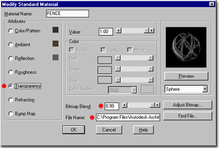
| Bitmap as Transparency Attribute
There are numerous architectural objects in the world that
are impractical to model correctly because the detail is too high and the value to the
project too low. An example of this is a chainlink fence, illustrated left, where an
ADT Wall object can be used to create the physical dimensions of the fence but not the
physical appearance. In a situation like this, you can use a bitmap of a chainlink
fence to create the illusion of a meshed fence. The process is nearly identical to
that discussed above, Bitmap as
Color/Pattern Attribute, with the exception of how the bitmap is colored and
used as a Transparency Mask.
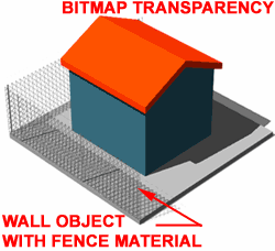 Illustrated to the right, I show how the black background of
the chainlink bitmap image can be used as a transparency mask for the
actual image set by the Color/Pattern Attribute. Since the bitmap image was already set
with a black background where transparency is required, it can be used for both Color/Pattern
and Transparency Attributes. In some cases you may
have to use two different images since the background must be black for the transparency
mask. Illustrated to the right, I show how the black background of
the chainlink bitmap image can be used as a transparency mask for the
actual image set by the Color/Pattern Attribute. Since the bitmap image was already set
with a black background where transparency is required, it can be used for both Color/Pattern
and Transparency Attributes. In some cases you may
have to use two different images since the background must be black for the transparency
mask.
To make the Transparency bitmap
work most effectively, you will need as much of a Transparency Value as
you can get ( 1.00 or 100% for full transparency ). The Bitmap
Blend value will also affect the transparency by affecting the ration between the
image and the black background; i.e., the lower the blend, the more transparent the
whole image and the higher the blend, the stronger
the transparency of only the black background area. |
  This sample chainlink fence with posts comes with the default AutoCAD
and Architectural Desktop texture library: "fence.tga".
Since there are no Chainlink fences in the default Materials Library, you will have
to create your own as discussed here. Unfortunately, there are no other chainlink
fence bitmaps in the default texture library; this one comes with posts that you may not
want to use. This sample chainlink fence with posts comes with the default AutoCAD
and Architectural Desktop texture library: "fence.tga".
Since there are no Chainlink fences in the default Materials Library, you will have
to create your own as discussed here. Unfortunately, there are no other chainlink
fence bitmaps in the default texture library; this one comes with posts that you may not
want to use.
Tip:
Use this technique in as many places as you can to create amazing effects. This
technique is also how decals can be applied over other
materials. Typically, I simply create a 3D Face a tiny tiny distance above another
object and Attach a Material such as this one to create a decal. Some examples
include letters on glass, public signage on walls and doors and maps on kiosks. |
| Bitmap as Bump Map Attribute
One of the best tricks in the world or Rendering involves
making Materials do the work of Modeling and the Bump Map is one of the
best examples of this type of tick. A Bump Map uses the light and dark
areas of a bitmap image to create a type of distortion
in the Material where dark areas appear closer to the true surface of the
object and white areas appear raised.
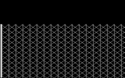
Illustrated to the right and below, I show a common
architectural application of a Bump Map used to create the effect of a standing seam metal
roof. By using one of the default Metallic Materials, all that is required to make
it work for a roof is to add a Bump Map as illustrated to the right. At its most
basic, a simple light line next to a larger area of black would do the trick and you can
learn more about this by reading Photoshop for Bump.
In the this Bump Map example, however, I show that you can make them more 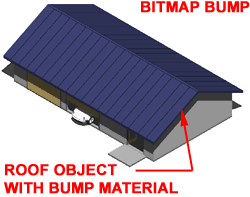 sophisticated so they produce a more realistic effect. In my example
Bump Map Image, I have White Lines for the standing seams but I also have a wider White
line for the ridge. sophisticated so they produce a more realistic effect. In my example
Bump Map Image, I have White Lines for the standing seams but I also have a wider White
line for the ridge.
Since my Bump Map Image is pure Black and White with no
shades of Gray, the Bitmap Blend Value does not need to be very high in
order to produce a believable seam. Shades of Gray on either side of each seam could
have been used to create a more Filleted look to the seams but in many cases such extreme
detail is not necessary. |
 The
biggest problem with Bump Maps is getting them to map correctly and this can be controlled
with the Adjust Material Bitmap Placement dialogue box as illustrated
above. In the case of my example Bump Map Image, I have an image perfectly matched
to my Architectural Desktop Roof object so I have used the Fit To Object
Map Style and uncheck the Use Auto Axis option so I don't get this
material on the fascia where I don't want it.
Using Fixed Scale vs. Fit To
Object is really a matter of how the Bitmap has been designed and in many cases you will
use Fixed Scale so that you can use the Scale values to adjust the image
to match the dimensions required in the Rendering. If you use Fixed Scale however,
don't expect to be able to create and use a Bump Map Image as complete ( with ridge seam )
as this example. |
| 10Customizing and Tricks |
10-7 MATERIALS |
| |
|
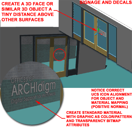
| Signage
and Decals
Illustrated to the right is an example of what I like to
refer to as a decal because it is a bitmap that appears to float over other materials due
to its transparency. Though it is possible to create a single Material that can
function as both primary surface material and decal, the work involved is too tedious for
me to justify a discussion here. Instead, simply create a 3D Object right where you
want your decal or signage and place it a tiny fraction of an inch or millimeter above the
surface below it. If the distance is too great then you will cast shadows onto the
surface below the decal.
In the illustration to the right, I used a 3D Face since it
consumes a very small amount of memory and is basically an infinitely flat 3D object (
just like a decal ). The important thing to keep in mind is that its size and
orientation will affect how the Material Maps to the Surface.
By orienting the UCS icon such that the Z-axis faces in the
direction I wanted the text to read ( called the Normal of this face ), I assured that I
got a proper mapping orientation ( text left to right ).
By drawing a 3D Face approximately the size I wanted the
decal while keeping it relative to the bitmap image ( aspect ratio ), I assured that I got
a proper fit along the X and Y axes.
And finally, by using the Fit to Object checkbox
on the Adjust Material Bitmap Placement dialogue box for this Material, I
assured that the bitmap would be stretched out perfectly across the surface of my 3D Face. |
 |